DUIM-Gadgets Library#
Overview#
The elements that comprise a Graphical User Interface (GUI) are arranged
in a hierarchical ordering of object classes. At the top level of the
DUIM hierarchy there are three main classes, <sheet>,
<gadget>, and <frame>, all of which are subclasses of
<object>.
The DUIM-Gadgets library contains classes that define a wide variety of gadgets for use in your GUI applications, such as push buttons, radio buttons, and check boxes. The library also provides the necessary functions, generic functions, and macros for creating and manipulating these classes. The library contains a single module, duim-gadgets, from which all the interfaces described in this chapter are exposed. DUIM-Gadgets Module contains complete reference entries for each exposed interface.
Gadgets are the basic behavioral GUI element (above the level of events).
Gadgets do not need to have a visual presence, though in practice every gadget provided by DUIM does, since all general instances of
<gadget>are also general instances of<sheet>.Many classes of gadget maintain some kind of state for their behavior, and in practice some of this is usually reflected in the UI. For example, you can tell that a check box is selected just by looking at it.
They handle events and turn these into callbacks, for convenience.
Some of the more important types of gadget are as follows:
- Buttons
A wide variety of buttons are provided by DUIM. These include not only standard buttons such as push buttons and radio buttons, but items that can be placed within menus.
- Action gadgets
An action gadget is any gadget that can be used to perform an action, such as a button, or menu command.
- Value gadgets
A value gadget is any gadget that can have a value associated with it. In principle, this is true of the majority of gadgets, but the value of a gadget is more important for certain types of gadget (for instance, lists or radio boxes) than for others (for instance, push buttons).
- Value range gadgets
Value range gadgets are those value gadgets for which the possible value sits within a defined range. This includes gadgets such as scroll bars and sliders.
- Collection gadgets
Collection gadgets are those gadgets that can contain a number of “child” gadgets, the specification of which can be described in terms of a Dylan collection, and includes gadgets such as list controls and groups of buttons. Usually, the behavior of each of the “child” gadgets is interdependent in some way; for example, only one button in a group of radio buttons may be selected at any time. With collection gadgets, you can specify the “child” gadgets very simply, without having to worry about defining each “child” explicitly.
Each of these types of gadget is described in more detail in subsequent sections, and full reference entries for every interface exposed in the DUIM-Gadgets library are available in DUIM-Gadgets Module. For a more general introduction to the gadgets provided in DUIM, see the tour in the Building Applications using DUIM book. See the same book for a more practical example of implementing an application using the DUIM library.
Callbacks and keys#
When an event occurs in a user interface (for example, a button is pressed, a menu command is chosen, or an item in a list is double-clicked), you usually want some operation to be performed. If the user of your application chooses the File > Open command, a File Open dialog should be displayed. If the user clicks on an OK button in a dialog, the dialog should be dismissed and the appropriate changes to the application state to be performed. In DUIM, you can provide this functionality by specifying a function known as a callback.
Generally speaking, a callback gets passed a single argument, which is the gadget that is affected. Thus, the argument passed to the callback for a button is the button itself. Callbacks do not need to have a return value, although they are not forbidden either. If a value is returned by a callback function, then it is just ignored.
Callbacks are used in preference to event handlers because Dylan does
not let you write methods that specialize on individual instances. In
languages such as C, you uniquely name each element in an interface, and
then provide behavior for each element by writing event handlers that
contain case statements that let you discriminate on individual
elements. This is a somewhat inelegant solution. Instead, in Dylan you
specify the names of the callbacks for each element in an interface when
you create the elements. It is then a simple matter for the system to
know what behavior goes with what elements, and is much less tedious
than having to write many cumbersome methods for handle-event.
In Dylan, you use events in order to create new kinds of class. If you
were creating a new kind of button, you would need to define a new
method for handle-event in order to describe what happens when
you click on an instance of that button. You would then write callbacks
to deal with particular instance of the new class of button.
By contrast with callbacks, you can also provide functions in DUIM known as keys, which are specific to collection gadgets. A key is used to set the value of some aspect of the collection gadget for which the key is defined. With keys, therefore, the values returned by the function are fundamental to the operation of the gadget. There are two keys that are generally used by gadgets, known as the value key and the label key. The value key is a function that is used to calculate the value of the gadget for which the key is defined. The label key is used to calculate the printed representation, or label, of all the items in a collection gadget.
Gadget protocols#
Gadgets are objects that make up an interface: the menus, buttons, sliders, check lists, tool bars, menu bars, and so on. Gadget classes may support three protocols, value, items, and activate.
Gadgets that support the value protocol respond to the
gadget-valuemessage, a value-changed callback, and have a setter function associated with them.Gadgets that support the items protocol respond to
gadget-itemsand have a gadget setter function associated with them.Gadgets that support the activate protocol have an activation callback associated with them.
Gadgets have a set of slots, or properties, associated with them:
gadget-label, gadget-value, gadget-items, and
gadget-enabled?. Every gadget has some or all of these properties.
gadget-labelThis slot holds the label that appears on the gadget on the screen. If a gadget does not have a label, the
gadget-labelfunction returns#f.gadget-valueThis slot holds the value(s) of the gadget. If a gadget does not have any values, the
gadget-valuefunction returns#f.gadget-itemsThis slot is a list of the contents of the gadget. If the gadget does not have items, for example a button,
gadget-itemsreturns nothing.gadget-enabled?This slot tests whether or not the gadget is active. All gadgets have a
gadget-enabled?slot.
An introduction to the protocols supported by different sorts of gadget can also be found in the Building Applications using DUIM book.
The class hierarchy for DUIM-Gadgets#
This section presents an overview of the available classes of gadget, and describes the class hierarchy present.
In each table below, classes that support the items protocol are displayed in bold text, and classes that support the activate protocol are displayed using italic text.
Note: In `Subclasses of the \<collection-gadget\> class`_, every subclass shown supports the items protocol, though for clarity, no bold is used.
All subclasses of <value-gadget> support the value protocol. These are described in Subclasses of <value-gadget>, Subclasses of <button>, and Subclasses of <collection-gadget>.
The <gadget> class and its subclasses#
The base class for the majority of DUIM gadgets is the <gadget> class, which is itself a subclass of <object>. All other DUIM gadgets are subclasses of <gadget>, with the exception of <list-item>, <tree-node>, and <table-item>.
The immediate subclasses of <gadget> are shown in `Overall class
hierarchy for the DUIM-Gadgets library`_. Only <value-gadget>
and <page> have any subclasses defined. See
Subclasses of <value-gadget> and Subclasses of <page> for details
of these subclasses.
The <gadget> class provides a number of subclasses that allow
particular parts of a user interface to be created:
<menu>Use this class to add a menu to the menu bar of any application frame. Menus themselves contain commands created using the menu-specific button and collection gadgets described in Subclasses of <button> and Subclasses of <collection-gadget>.
<tool-bar>This class is used to add a tool bar to an application frame. A tool bar is a row of buttons that duplicates the functionality of the most commonly used menu commands, thereby providing the user with quick access to the most useful operations in the application.
<scroller>This is a generic scrolling gadget that can be used in a number of situations.
<viewport>A viewport can be used to create a generic pane for displaying specialized contents that you may have defined. Use this class when there is no other class provided for displaying the objects in question.
<splitter>This class can be used to split the current view in half. This allows the user, for example, to create a second view of the same document.
The <gadget> class provides a number of subclasses that allow
general spatial and grouping capability, in addition to the layout
functionality described in DUIM-Layouts Library.
These are as follows:
<label>This class is used to assign label to many other types of gadget. Many gadgets can be assigned one or more labels, usually by means of a label: init-keyword. This class is used to assign any label.
<separator>This allows a line to be drawn between any two gadgets or groups of gadgets, so as to provide a visible barrier between them.
<spacing>This allows you to specify how much space should be placed between any two gadgets or groups of gadgets.
<border>This allows a visible border to be placed around any number of gadgets.
<group-box>This allows you to group together any number of related gadgets in a frame. Grouped elements are usually displayed with a border and label identifying the grouping.
Overall class hierarchy for the DUIM-Gadgets library
<object>
<gadget>
<action-gadget>
<value-gadget>
See Subclasses of <value-gadget>
<label>
<tool-bar>
<scroller>
<separator>
<viewport>
<spacing>
<border>
<group-box>
<splitter>
<page>
<list-item>
<tree-node>
<table-item>
Subclasses of <value-gadget>#
Any gadget that can take a value of some sort is a subclass of
<value-gadget>. As might be expected, this includes the majority of
the gadgets in the DUIM-Gadgets library.
Every subclass of <value-gadget> supports the value protocol, as
described in Overview.
Several subclasses of <value-gadget> themselves have a number of
subclasses defined. These include:
<text-gadget>Any gadget into which you can type text. These include both text editors (multiple line edit controls) and text fields (single line edit controls).
<value-range-gadget>Value gadgets whose value can vary within a known range, such as scroll bars.
<button>Any button, such as a radio button, check button, or push button. See Subclasses of <button> for more details about the classes of button available.
<collection-gadget>Any gadget whose contents form a collection, such as a list, a tree control, or a group of buttons. See Subclasses of <collection-gadget> for more details about the classes of collection gadget available.
Also provided are the following specific GUI elements:
<menu-bar>This used to create the standard menu bar that is commonly found across the top of an application frame.
<status-bar>This is used to create a status bar, usually placed at the bottom of an application frame. A status bar is used to display miscellaneous information about the current state of the application.
<tab-control>Tab controls are analogous to dividers in a filing cabinet or notebook, with multiple logical pages of information displayed within the same window. Clicking on any of the tabs displayed in a tab control displays a new page of information.
The subclasses of <value-gadget> are as shown in `Subclasses of
the \<value-gadget\> class`_.
Subclasses of the <value-gadget> class
<value-gadget>
<text-gadget>
<password-field>
<text-editor>
<text-field>
<value-range-gadget>
<slider>
<scroll-bar>
<progress-bar>
<button>
<status-bar>
<tab-control>
<collection-gadget>
Subclasses of <page>#
The <page> class is the base class of gadgets that are used to display a whole page of information within a “parent” element, with the page itself optionally containing other layouts or gadgets. Pages are used in situations where different sets of information (the pages themselves) need to be displayed in a common parent.
The subclasses of <page> are as shown in `Subclasses of the <page>
class`_.
Subclasses of the <page> class
<page>
<tab-control-page>
<property-page>
<wizard-page>
The <tab-control-page> class is used to define the elements that are
associated with each tab in a tab control.

A tab control page#
The <property-page> class performs a similar job for property frames
(visually, a property frame looks like a tab control in a dialog box,
and is one way of implementing a dialog box that has several pages of
information. Property frames are so named because they are often used to
display the user-configurable properties of an application.

A property page#
The <wizard-page> class is used to define the elements in each
page of a wizard frame. Wizard frames are another form of multi-page
dialog, but consist of several physically distinct windows that are
presented to the user in a strict order.

A wizard page#
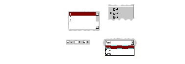
Subclasses of <collection-gadget>#
The subclasses of <collection-gadget> are as shown in `Subclasses
of the \<collection-gadget>\ class`_. All of these
subclasses support the items protocol, even though they are not
displayed in bold.
Subclasses of the <collection-gadget> class
<collection-gadget>
<button-box>
<check-box>
<push-box>
<radio-box>
<list-box>
<menu-box>
<check-menu-box>
<push-menu-box>
<radio-menu-box>
<option-box>
<combo-box>
<spin-box>
<list-control>
<tree-control>
<table-control>
Two subclasses themselves have a number of subclasses defined: those subclasses representing collections of buttons:
<button-box>These are used to create collections of buttons of the same type. You can create collections of any of the three basic types of button available: check buttons, radio buttons, or push buttons.
<menu-box>These are used to create collections of menu items of the same type. As with
<button-box>, you can create collections of any of the three basic types of menu button available: check, radio, or push menu buttons.
In addition, the following types of list are provided:
<list-box>These are standard list boxes, allowing a list of items to be displayed in a pane, with a scroll bar allowing the complete list to be viewed if necessary. List boxes may be single, multiple, or no selection.
<option-box>A standard drop-down list box. This is similar to a list box, except that the entire list of options is only displayed on demand. In its closed state, only the current selection is visible.
<combo-box>A combo box combines an option box with a text field, providing a list box whose contents can be displayed on demand, or edited by typing into the box in its closed state. Any new values typed in by the user are automatically added to the list of options subsequently displayed.
<spin-box>A spin box is a text box that will only accept a limited number of input values, themselves making up a loop. A typical example might be the integers between 0 and 10. Spin boxes also incorporate small buttons (up-down controls) that allow the user to change the value by clicking the button in the appropriate direction.
Three controls are also available for displaying more general pieces of information:
<list-control>List controls provide an extended list box functionality that let you display a collection of items, each item consisting of an icon and a label. A number of different views are available, allowing you to view the items in different ways.
<tree-control>Tree controls are a special list control that displays a set of objects in an indented outline based on the logical hierarchical relationship between the objects.
<table-control>These allow you to display information as a table, with information divided into a number of column headings.
Since all the subclasses of <collection-gadget> are themselves
value gadgets, each one supports the value protocol, as described in
Overview.
Button gadgets#
Broadly speaking, buttons are gadgets whose value can be changed, or for which some user-defined functionality can be invoked, by clicking on the gadget with the pointer device. Buttons encompass obvious controls such as push buttons, radio buttons, and check boxes, and, less obviously, menu items.

A selection of button and equivalent menu buttons#
Text gadgets#
A text gadget is a gadget into which you can type textual information.
There are three different classes of text gadget available in DUIM, each
of which is a subclass of the <text-gadget> class.
<text-field>This is the most basic type of text gadget: the single line.
Collection gadgets#
A collection gadget is any gadget whose items may themselves form a
Dylan collection. Often, a collection gadget is used to group together a
number other gadgets, such as buttons, in such a way that the
functionality of those gadgets is connected in some way. For example, a
<radio-box> is a collection of radio buttons connected in such a way
that only one of the buttons can be selected at any time (as is the
standard behavior for a group of radio buttons). The items contained in
a collection gadget are expressed using the gadget-items slot.
Note that collection gadgets are not defined as collections of other
gadgets, even though this might be a convenient way to think of them.
When defining a collection gadget, you give the gadget-items slot a
standard Dylan collection. The type of collection gadget you are
creating then determines the type of gadget that is contained in the
resulting collection gadget.
The most simple types of collection gadget mirror the standard buttons and menu buttons available, allowing you to create collections of push buttons, radio buttons, check buttons, and their menu button equivalents. Separators are automatically added to collections of menu buttons so as to delineate them visually from other menu buttons in the same menu.
A variety of simple collection gadgets#
Value range gadgets#
A value range gadget is any gadget whose value falls within a defined Dylan range.

A variety of value range gadgets#
Sliders, scroll bars, and scroll bars are all examples of value range
gadgets. Value range gadgets provide immediate visual feedback of the
value of the gadget at any time, as shown in `A variety of value
range gadgets`_. In the case of sliders and scroll
bars, the user can set the gadget-value by dragging the appropriate
part of the gadget to a new point on the scale. Progress bars are
typically used only to provide the user with feedback about the progress
of a task.
Page gadgets#
A page gadget is used to define the contents of a page in any control that consists of multiple pages. Different classes of page gadget are used for different types of multi-page control. There are three types of page available:
<tab-control-page>These are pages that are used within a tab control. Clicking on any tab in a tab control displays a different page of information.
<property-page>These are pages that are displayed in property frames: modeless dialog boxes that contain several pages of information displayed as tabbed pages. This class is similar to
<tab-control-page>, except that its use is limited to modeless dialog boxes. For more information about property frames, see ` <frames.htm#89815>`_.<wizard-page>This type of page is used exclusively in wizard frames, in which the user is guided through a sequence of steps in order to perform a specified operation. For more information about wizard frames, see ` <frames.htm#89815>`_.

A tab control page, a property page, and a wizard page#
Note
The <wizard-page> and <property-page> classes
are actually exposed by the DUIM-Frames library, rather than the
DUIM-Gadgets library. See ` <frames.htm#89815>`_for full details
on this library.
Gadgets that can have children#
Most gadgets cannot have any children associated with them; they are leaf elements in the sheet hierarchy. However, a number of specialized gadgets exist which can take children. This section describes those classes.
For all the classes described in this section, the children of any instance of the class are defined using the children: init-keyword. In addition, the children of an instance of any of these classes must themselves be gadgets of some kind. In some cases (menu bars, for instance), the type of gadgets that can be defined as a child is constrained.
Status bars#
You can add a status bar to a window in a DUIM application by creating
an instance of the <status-bar> class. A status bar is typically used
to provide feedback to the user, and by default shows displays the
documentation string for any menu command currently under the mouse
cursor. In addition, you can define status bars that display any textual
information your application requires, and to this end, status bars can
take a number of children.

A status bar#
In word processing applications, the status bar may also display the current position of the insertion point, and information about the current font family, size, and variation, if appropriate. In an e-mail client application, the status bar may display the number of messages in the current folder. Often, the system time is displayed in the status bar for an application.
Tab controls#
An instance of the class <tab-control> lets you define a sheet that
contains several “pages” of information. Each page of information is
displayed by clicking on the appropriate tab along the top of the sheet.

A tab control#
This children of a tab control are the pages of information themselves.
Each child should be an instance of the <page> class. The various
types of page available are described in Page gadgets.
Group boxes#
 The
The <group-box> class allows you to group together any number
of gadgets that are associated to some degree in an interface. A group
box creates a purely visual grouping, and does not affect the behavior
or interaction between its children in any way. For this reason, there
are no constraints on the types of gadget that you can group together;
the children of a group box can be any type of gadget.
DUIM-Gadgets Module#
This section contains a complete reference of all the interfaces that are exported from the duim-gadgets module.
- <action-gadget> Open Abstract Class#
The protocol class for gadgets that have action callbacks.
- Superclasses:
- Init-Keywords:
activate-callback – An instance of type
false-or(<function>). Default value:#f.
- Discussion:
The class used by gadgets that have an action callback that allows some type of action to be performed, such as a push button. Action gadgets can only be activated when they are enabled.
- Operations:
- See also:
- activate-gadget Generic function#
Activates the specified gadget.
- Signature:
activate-gadget gadget => ()
- Parameters:
gadget – An instance of type
<gadget>.
- Discussion:
Activates gadget by calling the activate callback. For example, in the case of a button, calling this generic function would be as if the user had pressed the button.
- add-column Generic function#
Adds a column to the specified table.
- Signature:
add-column table heading generator index => ()
- Parameters:
table – An instance of type
<table-control>.heading – An instance of type
type-union(<string>, <label>).generator – An instance of type
<function>.index – An instance of type
<integer>.
- Discussion:
Adds a column table, with a table heading given by heading. The contents of the column are generated by calling the generator function on the item for each row of table. The index specifies where in the column order the new column should be added.
- See also:
- add-item Generic function#
Adds an item to the specified list or table control.
- Signature:
add-item list-or-table item #key after => item
- Parameters:
list-or-table – An instance of
type-union(<list-control>, <table-control>).item – An instance of type
type-union(<list-item>, <table-item>).after (#key) – An instance of type
type-union(<list-item>, <table-item>).
- Values:
item – An instance of type
type-union(<list-item>, <table-item>).
- Discussion:
Adds an item to the specified list-or-table. The new item is created via a call to
make-item.The after argument indicates which item to place the new item after.
- See also:
- add-node Generic function#
Adds node to the specified tree control.
- Signature:
add-node tree parent node #key after setting-roots? => node
- Parameters:
tree – An instance of
<tree-control>.parent – An instance of
<tree-control>.node – An instance of type
<tree-node>.after (#key) – An instance of type
<tree-node>.setting-roots? (#key) – An instance of type
<boolean>.
- Values:
node – An instance of type
<tree-node>.
- Discussion:
Adds a node to the specified tree with the specified parent. The new item is created via a call to
make-node.The after argument indicates which node to place the new node after. If setting-roots? is true, then the new node is added at the root of tree.
- See also:
- <border> Open Abstract Instantiable Class#
The class of bordering gadgets.
- Superclasses:
- Init-Keywords:
thickness – An instance of type
<integer>. Default value: 1.type – An instance of type
one-of(#f, #"flat", #"sunken",
#"raised", #"ridge", #"groove", #"input", #"output")
. Default value:#f.
- Discussion:
The base class of gadgets that provide borders to their children.
The thickness of the border is specified by the
thickness:init-keyword, and is given in pixels.The
type:init-keyword represents the kind of border to be created. Borders may appear raised from the area they surround, or lowered with respect to it. Alternatively, a border may be displayed as a thin ridge or groove. Input and output borders represent “logical” borders.
Different types of border#
Borders are usually created using the
with-bordermacro, rather than by making direct instances of this class.- See also:
- <button> Open Abstract Instantiable Class#
The class of all button gadgets.
- Superclasses:
- Init-Keywords:
accelerator – An instance of type
false-or(<gesture>). Default value:#f.mnemonic – An instance of type
false-or(<character>). Default value:#f.
- Discussion:
The class of all button gadgets.
The
accelerator:init-keyword is used to specify a keyboard accelerator for the button. This is a key press that gives the user a method for activating the button using a short key sequence rather than by clicking the button itself. Keyboard accelerators usually combine the CONTROL and possibly SHIFT keys with an alphanumeric character.When choosing accelerators, you should be aware of style guidelines that might be applicable for the operating system you are developing for. For example, a common accelerator for the command File > Open in Windows is CTRL+O.
Keyboard accelerators are mostly used in menu buttons, though they can be applied to other forms of button as well.
The
mnemonic:init-keyword is used to specify a keyboard mnemonic for the button. This is a key press that involves pressing the ALT key followed by a number of alphanumeric keys.Note that the choice of keys is more restrictive than for keyboard accelerators. They are determined in part by the names of button itself (and, in the case of menu buttons, the menu that contains it), as well as by any appropriate style guidelines. For example, a common mnemonic for the File > Open command is ALT, F, O.
Mnemonics have the advantage that the letters forming the mnemonic are automatically underlined in the button label on the screen (and, for menu buttons, the menu itself). This means that they do not have to be remembered. In addition, when the user makes use of a mnemonic in a menu, the menu itself is displayed on screen, as if the command had been chosen using the mouse. This does not happen if the keyboard accelerator is used.
Buttons are intrinsically “non-stretchy” gadgets. That is, the width and height of a button is generally calculated on the basis of the button’s label, and the button will be sized so that it fits the label accordingly. Sometimes, however, you want a button to occupy all the available space that is given it, however large that space may be. To force a button to use all the available width or height, specify
max-width: $fillormax-height: $fillaccordingly in the button definition. See the second example below to see how this is done.- Operations:
<frames.htm#56017>
<frames.htm#56015>
<frames.htm#24406>
<frames.htm#37806>
<frames.htm#48310>
<frames.htm#91817>
<frames.htm#56017>
- Example:
contain
  (make(<button>, label: "Hello",
        activate-callback:
        method (gadget)
          notify-user
            (format-to-string
              ("Pressed button %=", gadget),
             owner: gadget)
        end));
The following example creates a column layout that contains two elements.
The first is a row layout that itself contains two buttons with short labels.
The second is a button with a long label.
The use of
equalize-widths?:in the call toverticallyensures that these two elements have the same width.The interesting part of this example is in the use of
max-width: $fillin the definition of the buttons with shorter labels. If this was not used, then each button would be sized such that it just fit its own label, and there would be empty space in the row layout. However, usingmax-width: $fillensures that each button is made as large as possible, so as to fit the entire width of the row layout.vertically (equalize-widths?: #t) horizontally () make(<button>, label: "Red", max-width: $fill); make(<button>, label: "Ultraviolet", max-width: $fill); end; make(<button>, label: "A button with a really really long label"); end
- See also:
- <button-box> Open Abstract Instantiable Class#
A class that groups buttons.
- Superclasses:
- Init-Keywords:
rows – An instance of type
false-or(<integer>).columns – An instance of type
false-or(<integer>).orientation – An instance of type
one-of(#"horizontal", #"vertical"). Default value:#"horizontal".layout-class – An instance of type
subclass(<layout>). Default value:<column-layout>or<row-layout>, depending on orientation.child – An instance of type
false-or(<sheet>). Default value:#f.
- Discussion:
The class of grouped buttons; the superclass of
<check-box>and<radio-box>.The
rows:andcolumns:init-keywords allow you to specify how many rows or columns should be used to lay out the buttons. In addition, you can set the orientation of the button box by specifying theorientation:init-keyword.An instance of the class that is specified by
layout-class:is used to parent the buttons that are created, and any extra arguments that are specified, such asx-alignment:andx-spacing:, are passed along to this layout.You can use the
child:init-keyword to specify a sheet hierarchy to be used in place of a list of items. Under normal circumstances, the items defined for any button box are realized in terms of their “natural” gadget class. For example, if you create a radio button box, DUIM creates a radio button for each item that you specify. By using thechild:init-keyword, you can define sheet hierarchies that override these “natural” gadget classes, letting you specify more complex arrangements of gadgets: in this way, you could create a check button box where each check button is itself surrounded by a group box. For an example of the use of thechild:init-keyword, look at the initial dialog box that is displayed when you first start the Dylan environment. In this dialog, a number of radio buttons are presented, each delineated by its own group box. In fact, this dialog is implemented s a radio button box in which thechild:init-keyword has been used rather than theitems:init-keyword.If you use
child:, then thegadget-valuereturned by the gadget is thegadget-idof the selected button. Contrast this withitems:, where the selected item is returned as the :gf:gadget-value`.- Examples:
contain(make(<button-box>,
             selection-mode: #"multiple",
             items: range(from: 0, to: 20)));
The following examples illustrate the use of some of the init-keywords described. They each create an instance of a subclass of
<button-box>. Note that theselection-mode:init-keyword may be used instead, rather than creating a direct instance of one of the subclasses.contain(make(<check-box>, items: range(from: 1, to: 9), columns: 3)); contain(make(<radio-box>, items: #("Yes", "No"), orientation: #"vertical"); contain(make(<check-box>, items: #(1, 2, 3. 4), layout-class: <table-layout> rows: 2));
- See also:
- <check-box> Open Abstract Instantiable Class#
The class of check boxes, or groups of check buttons.
- Superclasses:
- Discussion:
 The instantiable class that implements an abstract check box,
that is, a gadget that constrains a number of toggle buttons, zero or
more of which may be selected at any one time.
The instantiable class that implements an abstract check box,
that is, a gadget that constrains a number of toggle buttons, zero or
more of which may be selected at any one time.The value of a check box is a sequence of all the currently selected items in the check box.
- Examples:
contain(make(<check-box>, items: #(1, 2, 3, 4, 5)));
contain(make(<check-box>, items: range(from: 1, to: 9),
             columns: 3));
contain(make(<check-box>, items: #(1, 2, 3, 4),
             layout-class: <table-layout>
             rows: 2));
- See also:
- <check-button> Open Abstract Instantiable Class#
The class of check buttons.
- Superclasses:
- Discussion:
 The class of check buttons. The value of a check button is
either
The class of check buttons. The value of a check button is
either #tor#f, depending whether or not it is currently selected.Internally, this class maps into the check box Windows control.
- Example:
contain(make(<check-button>, label: "Check button"));
- See also:
The class of groups of check buttons displayed in a menu.
- Superclasses:
- Discussion:
The class of groups of check buttons displayed in a menu|image3| .
Internally, this class maps into the menu Windows control.
- Example:
The following example creates a menu that shows an example of a check menu box.
contain(make(<menu>,
             label: "Hello...",
             children: vector
               (make(<radio-menu-box>,
                     items:
                       #("You", "All",
                         "Everyone")),
)));
- See also:
The class of check buttons that can be displayed in a menu.
- Superclasses:
- Discussion:
 The class of check buttons that can be displayed in a menu. The
values of a menu button is either
The class of check buttons that can be displayed in a menu. The
values of a menu button is either #tor#f.Internally, this class maps into the menu item Windows control.
- Example:
contain
  (make(<check-menu-button>,
        label: "Menu button",
        activate-callback:
          method (gadget)
            notify-user(format-to-string
              ("Toggled button %=", gadget)) end));
- See also:
- <collection-gadget> Open Abstract Class#
The class of all gadgets that contain collections.
- Superclasses:
- Init-Keywords:
items – An instance of type
<sequence>. Default value:#[].label-key – An instance of type
<function>.value-key – An instance of type
<function>. Default value:identity.test – An instance of type
<function>. Default value:==.selection – An instance of type
limited(<sequence>, of: <integer>). Default value:#[].selection-mode – An instance of type
one-of(#"single", #"multiple", #"none"). Default value:#"single".key-press-callback – An instance of type
false-or(<frames.htm#40934>, <function>).
- Discussion:
The class of all gadgets that can contain collections.
The
items:init-keyword is used to specify the collection of items that the collection gadget contains.The
label-key:andvalue-key:init-keywords are functions that are used to calculate the labels and the value of the gadget respectively.The value of a collection gadget is determined by calling the value key of the gadget on each selected item in the gadget. The “printed representation” of a collection gadget is determined by calling the label key of the gadget on each item.
By default, the label key returns the numeric label of the gadget items (for example, the buttons in a button box would be labeled 1, 2, 3, and so on). In general, the label key can be trusted to “do the right thing” by default.
By default, the value key returns the collection gadget itself.
Note also that the
gadget-valuemethod for collection gadgets is different for single and multiple selection gadgets. For single selection, the item that is selected is returned. For multiple selection, a sequence of the selected items is returned.The
test:init-keyword is the function used to test whether two items of the collection are considered identical.The
selection:init-keyword is available only to those subclasses of<collection-gadget>that contain items that may be selected. The selection is a collection containing the selected keys from the items collection.Subclasses of
<collection-gadget>that can have selections are:The
key-press-callback:init-keyword lets you specify a key-press callback. This type of callback is invoked whenever a key on the keyboard is pressed while the gadget has focus. It applies only to graph controls, list controls, tab controls, and table controls. Seegadget-key-press-callback, for a fuller description of key-press callbacks.- Operations:
- See also:
- <combo-box> Open Abstract Instantiable Class#
The class of combo boxes, which combine options boxes with text fields.
- Superclasses:
- Init-Keywords:
borders – An instance of type
one-of(#f, #"none", #"flat",
#"sunken", #"raised", #"ridge", #"groove", #"input", #"output")
. Default value:#f.scroll-bars – An instance of type
one-of(#f, #"none",
#"horizontal", #"vertical", #"both", #"dynamic")
. Default value:#"both".
- Discussion:
The class of combo boxes. Combo boxes are similar to option boxes, except that the text field is editable, so that new values can be specified in addition to those already provided in the drop-down list. Users may either choose an existing option from the list, or type in their own.|image5|
It is common for additional items typed by the user to be added to the list of options available. A combo box is often used to specify text in a Find dialog box, for example, and any previous search terms can be recalled by choosing them from the list. If you wish to provide this functionality, then you can do so using a combination of
add-itemandfind-item, to search for the presence of an item and add it if it does not already exist.The
borders:init-keyword lets you specify a border around the combo box. If specified, a border of the appropriate type is drawn around the gadget.The
scroll-bars:init-keyword lets you specify the scroll bar behavior for the gadget.Internally, this class maps into the Windows combo box control.
- Example:
contain(make(<combo-box>, value-type: <integer>
             items: range(from: 1 to: 5)));
- See also:
- contract-node Generic function#
Contracts the specified node in a tree control.
- Signature:
contract-node tree-control node => ()
- Parameters:
tree-control – An instance of
<tree-control>.node – An instance of type
<tree-node>.
- Discussion:
Contracts the specified node in tree-control, thereby hiding any children of the node that were displayed.
- See also:
Displays the specified menu.
- Signature:
display-menu menu #key x y => ()
- Parameters:
menu – An instance of type
<menu>.x (#key) – An instance of type
false-or(<integer>). Default value:#f.y (#key) – An instance of type
false-or(<integer>). Default value:#f.
- Discussion:
Displays the specified menu, optionally at a precise position on the screen, specified by x and y, where x and y are both relative to the owner of the menu.
The function returns when the menu has been popped down again.
- See also:
- expand-node Generic function#
Expands the specified node in a tree control.
- Signature:
expand-node tree-control node #key sort-function => ()
- Parameters:
tree-control – An instance of
<tree-control>.node – An instance of type
<tree-node>.sort-function (#key) – An instance of type
<function>.
- Discussion:
Expands the specified node in a tree-control, thereby displaying any children that the node has.
If no children have been explicitly added to the node before it is expanded, they are generated by calling the tree’s children generating function on the node.
- See also:
- find-item Generic function#
Finds an item in a list control or a table control.
- Signature:
find-item list-or-table object #key => found-item
- Parameters:
list-or-table – An instance of
type-union(<list-control>, <table-control>).object – An instance of type
<object>.
- Values:
found-item – An instance of type
type-union(<list-item>, <table-item>, #f).
- Discussion:
Finds the item in a list control or a table control that corresponds to object.
- See also:
- find-node Generic function#
Finds a node in a tree control.
- Signature:
find-item tree object #key parent-node => found-item
- Parameters:
tree – An instance of
<tree-control>.object – An instance of
<object>.parent-node (#key) – An instance of type
<tree-node>.
- Values:
found-item – An instance of type
<tree-node>.
- Discussion:
Finds the item in a tree control that corresponds to object.
- See also:
- <gadget> Open Abstract Class#
The protocol class of all gadgets.
- Superclasses:
- Init-Keywords:
id – An instance of type
false-or(<object>). Default value:#f.client – An instance of type
false-or(<object>). Default value:#f.label – An instance of type
type-union(<string>, <image>). Required.documentation – An instance of type
false-or(<string>). Default value:#f.enabled? – An instance of type
<boolean>. Default value:#t.read-only? – An instance of type
<boolean>. Default value:#f.
- Discussion:
The class of all gadgets. You should not create a direct instance of this class.
The
id:init-keyword lets you specify a unique identifier for the action gadget. This is a useful way of identifying gadgets, and provides you with an additional way of controlling execution of your code, allowing you to create simple branching statements such as:select (gadget-id) #"ok" => do-okay(); #"cancel" => do-cancel(); end select;
Note, however, that specifying
id:is not generally necessary. Theid:init-keyword is useful in the case of tab controls, where it is returned bygadget-value.Every gadget has a
client:that is specified when the gadget is created. Typically,client:is a frame or a composite sheet.The
label:init-keyword lets you assign a label to any gadget. A label may be any string, or an image of an appropriate size (usually a small icon).The
documentation:init-keyword is used to provide a short piece of online help for the gadget. Any documentation supplied for a gadget may be used in a tooltip or a status bar. For example, moving the mouse over a menu command may display the supplied documentation for that command in the status bar of your application, or moving the mouse over any of the buttons in a tool bar may display a tooltip (a piece of pop-up text) that contains the supplied documentation.If
enabled?:is true, then the gadget is enabled; that is, the user can interact with the gadget in an appropriate way. If the gadget is not enabled, then the user cannot interact with it. For example, if a push button is not enabled, it cannot be clicked, or if a check box is not enabled, its setting cannot be switched on or off. Gadgets that are not enabled are generally grayed out on the screen.If
read-only?: is true, then the user cannot alter any of the values displayed in the gadget; this typically applies to text gadgets. Note that this is not the same as disabling the gadget — if a gadget is set to read-only, it is not grayed out, and the user may still interact with it: only the values cannot be changed.- Operations:
- See also:
- gadget? Generic function#
Returns true if the specified object is a gadget.
- gadget-accelerator Generic function#
Returns the keyboard accelerator of the specified gadget.
- Signature:
gadget-accelerator gadget => accelerator
- Parameters:
gadget – An instance of type
<gadget>.
- Values:
accelerator – An instance of type
<gesture>.
- Discussion:
Returns the keyboard accelerator of the specified gadget. An accelerator is a keyboard gesture that activates a gadget (that is, it invokes the activate callback for the gadget) without needing to use the mouse.
Accelerators are of most use with button gadgets, and in particular menu button gadgets.
- See also:
- gadget-accelerator-setter Generic function#
Sets the keyboard accelerator of the specified gadget.
- Signature:
gadget-accelerator-setter accelerator gadget => accelerator
- Parameters:
- Values:
accelerator – An instance of type
<gesture>.
- Discussion:
Sets the keyboard accelerator of the specified gadget. An accelerator is a keyboard gesture that invokes the activate callback of a gadget without needing to use the mouse.
Accelerators are of most use with button gadgets, and in particular menu button gadgets.
- See also:
- gadget-activate-callback Generic function#
Returns the activate callback of the specified gadget.
- Signature:
gadget-activate-callback gadget => activate-callback
- Parameters:
gadget – An instance of type
<action-gadget>.
- Values:
activate-callback – An instance of type
false-or(<function>).
- Discussion:
Returns the function that will be called when gadget is activated. This function will be invoked with one argument, the gadget itself.
When this function returns
#f, this indicates that there is no activate callback for the gadget.- See also:
- gadget-activate-callback-setter Generic function#
Sets the activate callback for the specified gadget.
- Signature:
gadget-activate-callback-setter activate-callback gadget => activate-callback
- Parameters:
activate-callback – An instance of type
false-or(<function>).gadget – An instance of type
<action-gadget>.
- Values:
activate-callback – An instance of type
false-or(<function>).
- Discussion:
Sets the activate callback for gadget to activate-callback.
- See also:
- gadget-client Generic function#
Returns the client of the specified gadget.
- Signature:
gadget-client gadget => client
- Parameters:
- Discussion:
Returns the client of gadget. The client is the gadget or frame that gadget should look to for callback information.
In any sheet hierarchy, the client is usually the immediate parent of gadget. This often means that the client is a frame, but it can also be another gadget. In the majority of cases, you need not be concerned with the client of a gadget. However, rather like the gadget-id, you are free to assign your own client to a given gadget whenever it is necessary for your code.
In less obvious cases, the client may not be the immediate parent: for example, in the case of a radio box, the client of each button in the radio box is the radio box itself. At the implementation level, the radio box is not the immediate parent of the buttons that it contains, since there is an intervening layout object that arranges the buttons within the box. See
<action-gadget>, for more details.Gadget clients enable you to pass messages between the gadget and its client when a callback is received.
- See also:
- gadget-client-setter Generic function#
Sets the client of the specified gadget.
- Signature:
gadget-client-setter client gadget => client
- Parameters:
- Values:
client – An instance of type
<object>.
- Discussion:
Sets the client of the specified gadget.
The client is often a frame, but it could be another gadget (for example, in the case of a push button that is contained in a radio box, the client of the button could be the radio box). See
<action-gadget>, for more details.Gadget clients enable you to pass messages between the gadget and its client when a callback is received.
- See also:
- gadget-command Generic function#
Returns the command associated with the specified gadget.
- Signature:
gadget-command gadget => command
- Parameters:
gadget – An instance of type
<gadget>.
- Values:
command – An instance of type
false-or(<frames.htm#40934>).
- Discussion:
Returns the command associated with gadget.
A command is typically associated with a gadget if that gadget has been created by using a command table. For example, the command associated with a menu button would represent the callback that is invoked when the user chooses the relevant menu command.
- See also:
- gadget-command-setter Generic function#
Sets the command of the specified gadget.
- Signature:
gadget-command-setter command gadget => command
- Parameters:
command – An instance of type
false-or(<frames.htm#40934>).gadget – An instance of type
<gadget>.
- Values:
command – An instance of type
false-or(<frames.htm#40934>).
- Discussion:
Sets the command of the specified gadget.
A command is typically associated with a gadget if that gadget has been created by using a command table. For example, the command associated with a menu button would represent the callback that is invoked when the user chooses the relevant menu command.
- See also:
- gadget-default? Generic function#
Returns true if the specified gadget is the default gadget in a frame.
- Signature:
gadget-default? gadget => default?
- Parameters:
gadget – An instance of type
<gadget>.
- Values:
default? – An instance of type
<boolean>.
- Discussion:
Returns true if the specified gadget is the default gadget for the frame it is part of.
It is generally useful to set a default gadget in a frame, or a default menu if there is no suitable gadget.
When a default gadget is specified, using the default keyboard gesture in the frame invokes the activate callback for the default gadget. The default gesture is usually pressing the RETURN button.
- See also:
- gadget-default?-setter Generic function#
Toggles whether the specified button is the default for the current frame.
- Signature:
gadget-default?-setter default? button => default?
- Parameters:
- Values:
default? – An instance of type
<boolean>.
- Discussion:
If default? is true, button becomes the default gadget for the current frame. If default? is
#f, button is not the default gadget for the current frame, regardless of any previous value thegadget-default?slot may have had.It is generally useful to set a default gadget in a frame, or a default menu if there is no suitable gadget.
When a default gadget is specified, using the default keyboard gesture in the frame invokes the activate callback for the default gadget. The default gesture is usually pressing the RETURN button.
- See also:
- gadget-documentation Generic function#
Returns the documentation string for the specified gadget.
- Signature:
gadget-documentation gadget => documentation
- Parameters:
gadget – An instance of type
<gadget>.
- Values:
documentation – An instance of type
false-or(<string>).
- Discussion:
Returns the documentation string for gadget.
The documentation string can be used to specify a short piece of online help text describing the action performed by the gadget. This text can then be displayed in a number of different ways. On Windows, for example, the documentation for a menu button might be displayed in the status bar of the application, and the documentation for a button might be displayed as a tooltip (a piece of pop-up text that appears next to the mouse pointer when the pointer is inside the region occupied by the gadget).
You are strongly encouraged to supply documentation strings for significant gadgets in your application. Because of the nature of their presentation, you should keep them as short as possible.
- See also:
- gadget-documentation-setter Generic function#
Sets the documentation string for the specified gadget.
- Signature:
gadget-documentation-setter documentation gadget => documentation
- Parameters:
- Values:
documentation – An instance of type
<string>.
- Discussion:
Sets the documentation string for gadget to documentation.
The documentation string can be used to specify a short piece of online help text describing the action performed by the gadget. This text can then be displayed in a number of different ways. On Windows, for example, the documentation for a menu button might be displayed in the status bar of the application, and the documentation for a button might be displayed as a tooltip (a piece of pop-up text that appears next to the mouse pointer when the pointer is inside the region occupied by the gadget).
You are strongly encouraged to supply documentation strings for significant gadgets in your application. Because of the nature of their presentation, you should keep them as short as possible.
- See also:
- gadget-enabled? Generic function#
Returns true if the gadget is enabled.
- Signature:
gadget-enabled? gadget => enabled?
- Parameters:
gadget – An instance of type
<gadget>.
- Values:
enabled? – An instance of type
<boolean>.
- Discussion:
Returns true if gadget is enabled.
If the gadget is enabled, the user can interact with it in an appropriate way. If the gadget is not enabled, then the user cannot interact with it. For example, if a push button is not enabled, it cannot be clicked, or if a check box is not enabled, its setting cannot be switched on or off. Gadgets that are not enabled are generally grayed out on the screen.
- Example:
*gadget* := contain(make
                     (<radio-box>,
                      items: range(from: 0, to: 20)));
gadget-enabled?(*gadget*);
- See also:
- gadget-enabled?-setter Generic function#
Toggles the enabled state of the specified gadget.
- Signature:
gadget-enabled?-setter enabled? gadget => enabled?
- Parameters:
- Values:
enabled? – An instance of type
<boolean>.
- Discussion:
Causes gadget to become active (that is, available for input) or inactive, by toggling its enabled state. If enabled? is true, then gadget is enabled, otherwise, gadget is not enabled.
If the gadget is enabled, the user can interact with it in an appropriate way. If the gadget is not enabled, then the user cannot interact with it. For example, if a push button is not enabled, it cannot be clicked, or if a check box is not enabled, its setting cannot be switched on or off. Gadgets that are not enabled are generally grayed out on the screen.
- Example:
*gadget* := contain(make
                     (<radio-box>,
                      items: range(from: 0, to: 20)));
gadget-enabled?(*gadget*) := #f;
- See also:
- gadget-id Generic function#
Returns the ID of the specified gadget.
- Signature:
gadget-id gadget => id
- Parameters:
gadget – An instance of type
<gadget>.
- Values:
id – An instance of type
<object>.
- Discussion:
Returns the identifier of gadget. The identifier is typically a simple Dylan object that uniquely identifies the gadget. For most gadgets, it is usually not necessary. Making use of a gadget ID provides you with an additional way of controlling execution of your code, allowing you to create simple branching statements such as:
select (gadget-id)
  #"modify" => do-modify();
  #"add" => do-add();
  #"remove" => do-remove();
  #"done" => do-done();
end select;
In the specific case of tab controls, it is more important that you specify an ID. The gadget ID for a tab control is returned as the gadget value for that tab control.
- Example:
*gadget* := contain(make(<button>, id: #test,
                         label: "Test"));
gadget-id(*gadget*);
- See also:
- gadget-id-setter Generic function#
Sets the ID of the specified gadget.
- Signature:
gadget-id-setter id gadget => id
- Parameters:
- Values:
id – An instance of type
<object>.
- Discussion:
Sets the identifier of gadget. The identifier is typically a simple Dylan object that uniquely identifies the gadget. For most gadgets, it is usually not necessary, though it does provide you with an additional way of controlling execution of your code based on the gadget returned.
In the specific case of tab controls, it is more important that you specify an ID. The gadget ID for a tab control is returned as the gadget value for that tab control.
- Example:
*gadget* := contain(make(<button>, id: #test,
                         label: "Test"));
gadget-id(*gadget*) := #test-two;
gadget-id(*gadget*);
- See also:
- gadget-items Generic function#
Returns the items for the specified gadget.
- Signature:
gadget-items gadget => items
- Parameters:
gadget – An instance of type
<collection-gadget>.
- Values:
items – An instance of type
<sequence>. Default value:#[].
- Discussion:
Returns the items for gadget. The items of any collection gadget is the collection of items that the collection gadget contains. In a list box, for example, the items are the list items themselves.
- Example:
The following code creates a list box whose items are the lower-cased equivalents of the symbols stated. Note that the label key for a gadget is a function that computes the label for the items in that gadget.
*gadget* := contain(make(<list-box>,
                         items: #(#"One", #"Two", #"Three"),
                         label-key:
                           method (symbol)
                             as-lowercase
                               (as(<string>, symbol)) end));
You can return the items in the gadget as follows:
gadget-items(\*g\*);
This returns the symbol:
#(#"one", #"two", #"three").- See also:
- gadget-items-setter Generic function#
Sets the items for the specified gadget.
- Signature:
gadget-items-setter items gadget => items
- Parameters:
items – An instance of type
<sequence>.gadget – An instance of type
<collection-gadget>.
- Values:
items – An instance of type
<sequence>.
- Discussion:
Sets the items for gadget to the items specified by items.
- Example:
*gadget* := contain(make
              (<radio-box>,
               items: range(from: 0, to: 20)));

gadget-items(*gadget*) := range(from: 0, to: 15);
- See also:
- gadget-key-press-callback Generic function#
Returns the key-press callback for the specified gadget.
- Signature:
gadget-key-press-callback gadget => key-press-callback
- Parameters:
gadget – An instance of type
<collection-gadget>.
- Values:
key-press-callback – An instance of type
false-or(<frames.htm#40934>, <function>).
- Discussion:
Returns the key-press callback for gadget. The key-press callback is the callback invoked when a key on the keyboard is pressed while the gadget has focus. They are of most use in tab controls, list controls, table controls, graph controls, and tree controls.
In Windows, a good use for the key-press callback would be to mirror the behavior of Windows Explorer, where typing a filename, or part of a filename, selects the first file in the current folder whose name matches that typed.
- See also:
- gadget-key-press-callback-setter Generic function#
Sets the key-press callback for the specified gadget.
- Signature:
gadget-key-press-callback-setter key-press-callback gadget * => *key-press-callback
- Parameters:
key-press-callback – An instance of type
false-or(<frames.htm#40934>, <function>).gadget – An instance of type
<collection-gadget>.
- Values:
key-press-callback – An instance of type
false-or(<frames.htm#40934>, <function>).
- Discussion:
Sets the key-press callback for gadget. The key-press callback is the callback invoked when a key on the keyboard is pressed while the gadget has focus. They are of most use in tab controls, list controls, table controls, graph controls, and tree controls.
In Windows, a good use for the key-press callback would be to mirror the behavior of Windows Explorer, where typing a filename, or part of a filename, selects the first file in the current folder whose name matches that typed.
- See also:
- gadget-label Generic function#
Returns the label for the specified gadget.
- Signature:
gadget-label gadget => label
- Parameters:
gadget – An instance of type
<gadget>.
- Values:
label – An instance of type
type-union(<string>, <image>).
- Discussion:
Returns the label for gadget.
- Example:
*gadget* := contain(make(<button>, label: "Hello"));
gadget-label(*gadget*);
- See also:
- gadget-label-key Generic function#
Returns the function that is used to compute the label for the items in the specified gadget.
- Signature:
gadget-label-key gadget => label-key
- Parameters:
gadget – An instance of type
<collection-gadget>.
- Values:
label-key – An instance of type
<function>.
- Discussion:
Returns the function that is used to compute the labels for the items in gadget. Using a label key can be a useful way of consistently specifying labels that are a mapping of, but not directly equivalent to, the item names. As shown in the example, it is possible to force the case of item labels, and this is useful if the items are specified as symbol names, rather than strings.
- Example:
The following code creates a list box whose items are the lower-cased equivalents of the symbols stated.
*gadget* := contain
             (make(<list-box>,
                   items: #(#"One", #"Two", #"Three"),
                   label-key:
                     method (symbol)
                       as-lowercase
                         (as(<string>, symbol))
                     end));
The label key function can be returned as follows:
gadget-label-key(*gadget*);
- See also:
- gadget-label-setter Generic function#
Sets the label for the specified gadget.
- Signature:
gadget-label-setter label gadget => label
- Parameters:
label – An instance of type
type-union(<string>, <image>).gadget – An instance of type
<gadget>.
- Values:
label – An instance of type
type-union(<string>, <image>).
- Discussion:
Sets the label for gadget to label. The label must be
#f, a string, or an instance of<image>. Changing the label of a gadget may result in invoking the layout protocol on the gadget and its ancestor sheets, if the new label occupies a different amount of space than the old label.- Example:
*gadget* := contain(make(<button>, label: "Hello"));
gadget-label(*gadget*) := "Hello world";
- See also:
- gadget-mnemonic Generic function#
Returns the mnemonic for the specified gadget.
- Signature:
gadget-mnemonic gadget => mnemonic
- Parameters:
gadget – An instance of type
<gadget>.
- Values:
mnemonic – An instance of type
false-or(<character>).
- Discussion:
Returns the mnemonic for gadget. On Windows, the mnemonic is displayed as an underlined character in the label of the gadget, and pressing the key for that character activates the gadget or gives it the focus.
- See also:
- gadget-mnemonic-setter Generic function#
Sets the mnemonic for the specified gadget.
- Signature:
gadget-mnemonic-setter mnemonic gadget => mnemonic
- Parameters:
mnemonic – An instance of type
false-or(<character>).gadget – An instance of type
<gadget>.
- Values:
mnemonic – An instance of type
false-or(<character>).
- Discussion:
Sets the mnemonic for gadget to mnemonic. On Windows, the mnemonic is displayed as an underlined character in the label of the gadget, and pressing the key for that character activates the gadget or gives it the focus.
- See also:
- gadget-orientation Generic function#
Returns the orientation of the specified gadget.
- Signature:
gadget-orientation gadget => orientation
- Parameters:
gadget – An instance of type
<gadget>.
- Values:
orientation – An instance of
type one-of(#"horizontal", #"vertical", #"none").
- Discussion:
Returns the orientation of gadget: either horizontal or vertical.
- Example:
The following code creates a vertical row of buttons:
*buttons* := contain(make(<button-box>,
                          selection-mode: #"multiple",
                          orientation: #"vertical",
                          items: range(from: 0, to: 5)));
The orientation can be returned as follows:
gadget-orientation(*buttons*);
Returns the popup menu callback of the specified gadget.
- Signature:
gadget-popup-menu-callback gadget => popup-menu-callback
- Parameters:
gadget – An instance of type
<gadget>.
- Values:
popup-menu-callback – An instance of type
<function>.
- Discussion:
Returns the popup menu callback of gadget. This is typically a function that is used to create a context-sensitive menu of available commands. It is generally invoked when the user right clicks on the gadget.
- See also:
Sets the popup menu callback of the specified gadget.
- Signature:
gadget-popup-menu-callback-setter popup-menu-callback gadget => popup-menu-callback
- Parameters:
popup-menu-callback – An instance of type
<function>.gadget – An instance of type
<gadget>.
- Values:
popup-menu-callback – An instance of type
<function>.
- Discussion:
Sets the popup menu callback of gadget to function. The function should typically create a menu of commands suited to the context in which the function is called. The function is generally invoked by right-clicking on the gadget.
- See also:
- gadget-ratios Generic function#
Returns the ratios of the windows in splitter. This generic function lets you query the position of a splitter.
- Signature:
gadget-ratios splitter => ratios
- Parameters:
splitter – An instance of type
<splitter>.
- Values:
ratios – An instance of type
false-or(<sequence>).
- gadget-ratios-setter Generic function#
Sets the ratios of the windows in splitter. This generic function lets you set the position of a splitter.
- Signature:
gadget-ratios-setter ratios splitter => ratios
- Parameters:
ratios – An instance of type
false-or(<sequence>).splitter – An instance of type
<splitter>.
- Values:
ratios – An instance of type
false-or(<sequence>).
- Discussion:
Set ratios to
#fif you do not care what ratios are used.
- gadget-read-only? Generic function#
Returns true if the gadget is editable.
- gadget-scrolling-horizontally? Generic function#
Returns true if the specified gadget has an associated horizontal scroll bar.
- gadget-scrolling-vertically? Generic function#
Returns true if the specified gadget has an associated vertical scroll bar.
- gadget-selection Generic function#
Returns the currently selected items of the specified gadget.
- Signature:
gadget-selection gadget => selection
- Parameters:
gadget – An instance of type
<collection-gadget>.
- Values:
selection – An instance of type
limited(<sequence>, of: <integer>). Default value:#[].
- Discussion:
Returns the keys for the currently selected items of gadget. Generally, you should use
gadget-valueto return the selected item, rather thangadget-selection, which is best used for handling repeated items.Single selection gadgets (such as radio boxes) always have exactly one key selected. Multiple selection gadgets (such as check boxes) have zero or more keys selected. The value of a collection gadget is determined by calling the value key of the gadget on each selected item in the gadget.
- Example:
Create a radio box as follows:
*radio* := contain(make(<radio-box>,
                        items: range(from: 0, to: 5)));
Select one of the items in the radio box. This selection can be returned with:
gadget-selection(*radio*);
- See also:
- gadget-selection-mode Generic function#
Returns the type of selection for the specified gadget.
- Signature:
gadget-selection-mode gadget => selection-mode
- Parameters:
gadget – An instance of type
<collection-gadget>.selection-mode – An instance of
type one-of(#"single", #"multiple",
#"none")
.
- Discussion:
Returns the selection mode for gadget. Typically, gadgets are either single or multiple selection (that is, either only one item can be selected at a time, or any number of items can be selected), or there is no selection behavior (items cannot be selected). Some gadgets, such as list boxes and button boxes, can choose a selection mode at initialization time using the
selection-mode:init-keyword.- Example:
Create a radio box as follows:
*radio* := contain(make(<radio-box>,
                        items: range(from: 0, to: 5)));
The selection mode of the radio box is returned with:
gadget-selection-mode(*radio*);
Because the gadget is a radio box, only one item of which may be selected at a time, the selection mode returned is
#"single".- See also:
- gadget-selection-setter Generic function#
Sets the selection of the specified gadget.
- Signature:
gadget-selection-setter selection gadget #key do-callback? => selection
- Parameters:
selection – An instance of type
limited(<sequence>, of: <integer>).gadget – An instance of type
<collection-gadget>.do-callback? – An instance of type
<boolean>. Default value:#f.
- Values:
selection – An instance of type
limited(<sequence>, of: <integer>).
- Discussion:
Sets the selection of gadget. When setting the selection, you need to be wary of the selection mode for gadget. It is an error to try to set multiple items in a single selection mode gadget.
If do-callback? is true, the selection callback for gadget is invoked.
As with
gadget-selection, you should usually usegadget-value-setterto set the selected item, rather than gadget-selection-setter, which is best used for handling repeated items. Seegadget-selectionfor more details.- Example:
Create a radio box as follows:
*radio* := contain(make(<radio-box>,
                        items: range(from: 0, to: 5)));
You can select the third item with:
gadget-selection(*radio*, do-callback?: #t) := #[3];
This sets the appropriate item, and invokes the callback that would have been invoked had the item been set manually, rather than programmatically (assuming that such a callback has been defined).
- See also:
- gadget-slug-size Generic function#
Returns the slug size of the specified gadget.
- Signature:
gadget-slug-size gadget => slug-size
- Parameters:
gadget – An instance of type
<scroll-bar>.
- Values:
slug-size – An instance of type
<real>.
- Discussion:
Returns the slug size of gadget. The slug is the part of gadget that can be dragged using the mouse. The value returned uses the same units as those used for
gadget-value-range.Note
The Microsoft Windows Interface Guidelines refer to the slug as a scroll-box, and the area in which the slug can slide as the scroll-shaft. You should be aware of this difference if you are using those guidelines as a reference.
- See also:
- gadget-slug-size-setter Generic function#
Sets the slug size of the specified gadget.
- Signature:
gadget-slug-size-setter slug-size gadget => slug-size
- Parameters:
- Values:
slug-size – An instance of type
<real>.
- Discussion:
Sets the slug size of gadget. The value should use the same units as those used for
gadget-value-range.Note
The Microsoft Windows Interface Guidelines refer to the slug as a scroll-box, and the area in which the slug can slide as the scroll-shaft. You should be aware of this difference if you are using those guidelines as a reference.
- See also:
- gadget-test Generic function#
Returns the test function for the specified gadget.
- Signature:
gadget-test gadget => gadget-test
- Parameters:
gadget – An instance of type
<collection-gadget>.
- Values:
gadget-test – An instance of type
<function>.
- Discussion:
Returns the test function for the specified gadget. This function is used to test whether two items of the collection are considered identical.
- gadget-text Generic function#
Returns the text for the specified gadget.
- Signature:
gadget-text gadget => gadget-text
- Parameters:
gadget – An instance of type
<text-gadget>.
- Values:
gadget-text – An instance of type
<string>.
- Discussion:
Returns the text for the specified gadget.
- Example:
First, create and display a text field by typing the following into an interactor:
*g* := contain(make(<text-field>,
                    value-type: <integer>));
Next, type something into the text field. You can return the text string that you just typed with the following form:
gadget-text(*g*);
- See also:
- gadget-text-setter Generic function#
Sets the text for the specified gadget.
- Signature:
gadget-text gadget-text gadget => gadget-text
- Parameters:
gadget-text – An instance of type
<string>.gadget – An instance of type
<text-gadget>.
- Values:
gadget-text – An instance of type
<string>.
- Discussion:
Sets the text for the specified gadget.
- Example:
First, create and display a text field by typing the following into an interactor:
*g* := contain(make(<text-field>,
                    value-type: <integer>));
Next, set the value of the text field with the following form:
gadget-text-setter("Hello world", *g*);
- See also:
- gadget-value Generic function#
Returns the gadget value of the specified gadget.
- Signature:
gadget-value gadget => gadget-value
- Parameters:
gadget – An instance of type
<value-gadget>.
- Values:
gadget-value – An instance of type
<object>.
- Discussion:
Returns the gadget value of the specified gadget.
The interpretation of the value varies from gadget to gadget. Most gadgets conceptually have “raw” values that can be determined directly using the generic function appropriate to the gadget class concerned (
gadget-textfor an instance of<text-gadget>,gadget-selectionfor an instance of<collection-gadget>, and so on). These gadget classes also have a convenience method ongadget-valuethat wraps up the raw value in some useful way. So, text gadgets have a method ongadget-valuethat converts thegadget-textbased on thegadget-value-type, for example converting the string to an integer forvalue-type: <integer>.The
gadget-valuemethod for collection gadgets is different for single and multiple selection gadgets. For single selection, the item that is selected is returned. For multiple selection, a sequence of the selected items is returned.Note
If the gadget ID has been specified for a tab control, then this is returned as the gadget value.
- Example:
Create a radio button:
*radio* := contain(make(<radio-button>,
                        label: "Radio"));
The gadget value of
*radio*can be returned as follows:gadget-value(*radio*);
If the radio button is selected,
gadget-valuereturns#t. If not selected,gadget-valuereturns#f.- See also:
- gadget-value-changed-callback Generic function#
Returns the value-changed callback of the specified gadget.
- Signature:
gadget-value-changed-callback gadget => value-changed-callback
- Parameters:
gadget – An instance of type
<value-gadget>.
- Values:
value-changed-callback – An instance of type
false-or(<function>).
- Discussion:
Returns the value-changed callback of gadget. This is the callback function that is called once the gadget value of gadget has been changed.
The value-changed callback function is invoked with one argument, the gadget.
If
gadget-value-changed-callbackreturns#f, there is no value changed callback for gadget.- See also:
- gadget-value-changed-callback-setter Generic function#
Sets the value-changed-callback of the specified gadget.
- Signature:
gadget-value-changed-callback-setter callback gadget => callback
- Parameters:
callback – An instance of type
false-or(<function>).gadget – An instance of type
<gadget>.
- Values:
callback – An instance of type
false-or(<function>).
- Discussion:
Sets the value-changed callback of gadget to function. This is the callback function that is called once the gadget value of gadget has been changed.
The value-changed callback function is invoked with one argument, the gadget.
- See also:
- gadget-value-changing-callback Generic function#
Returns the value changing callback of the specified gadget.
- Signature:
gadget-value-changing-callback gadget => value-changing-callback
- Parameters:
gadget – An instance of type
<gadget>.
- Values:
value-changing-callback – An instance of type
<function>.
- Discussion:
Returns the function that will be called when the value of gadget is in the process of changing, such as when a slider is being dragged. The function will be invoked with a two arguments, gadget and the new value.
- See also:
- gadget-value-changing-callback-setter Generic function#
Sets the value-changing callback of the specified gadget.
- Signature:
gadget-value-changing-callback-setter value-changing-callback gadget => value-changing-callback
- Parameters:
value-changing-callback – An instance of type
<function>.gadget – An instance of type
<gadget>.
- Values:
value-changing-callback – An instance of type
<function>.
- Discussion:
Sets the function that will be called when the value of gadget is in the process of changing, such as when a slider is being dragged. The function will be invoked with a two arguments, gadget and the new value.
- See also:
- gadget-value-key Generic function#
Returns the function that is used to calculate the gadget value of the specified gadget.
- Signature:
gadget-value-key gadget => value-key
- Parameters:
gadget – An instance of type
<collection-gadget>.
- Values:
value-key – An instance of type
<function>. Default value:identity.
- Discussion:
Returns the function that is used to calculate the gadget value of gadget, given the selected items. The function takes an item and returns a value.
- Example:
The list box defined below has three items, each of which is a pair of two symbols. A label-key and a value-key is defined such that the label for each item is calculated from the first symbol in each pair, and the gadget value is calculated from the second.
*list* := contain(make(<list-box>,
                       items: #(#("One", #"one"),
                              #("Two", #"two"),
                              #("Three", #"three")),
                       label-key: first,
                       value-key: second));
This ensures that while the label of the first item is displayed on-screen as One, the value returned from that item is
#"one", and similarly for the other items in the list.The gadget value key function can be returned with:
gadget-value-key(*list*);
- See also:
- gadget-value-range Generic function#
Returns the range of values for the specified gadget.
- Signature:
gadget-value-range gadget => range
- Parameters:
gadget – An instance of type
<value-range-gadget>.
- Values range:
An instance of type
<range>.- Discussion:
Returns the range of values for gadget. The value range is the elements represented by the range specified for gadget.
Note
The value range is not simply the difference between the maximum and minimum values in the range. Consider the following range:
range (from: 10, to: 0, by: -2)
In this case, the value range is the elements 10, 8, 6, 4, 2, 0.
The units in which the range is specified are also used for
gadget-slug-size.- Example:
You can create a slider with a given range as follows:
*slider* := contain(make(<slider>,
                         value-range: range(from: -20,
                                            to: 20,
                                            by: 5)));
You can return the range of this gadget by executing the following:
gadget-value-range(*slider*);
which in this case returns {range -20 through 20, by 5}.
- See also:
- gadget-value-range-setter Generic function#
Sets the range of values for the specified gadget.
- Signature:
gadget-value-range-setter range gadget => range
- Parameters:
range – An instance of type
<range>.gadget – An instance of type
<value-range-gadget>.
- Values:
range – An instance of type
<range>.
- Discussion:
Sets the range of values for gadget. The value range is the elements represented by the range specified for gadget.
- Example:
Create a slider without specifying a range:
*slider* := contain(make(<slider>);
You can specify the range of this gadget by executing the following:
gadget-value-range(*slider*) :=
  (range (from: -20 to: 20, by: 5});
- See also:
- gadget-value-setter Generic function#
Sets the gadget value of the specified gadget.
- Signature:
gadget-value-setter value gadget #key do-callback? => value
- Parameters:
value – An instance of type
<object>.gadget – An instance of type
<value-gadget>.do-callback? – An instance of type
<boolean>. Default value:#f.
- Values:
value – An instance of type
<object>.
- Discussion:
Sets the gadget value of gadget.
The value that you need to specify varies from gadget to gadget. For example, for a scroll bar, value might be a number between 0 and 1, while for a radio button, value is either true or false.
If do-callback? is true, the value-changed callback for gadget is invoked.
- Example:
Create a radio button:
*radio* := contain(make(<radio-button>,
                        label: "Radio"));
The gadget value of
*radio*can be set with either of the following:gadget-value(*radio*) := #t; gadget-value(*radio*) := #f;
Setting the gadget value to
#tselects the button, and setting it to#fdeselects it.- See also:
- gadget-value-type Generic function#
Returns the type of the gadget value for the specified gadget.
- Signature:
gadget-value-type gadget => type
- Parameters:
gadget – An instance of type
<value-gadget>.
- Values:
type – An instance of type
<type>.
- Discussion:
Returns the type of the gadget value for gadget.
- Example:
The following code creates a text field, the contents of which are constrained to be an integer.
*numeric* := contain(make(<text-field>,
                          value-type: <integer>));
Evaluating the following code confirms the gadget value type to be the class
<integer>.gadget-value-type(*numeric*);
- See also:
- gadget-x-alignment Generic function#
Returns the horizontal alignment of the specified gadget.
- Signature:
gadget-x-alignment gadget => alignment
- Parameters:
gadget – An instance of type
<gadget>.
- Values:
alignment – An instance of type
one-of(#"left", #"right",
#"center")
.
- Discussion:
Returns the horizontal alignment of gadget. You can only set the horizontal alignment of a gadget when first initializing that gadget, using the
x-alignment:init-keyword.- See also:
- gadget-y-alignment Generic function#
Returns the vertical alignment of the specified gadget.
- Signature:
gadget-x-alignment gadget => alignment
- Parameters:
gadget – An instance of type
<gadget>.
- Values:
alignment – An instance of type
one-of(#"top", #"bottom",
#"center")
.
- Discussion:
Returns the vertical alignment of gadget. You can only set the vertical alignment of a gadget when first initializing that gadget, using the
y-alignment:init-keyword.- See also:
- <group-box> Open Abstract Instantiable Class#
The class of gadgets that group their children using a labelled border.
- Superclasses:
- Init-Keywords:
label – An instance of type
<label>.label-position – An instance of type
one-of(#"top", #"bottom"). Default value:#"top".
- Discussion:
The class of gadgets that group their children using a labelled border. You can use this gadget class to group together a number of related items visually.

A group box#
The
label:init-keyword specifies a string or icon that is to be used as a label for the gadget.The
label-position:init-keyword is used to specify whether the label should be displayed along the top or the bottom edge of the border.Internally, this class maps into the Windows group box control.
- Example:
contain(make(<group-box>,
             child: make(<radio-box>, items: #(1,2,3,4),
             orientation: #"vertical"),
             label: "Select integer:"));
- See also:
- item-object Generic function#
Returns the Dylan object representing an item in a list or table control.
- Signature:
item-object item => object
- Parameters:
item – An instance of type
type-union(<list-item>, <table-item>).
- Values:
object – An instance of type
<object>.
- Discussion:
Returns the Dylan object representing an item in a list or table control.
- <label> Open Abstract Instantiable Class#
The class of label gadgets.
- Superclasses:
- Init-Keywords:
label – An instance of type
type-union(<string>, <image>).
- Discussion:
The class of label gadgets.
The
label:init-keyword specifies a string or image that is to be used as a label for the gadget. If you use an image, you should be wary of its size: only use images that are the size of a typical icon.Internally, this class maps into the Windows static control.
- Operations:
<frames.htm#74637>
<frames.htm#10131>
<frames.htm#68823>
<frames.htm#14565>
- Example:
contain(make(<label>, label: "Hello"));
- See also:
- labelling Statement Macro#
Creates the specified sheet and assigns a label to it.
- Macro Call:
labelling ([*options* ]) {*pane* } end
- Parameters:
options – Dylan arguments bnf.
pane – A Dylan expression bnf.
- Discussion:
Creates pane with a label assigned to it, taking into account any of the specified options.
The options specified may be any of the legal init-keywords used to specify an instance of
<label>. If no options are specified, then the default label is used.The pane is an expression whose return value is the sheet to which the label should be assigned.
- Example:
labelling ("Color Type:")
  make(<check-box>, items: #("Color", "Monochrome"))
end;
- See also:
- <list-box> Open Abstract Instantiable Class#
The class of list boxes.
- Superclasses:
- Init-Keywords:
borders – An instance of type
one-of(#f, #"none", #"flat",
#"sunken", #"raised", #"ridge", #"groove", #"input", #"output")
. Default value:#f.scroll-bars – An instance of type
one-of(#f, #"none",
#"horizontal", #"vertical", #"both", #"dynamic")
. Default value:#"both".
- Discussion:

The class of list boxes.#
The
borders:init-keyword lets you specify a border around the list box. If specified, a border of the appropriate type is drawn around the gadget.The
scroll-bars:init-keyword lets you specify the presence of scroll bars around the gadget. By default, both horizontal and vertical scroll bars are created. You can also force the creation of only horizontal or vertical scroll bars, or you can create scroll bars dynamically: that is, have them created only if necessary, dependent on the size of the gadget. Ifscroll-bars:is#f, no scroll bars are added to the gadget.Internally, this class maps into the Windows list box control.
- Example:
The following creates a list of three items, without scroll bars.
*list* := contain(make(<list-box>,
                       items: #(#("One", #"one"),
                         #("Two", #"two"),
                         #("Three", #"three")),
                       label-key: first,
                       value-key: second,
                       scroll-bars: #f));
- See also:
- <list-control> Open Abstract Instantiable Class#
The class of list controls.
- Superclasses:
- Init-Keywords:
icon-function – An instance of type
<function>.view – An instance of type
<list-control-view>. Default value:#"list".borders – An instance of type
one-of(#f, #"none", #"flat",
#"sunken", #"raised", #"ridge", #"groove", #"input", #"output")
. Default value:#f.scroll-bars – An instance of type
one-of(#f, #"none",
#"horizontal", #"vertical", #"both", #"dynamic")
. Default value:#"both".popup-menu-callback – An instance of type
<function>.key-press-callback – An instance of type
false-or(<frames.htm#40934>, <function>).
- Discussion:
 The class of list controls. These are controls that can list
items in a number of different ways, using a richer format than the
The class of list controls. These are controls that can list
items in a number of different ways, using a richer format than the
<list-box>class. Examples of list controls are the main panels in the Windows Explorer, or the Macintosh Finder. List controls can also be seen in the standard Windows 95 Open File dialog box.The
icon-function:init-keyword lets you specify a function to supply icons for display in the control. The function is called with the item that needs an icon as its argument, and it should return an instance of<image>as its result. Typically, you might want to define an icon function that returns a different icon for each kind of item in the control. For example, if the control is used to display the files and directories on a hard disk, you would want to return the appropriate icon for each registered file type.The
view:init-keyword can be used to specify the way in which the items in the list box are displayed. There are three options, corresponding to the view options that will be familiar to most users of GUI-based operating systems.The
borders:init-keyword lets you specify a border around the list control. If specified, a border of the appropriate type is drawn around the gadget.The
scroll-bars:init-keyword lets you specify the presence of scroll bars around the gadget. By default, both horizontal and vertical scroll bars are created. You can also force the creation of only horizontal or vertical scroll bars, or you can create scroll bars dynamically: that is, have them created only if necessary, dependent on the size of the gadget. Ifscroll-bars:is#f, no scroll bars are added to the gadget.You can use the
popup-menu-callback:init-keyword to specify a context-sensitive menu to display for one or more selected items in the list control. In Windows 95, for instance, such a context-sensitive menu can be displayed by right-clicking on any item or group of selected items in the list control.The
key-press-callback:init-keyword lets you specify a key-press callback. This type of callback is invoked whenever a key on the keyboard is pressed while the gadget has focus. Seegadget-key-press-callback, for a fuller description of key-press callbacks.Internally, this class maps into the Windows list view control.
- Operations:
- See also:
- list-control-icon-function Generic function#
Returns the icon function for the specified list control.
- Signature:
list-control-icon-function list-control => icon-function
- Parameters:
list-control – An instance of
<list-control>.
- Values:
icon-function – An instance of type
<function>.
- Discussion:
Returns the icon-function for list-control. This function lets you specify which icon to display for each item in the control. The function is called with the item that needs an icon as its argument, and it should return an instance of
<image>as its result. Typically, you might want to define an icon function that returns a different icon for each kind of item in the control. For example, if the control is used to display the files and directories on a hard disk, you would want to return the appropriate icon for each registered file type.Note that, unlike tree controls, the icon function for a list control can be changed once the list control has been created.
- See also:
- list-control-icon-function-setter Generic function#
Sets the icon function for the specified list control.
- Signature:
list-control-icon-function-setter icon-function list-control => icon-function
- Parameters:
icon-function – An instance of type
<function>.list-control – An instance of
<list-control>.
- Values:
icon-function – An instance of type
<function>.
- Discussion:
Sets the icon-function for list-control. This function lets you specify which icon to display for each item in the control. The function is called with the item that needs an icon as its argument, and it should return an instance of
<image>as its result. Typically, you might want to define an icon function that returns a different icon for each kind of item in the control. For example, if the control is used to display the files and directories on a hard disk, you would want to return the appropriate icon for each registered file type.Note that, unlike tree controls, the icon function for a list control can be changed once the list control has been created.
- See also:
- <list-control-view> Type#
The type of possible views for a list control
- Equivalent:
one-of(#"small-icon", #"large-icon", #"list")- Discussion:
This type represents the acceptable values for the view arguments to operators of
<list-control>. You should not attempt to redefine this type in any way.There are three possible values, corresponding to the view options that will be familiar to most users of GUI-based operating systems:
#"small-icon"Displays each item in the list control using a small icon to the left of the item. Items are arranged horizontally.
#"large-icon"Displays each item in the list control using a large icon to the left of the item. Items are arranged horizontally.
#"list"Displays each item in the list control using a small icon to the left of the item. Items are arranged vertically in one column.
- See also:
:class;`<list-control>`
- list-control-view Generic function#
Returns the view for the specified list control.
- Signature:
list-control-view list-control => view
- Parameters:
list-control – An instance of
<list-control>.
- Values:
view – An instance of type
<list-control-view>.
- Discussion:
Returns the view for list-control. The view defines how items in the list control are displayed. Three views are available; items are accompanied either by a small icon or a large icon. In addition, items can be listed vertically, and additional details can be displayed for each item. For more details, see the description for
<list-control-view>.- Example:
Given a list control created with the following code:
*list* := contain(make(<list-control>,
                       items: #(#("One", #"one"),
                         #("Two", #"two"),
                         #("Three", #"three")),
                       view: #"list"
                       scroll-bars: #f));
The list control view may be returned with:
list-control-view(*list*);
- See also:
- list-control-view-setter Generic function#
Sets the view for the specified list control.
- Signature:
list-control-view-setter view list-control => view
- Parameters:
view – An instance of type
<list-control-view>.list-control – An instance of
<list-control>.
- Values:
view – An instance of type
<list-control-view>.
- Discussion:
Sets the view for list-control. The view defines how items in the list control are displayed. Three views are available; items are accompanied either by a small icon or a large icon. In addition, items can be listed vertically, and additional details can be displayed for each item. For more details, see the description for
<list-control-view>.- Example:
Given a list control created with the following code:
*list* := contain(make(<list-control>,
                       items: #("One",
                                "Two",
                                "Three")));
The list control view may be specified with:
list-control-view(*list*) := #"view";
- See also:
- <list-item> Open Abstract Instantiable Class#
The class that represents an item in a list control.
- Superclasses:
- Init-Keywords:
object – An instance of type
<object>. Default value:#f.
- Discussion:
The class that represents an item in a list control.
- Operations:
- See also:
- make-item Generic function#
Creates an item which can be inserted in the specified list control or table control.
- Signature:
make-item list-or-table object #key frame-manager => item
- Parameters:
list-or-table – An instance of
type-union(<list-control>, <table-control>).object – An instance of type
<object>.frame-manager (#key) – An instance of type
<frame-manager>.
- Values:
item – An instance of type
<list-item>.
- Discussion:
Creates an item that represents object which can be inserted in the specified list-or-table. To insert the item in the list control or table control,
add-itemis used. You would not normally callmake-itemexplicitly: just useadd-itemand the item is created automatically before it is added to the list or table control.If the frame-manager argument is specified, then this is used instead of the default frame manager.
- See also:
Returns a menu object created from the specified items.
- Signature:
make-menu-from-items framem items #key owner title label-key value-key foreground background text-style => menu
- Parameters:
framem – An instance of type
<frame-manager>.items – An instance of type
<sequence>.owner (#key) – An instance of type
<sheet>.title (#key) – An instance of type
<string>`.label-key (#key) – An instance of
<function>. Default value:identity.value-key (#key) – An instance of
<function>. Default value:identity.foreground (#key) – An instance of type
false-or(<ink>). Default value:#f.background (#key) – An instance of type
false-or(<ink>). Default value:#f.text-style (#key) – An instance of type
<text-style>.
- Values:
menu – An instance of type
<menu>.
- Discussion:
Returns a menu object created from the specified items.
The framem argument lets you specify a frame manager.
The owner argument is used to specify which sheet owns the menu. If you fail to supply this, then the menu will be owned by the entire screen.
You can specify a title, if desired.
The label-key and value-key can be functions used to compute the label and value for each item in the menu, respectively. For more information, see `gadget-label-key`_, or `gadget-value-key`_. In general, the label key can be trusted to “do the right thing” by default.
The text-style argument specified a text style for the menu. The foreground and background arguments specify foreground and background colors for the menu: foreground being used for the text in the menu, and background for the menu itself.
- See also:
- make-node Generic function#
Creates a node which can be inserted in the specified tree control.
- Signature:
make-node tree object #key #all-keys => node
- Parameters:
tree – An instance of
<tree-control>.object – An instance of type
<object>.
- Values:
node – An instance of type
<tree-node>.
- Discussion:
Creates a node that represents object which can be inserted in the specified tree. To insert the item in the tree control,
add-nodeis used. You would not normally callmake-nodeexplicitly: just useadd-nodeand the node is created automatically before it is added to the tree control.- See also:
The class of menu gadgets.
- Superclasses:
- Init-Keywords:
update-callback – An instance of type
false-or(<function>).owner – An instance of type
<sheet>.mnemonic – An instance of type
false-or(<character>). Default value:#f.command – An instance of
false-or(<frames.htm#40934>). Default value:#f.
- Discussion:
The class of menu gadgets.
Support for dynamically modifying the contents of a menu is provided in the form of an update callback, If this is supplied using the
update-callback:init-keyword, then it is invoked just before the menu is displayed. This callback is free to make changes to the contents of the menu, which will then appear when the update callback is complete. Note that you can also supply an update callback to any menu box which forms a part of the menu, using the relevant init-keyword to :class:<menu-box>`.The
owner:argument is used to specify which sheet owns the menu. If you fail to supply this, then the menu will be owned by the entire screen.The
mnemonic:init-keyword is used to specify a keyboard mnemonic for the button. This is a key press that involves pressing the ALT key followed by a number of alphanumeric keys.The
command:init-keyword specifies a command that is invoked when the menu is chosen. For most menus, you should not specify a command; instead, you assign menu buttons as children to the menu, and the menu buttons themselves have commands specified. However, in the rare case where the menu has no children, and you want the menu itself to invoke a command, you can use this init-keyword.Internally, this class maps into the menu Windows control.
- Operations:
<frames.htm#89020>
- Example:
The following code creates a menu, Hello, that contains a single button, World. Notice how using
containcreates a menu bar for you automatically. You should note that usingdisplay-menuwould not have this effect.*menu* := contain(make(<menu>, label: "Hello", children: vector (make(<menu-button>, label: "World"))));
- See also:
The class of menu bar gadgets.
- Superclasses:
- Init-Keywords:
update-callback – An instance of type
<function>.
- Discussion:
The class of menu bar gadgets.
Internally, this class maps into the Windows menu control.
- Operations:
<frames.htm#63229>
<frames.htm#56600>
- Example:
The following example is similar to the example for
<menu>, except that here, the menu bar object is explicitly defined. In the example for<menu>, it is created automatically by usingcontain:*menu* := make(<menu-bar>, children: vector(make(<menu>, label: "Hello", children: vector (make(<menu-button>, label: "World") ))));
- See also:
A class that groups menu buttons.
- Superclasses:
- Init-Keywords:
update-callback – An instance of type
false-or(<function>).
- Discussion:
A class that groups menu buttons. Like the
<button-box>class, you can use this class to create groups of menu buttons that are related in some way. A visual separator is displayed in the menu in which a menu box is inserted, separating the menu buttons defined in the menu box from other menu buttons or menu boxes in the menu.An example of the way in which a menu box may be used is to implement the clipboard menu commands usually found in applications. A menu box containing items that represent the Cut, Copy, and Paste commands can be created and inserted into the Edit menu.
Internally, this class maps into the menu Windows control.
Support for dynamically modifying the contents of a menu box is provided in the form of an update callback, If this is supplied using the
update-callback:init-keyword, then it is invoked just before the menu box is displayed (this usually occurs at the same time that the menu of which the menu box is a part is displayed). This callback is free to make changes to the contents of the menu box, which will then appear when the update callback is complete.- Example:
*menu-box* := contain(make(<menu-box>,
                           items: range
                             (from: 0, to: 5)));
- See also:
The class of all buttons that can appear in menus.
- Superclasses:
- Init-Keywords:
update-callback – An instance of type
<function>.
- Discussion:
The class of all buttons that can appear on menus.
You should take special care to define keyboard accelerators and keyboard mnemonics for any menu buttons you create. For a full discussion on this, see the entry for
<button>Internally, this class maps into the menu item Windows control.
- Example:
contain
  (make(<menu-button>, label: "Hello",
        activate-callback:
          method (gadget)
            notify-user
              (format-to-string
                ("Pressed button %=", gadget),
               owner: gadget) end));
- See also:
Returns the sheet that owns the specified menu.
- Signature:
menu-owner menu => sheet
- Parameters:
menu – An instance of type
<menu>.
- Values:
sheet – An instance of type
<sheet>.
- Discussion:
Returns the sheet that owns menu, that is, the sheet in which menu is displayed.
Every menu should specify which sheet it is owned by. If this is not specified, then the menu will be owned by the entire screen.
- node-children Generic function#
Returns the children of the specified node in a tree control.
- Signature:
node-children tree-node => children
- Parameters:
tree-node – An instance of type
<tree-node>.
- Values:
children – An instance of type
limited(<sequence>, of: <tree-node>).
- Discussion:
Returns the children of tree-node in a tree control.
- See also:
- node-children-setter Generic function#
Sets the children of the specified node in a tree control.
- Signature:
node-children-setter children tree-node => children
- Parameters:
children – An instance of type
limited(<sequence>, of: <tree-node>).tree-node – An instance of type
<tree-node>.
- Values:
children – An instance of type
limited(<sequence>, of: <tree-node>).
- Discussion:
Sets the children of tree-node in a tree control.
- See also:
- node-expanded? Generic function#
Returns true if the specified node is expanded in a tree control.
- Signature:
node-expanded? tree-node => expanded?
- Parameters:
tree-node – An instance of type
<tree-node>.
- Values:
expanded? – An instance of type
<boolean>.
- Discussion:
Returns true if tree-node is expanded in a tree control, so that its children are displayed in the tree control.
- See also:
- node-object Generic function#
Returns the object that the specified node in a tree control represents.
- Signature:
node-object tree-node => object
- Parameters:
tree-node – An instance of type
<tree-node>.
- Values:
object – An instance of type
<object>.
- Discussion:
Returns the object that tree-node represents.
- See also:
- node-parents Generic function#
Returns the parents of the specified node in a tree control.
- Signature:
node-parents tree-node => parents
- Parameters:
tree-node – An instance of type
<tree-node>.
- Values:
parents – An instance of type
<sequence>.
- Discussion:
Returns the parents of tree-node in a tree control.
- See also:
- node-state Generic function#
Returns the state of the specified node in a tree control.
- Signature:
node-parents tree-node => state
- Parameters:
tree-node – An instance of type
<tree-node>.
- Values:
parents – An instance of type
one-of(#"expanded", #"contracted", #f).
- Discussion:
Returns the state of tree-node in a tree control, that is, whether it is currently expanded or contracted. This function returns
#fif tree-node does not exist.- See also:
- <option-box> Open Abstract Instantiable Class#
The class of option boxes.
- Superclasses:
- Init-Keywords:
borders – An instance of type
one-of(#f, #"none", #"flat",
#"sunken", #"raised", #"ridge", #"groove", #"input", #"output")
. Default value:#f.scroll-bars – An instance of type
one-of(#f, #"none",
#"horizontal", #"vertical", #"both", #"dynamic")
. Default value:#"both".
- Discussion:

The class of option boxes.#
The
borders:init-keyword lets you specify a border around the option box. If specified, a border of the appropriate type is drawn around the gadget.The
scroll-bars:init-keyword lets you specify the scroll bar behavior for the gadget.Internally, this class maps into the Windows drop-down list control.
- See also:
- <page> Open Abstract Instantiable Class#
The class that represents a page in a tab control.
- Superclasses:
- Init-Keywords:
label – An instance of type
type-union(<string>, <image>).
- Discussion:
The class that represents a page in a multi-page frame, such as a tab control or wizard frame or property frame.
The label: init-keyword specifies a string or icon that is to be used as a label for the gadget. Pages typically appear inside a tab control, where the label for the page becomes the label on the tab for the page.
- Operations:
<frames.htm#88015>
<frames.htm#89408>
- See also:
<frames.htm#93333>
<frames.htm#87607>
- <password-field> Open Abstract Instantiable Class#
The class of text fields that do not echo typed text.
- Superclasses:
- Discussion:
 The class of text fields that do not echo typed text. This
class of gadgets are very similar in appearance to the
The class of text fields that do not echo typed text. This
class of gadgets are very similar in appearance to the <text-field>gadget, except that any text typed by the user is hidden in some way, rather than being echoed to the screen in the normal way.Internally, this class maps into the Windows single-line edit control with ES-PASSWORD style.
- Example:
*pass* := contain(make(<password-field>));
- See also:
- <progress-bar> Open Abstract Instantiable Class#
The class of progress bar windows.
- Superclasses:
- Init-Keywords:
orientation – An instance of type
one-of(#"horizontal",
#"vertical")
. Default value:#"horizontal".
- Discussion:

The class of progress bar windows.#
The
orientation:init-keyword lets you specify whether the progress bar should be horizontal or vertical.Internally, this class maps into the Windows progress indicator control.
- Example:
The following code creates an “empty” progress bar:
*prog* := contain
            (make(<progress-bar>,
                  value-range:
                    range(from: 0, to: 100)));
By setting the gadget value of the progress bar, the progress of a task can be monitored as follows:
for (i from 0 to 100) gadget-value(*prog*) := i end;
- See also:
- <push-box> Class#
- Open:
- Abstract:
- Instantiable:
The class of grouped push buttons.
- Superclasses:
- Discussion:

The class of grouped push buttons.#
The
gadget-valueof a push box is always the gadget value of the last push button in the box to be pressed. You should use the gadget value of a push box as the way of determining which button has been pressed in a callback for the push box.- Example:
*push-box* := contain
                (make(<push-box>,
                      items: range(from: 0, to: 5)));
- See also:
- <push-button> Open Abstract Instantiable Class#
The class of push buttons.
- Superclasses:
- Init-Keywords:
default? – An instance of type
<boolean>. Default value:#f.
- Discussion:

The class of push buttons.The push button gadget provides press-to-activate switch behavior.#
When the button is activated (by releasing the pointer button over it), its activate callback is invoked.
If you supply a
gadget-valuefor a push button, this can be used by any callback defined on the push button. This is especially useful in the case of push boxes, where this value can be used to test which button in the push box has been pressed.The
default?:init-keyword sets the default property for the push button gadget. When true, the push button is drawn with a heavy border, indicating that it is the “default operation” for that frame. Usually, this means that pressing the Return key invokes the activate callback.Internally, this class maps into the push button Windows control.
- Example:
The following code creates a push button which, when clicked, displays a message showing the label of the button.
contain(make(<push-button>,
             label: "Hello",
             activate-callback:
             method (gadget)
               notify-user(format-to-string
                             ("Pressed button %=",
                              gadget-label(gadget)),
                           owner: gadget) end));
- See also:
The class of grouped push buttons in menus.
- Superclasses:
- Discussion:

The class of grouped push buttons in menus.#
Internally, this class maps into the menu Windows control.
- Example:
contain(make(<push-menu-box>,
             items: range(from: 0, to: 5)));
- See also:
The class of push buttons that appear on menus.
- Superclasses:
- Init-Keywords:
default? – An instance of type
<boolean>. Default value:#f.
- Discussion:

The class of push buttons that appear on menus.#
The
default?:init-keyword sets the default value for the push menu button gadget.Internally, this class maps into the menu item Windows control.
- See also:
- <radio-box> Open Abstract Instantiable Class#
The class of radio boxes, or groups of mutually exclusive radio buttons.
- Superclasses:
- Discussion:
 The instantiable class that implements an abstract radio box,
that is, a gadget that constrains a number of toggle buttons, only one
of which may be selected at any one time.
The instantiable class that implements an abstract radio box,
that is, a gadget that constrains a number of toggle buttons, only one
of which may be selected at any one time.The value of the radio box is the value of the currently selected item in the radio box.
- Example:
contain(make(<radio-box>, items: #("Yes", "No"),
             orientation: #"vertical");
The following example defines a label-key function which formats the label of each item in the radio box, rather than just using the item itself.
*radio-box* := contain
  (make(<radio-box>,
        items: #(1, 2, 3, 4, 5),
        orientation: #"vertical",
        label-key:
          method (item)
            format-to-string("===%d===",
              item) end));
- See also:
- <radio-button> Open Abstract Instantiable Class#
The class of radio buttons.
- Superclasses:
- Discussion:
 The class of radio buttons. Isolated radio buttons are of
limited use: you will normally want to combine several instances of such
buttons using the :class:<radio-box>` gadget.
The class of radio buttons. Isolated radio buttons are of
limited use: you will normally want to combine several instances of such
buttons using the :class:<radio-box>` gadget.Internally, this class maps into the radio button Windows control.
- Example:
contain(make(<radio-button>, label: "Hello"));
- See also:
The class of grouped radio buttons that can appear in menus.
- Superclasses:
- Discussion:
The class of grouped radio buttons that can appear in menus.

A radio menu box#
Internally, this class maps into the menu Windows control.
- Example:
The following example creates a menu that shows an example of a radio menu box, as well as several other menu gadgets.
contain(make(<menu>,
             label: "Hello...",
             children: vector
               (make(<menu-button>,
                     label: "World"),
                make(<menu-button>,
                     label: "Bonzo"),
                make(<radio-menu-box>,
                     items:
                       #("You", "All",
                         "Everyone")),
                make(<menu>,
                     label: "Others",
                     children:
                       vector
                         (make(<check-menu-box>,
                               items: #(1, 2, 3)))
))));
- See also:
The class of radio buttons that can appear in menus.
- Superclasses:
- Discussion:
 The class of radio buttons that can appear in menus. Isolated
radio menu buttons are of limited use: you will normally want to combine
several instances of such buttons using the :class:<radio-menu-box>` gadget.
The class of radio buttons that can appear in menus. Isolated
radio menu buttons are of limited use: you will normally want to combine
several instances of such buttons using the :class:<radio-menu-box>` gadget.Internally, this class maps into the menu radio item Windows control.
- Example:
contain(make(<radio-menu-button>, label: "Hello"));
- See also:
- remove-column Generic function#
Removes a column from the specified table.
- Signature:
remove-column table index =>
- Parameters:
table – An instance of type
<table-control>.index – An instance of type
<integer>.
- Discussion:
Removes a column from table.
- See also:
- remove-item Generic function#
Removes an item from a list control or table control.
- Signature:
remove-item list-or-table item => ()
- Parameters:
list-or-table – An instance of
type-union(<list-control>, <table-control>).item – An instance of type :class`<list-item>`.
- Discussion:
Removes item from list-or-table.
- See also:
- remove-node Generic function#
Removes a node from a tree control.
- Signature:
remove-node tree node => ()
- Parameters:
tree – An instance of
<tree-control>.node – An instance of type
<tree-node>.
- Discussion:
Removes node from tree.
- See also:
- <scroll-bar> Open Abstract Instantiable Class#
The class of scroll bars.
- Superclasses:
- Init-Keywords:
orientation – An instance of type
one-of(#"horizontal",
#"vertical", #"none")
. Default value:#"none".value-changing-callback – An instance of type
<function>.value-changed-callback – An instance of type
<function>.slug-size – An instance of type
<real>.
- Discussion:
 The instantiable class that implements an abstract scroll bar.
The
orientation:init-keyword defines whether the scroll bar is horizontal or vertical.The
value-changing-callback:init-keyword is the callback that is invoked when the gadget value is in the process of changing, such as when the scroll bar slug is dragged.The
value-changed-callback:init-keyword is the callback that is invoked when the gadget value has changed, such as when the scroll bar slug has come to rest after being dragged. You could use this callback, for example, to refresh the screen in your application to show a different part of a sheet, after the scroll bar had been moved.The
slug-size:init-keyword defines the size of the slug in the scroll bar, as a proportion ofvalue-range:. For example, ifvalue-range:is from 0 to 100, andslug-size:is 25, then the slug occupies a quarter of the total length of the scroll bar. The slug is the part of the scroll bar that can be dragged up and down, and represents how much of the sheet being scrolled is visible.Note
The Microsoft Windows Interface Guidelines refer to the slug as a scroll-box, and the area in which the slug can slide as the scroll-shaft. You should be aware of this difference if you are using those guidelines as a reference.
Internally, this class maps into the Windows scroll bar control.
- Operations:
- Example:
As an example of how the slug-size: init-keyword operates, compare the two examples of scroll bars below. The second scroll bar has a slug that is twice the size of the first.
- contain(make(<scroll-bar>,
value-range: range(from: 0, to: 100) slug-size: 10));
- contain(make(<scroll-bar>,
value-range: range(from: 0, to: 100) slug-size: 20));
- See also:
- scrolling Statement Macro#
Places scroll bars around the specified DUIM panes, if required.
- Macro Call:
scrolling ([*options* ]) {*pane* } end
- Parameters:
options – Dylan arguments bnf.
pane – A Dylan expression bnf.
- Discussion:
Places scroll bars around the DUIM panes created by pane, if required. It is useful to use this macro if you are unsure that the panes created can be displayed on the screen successfully without scroll bars: this macro only adds scroll bars when it is necessary.
Creates pane with scroll bars attached to it, taking into account any of the specified options.
The pane is an expression whose return value is the sheet to which the scroll bars should be attached.
The options can be used to specify the properties of the scroll bars. As well as all the properties of
<gadget>, these include ascroll-bars:init-keyword, which may take one of the following values:#f, #"none", #"horizontal", #"vertical", #"both", #"dynamic". If no options are specified, then both vertical and horizontal scroll bars are used.The pane is a body of code whose return value is the sheet to which the label should be assigned.
- Example:
scrolling (scroll-bars: #"vertical")
  make(<radio-box>,
       orientation: #"vertical",
       items: range(from: 1, to: 50))
end
- See also:
- scroll-position Generic function#
Returns the position of the scroll bar slug in the specified sheet.
- Signature:
scroll-position sheet => x y
- Parameters:
sheet – An instance of type
<sheet>.
- Values:
- Discussion:
Returns the position of the scroll bar slug in sheet. Note that this generic function only returns the position of scroll bar slugs that have been created using the
scrollingmacro. It does not work on gadgets with scroll bars defined explicitly.Note
The Microsoft Windows Interface Guidelines refer to the slug as a scroll-box, and the area in which the slug can slide as the scroll-shaft. You should be aware of this difference if you are using those guidelines as a reference.
- See also:
- <separator> Open Abstract Instantiable Class#
The class of gadgets used as a visual separator.
- Superclasses:
- Init-Keywords:
orientation – An instance of type
one-of(#"horizontal", #"vertical"). Default value:#"horizontal".
- Discussion:
The class of gadgets used as a visual separator.

A separator#
The
orientation:init-keyword specifies whether the separator is vertical or horizontal.- Example:
The following example creates a column layout and places two buttons in it, separated with a separator.
contain(vertically ()
          make(<button>, label: "Hello");
          make(<separator>);
          make(<button>, label: "World")
        end);
- See also:
- set-scroll-position Generic function#
Scrolls the window on the specified sheet.
- Signature:
set-scroll-position sheet x y => ()
- Parameters:
- Discussion:
Scrolls the window on sheet by setting the position of the scroll bar slug. Note that this generic function only sets the position of scroll bar slugs that have been created using the
scrollingmacro. It does not work on gadgets with scroll bars defined explicitly.Note
The Microsoft Windows Interface Guidelines refer to the slug as a scroll-box, and the area in which the slug can slide as the scroll-shaft. You should be aware of this difference if you are using those guidelines as a reference.
- See also:
- sheet-viewport Generic function#
Returns the viewport that is clipping the specified sheet.
- Signature:
sheet-viewport sheet => viewport
- Parameters:
sheet – An instance of type
<sheet>.
- Values:
viewport – An instance of type
false-or(`<viewport>).
- Discussion:
Returns the viewport that is clipping sheet.
- See also:
- sheet-viewport-region Generic function#
Returns the sheet region of the specified sheet’s viewport, if it has one.
- <slider> Open Abstract Instantiable Class#
The class of slider gadgets.
- Superclasses:
- Init-Keywords:
min-label – An instance of type
type-union(<string>, <image>).max-label – An instance of type
type-union(<string>, <image>).borders – An instance of type
one-of(#f, #"none", #"flat",
#"sunken", #"raised", #"ridge", #"groove", #"input", #"output")
. Default value:#f.tick-marks – An instance of type
false-or(<integer>). Default value:#forientation – An instance of type
one-of(#"horizontal", #"vertical"). Default value:#"horizontal".value-changing-callback – An instance of type
<function>.
- Discussion:
 The class of slider gadgets. This is a gadget used for setting
or adjusting the value on a continuous range of values, such as a volume
or brightness control.
The class of slider gadgets. This is a gadget used for setting
or adjusting the value on a continuous range of values, such as a volume
or brightness control.You can specify a number of attributes for the labels in a slider. The
min-label:andmax-label:init-keywords let you specify a label to be displayed at the minimum and maximum points of the slider bar, respectively. In addition, therange-label-text-style:init-keyword lets you specify a text style for these labels.The
borders:init-keyword lets you specify a border around the slider. If specified, a border of the appropriate type is drawn around the gadget.The
tick-marks:init-keyword specifies the number of tick-marks that are shown on the slider. Displaying tick marks gives the user a better notion of the position of the slug at any time.The
orientation:init-keyword specifies whether the slider is horizontal or vertical.The
value-changing-callback:init-keyword is the callback that is invoked when the slider slug is dragged.Internally, this class maps into the Windows trackbar control.
When designing a user interface, you will find that spin boxes are a suitable alternative to spin boxes in many situations.
- Example:
contain(make(<slider>,
             value-range:
               range(from: -20, to: 20, by: 5)));
- See also:
- <spacing> Open Abstract Instantiable Class#
The class of gadgets that can be used to provide spacing around a sheet.
- Superclasses:
- Init-Keywords:
child – An instance of type
limited(<sequence> of: <sheet>).thickness – An instance of type
<integer>. Default value: 1.
- Discussion:
The class of gadgets that can be used to provide spacing around a sheet.
The
child:init-keyword is the sheet or sheets that you are adding spacing around.The
thickness:init-keyword specifies the thickness of the spacing required.It is usually clearer to use the
with-spacingmacro, rather than to create an instance of<spacing>explicitly.- Example:
The following creates a vertical layout containing two buttons separated by a text field that has spacing added to it.
contain(vertically ()
  make(<button>, label: "Hello");
  make(<spacing>,
       child: make(<text-field>),
       thickness: 10);
  make(<button>, label: "World")
end);
- See also:
- <spin-box> Open Abstract Instantiable Class#
The class of spin box gadgets.
- Superclasses:
- Init-Keywords:
borders – An instance of type
one-of(#f, #"none", #"flat",
#"sunken", #"raised", #"ridge", #"groove", #"input", #"output")*.
Default value: ``#f
.
- Discussion:
 The class of spin box gadgets. A spin box gadget is a text box
that only accepts a limited range of values that form an ordered loop.
As well as typing a value directly into the text box, small buttons are
placed on its right hand side (usually with up and down arrow icons as
labels). You can use these buttons to increase or decrease the value
shown in the text box.
The class of spin box gadgets. A spin box gadget is a text box
that only accepts a limited range of values that form an ordered loop.
As well as typing a value directly into the text box, small buttons are
placed on its right hand side (usually with up and down arrow icons as
labels). You can use these buttons to increase or decrease the value
shown in the text box.A spin box may be used when setting a percentage value, for example. In this case, only the values between 0 and 100 are valid, and a spin box is a suitable way of ensuring that only valid values are specified by the user.
The borders: init-keyword lets you specify a border around the spin box. If specified, a border of the appropriate type is drawn around the gadget.
When designing a user interface, you will find that sliders are a suitable alternative to spin boxes in many situations.
- Example:
contain(make(<spin-box>,
             items: range(from: 1, to: 10)));
- See also:
- <splitter> Abstract Instantiable Class#
The class of splitter gadgets. Splitters are subclasses of both
<gadget>and<layout>. Splitters (sometimes referred to as split bars in Microsoft documentation) are gadgets that allow you to split a pane into two resizable portions. For example, you could create a splitter that would allow more than one view of a single document. In a word processor, this may be used to let the user edit disparate pages on screen at the same time.A splitter consists of two components: a button that is used to create the splitter component itself (referred to as a split box), and the splitter component (referred to as the split bar). The split box is typically placed adjacent to the scroll bar. When the user clicks on the split box, a movable line is displayed in the associated pane which, when clicked, creates the split bar.
The
split-box-callback:init-keyword is an instance of typefalse-or(<function>), and specifies the callback that is invoked when the split box is clicked.The
split-bar-moved-callback:init-keyword is an instance of typefalse-or<function>), and specifies a callback that is invoked when the user moves the split bar.The
horizontal-split-box?:init-keyword is an instance of type<boolean>, and if true a horizontal split bar is created.The
vertical-split-box?:init-keyword is an instance of type<boolean>, and if true a vertical split bar is created.
- splitter-split-bar-moved-callback Generic function#
Returns the function invoked when the split bar of splitter is moved.
- Signature:
splitter-split-bar-moved-callback splitter => function
- Parameters:
splitter – An instance of type
<splitter>.
- Values:
function – An instance of type
<function>.
- splitter-split-bar-moved-callback-setter Generic function#
Sets the callback invoked when the split bar of splitter is moved.
- Signature:
splitter-split-bar-moved-callback-setter function splitter => function
- Parameters:
function – An instance of type
<function>.splitter – An instance of type
<splitter>.
- Values:
function – An instance of type
<function>.
- splitter-split-box-callback Generic function#
Returns the callback invoked when the split box of splitter is clicked.
- Signature:
splitter-split-box-callback splitter => function
- Parameters:
splitter – An instance of type
<splitter>.
- Values:
function – An instance of type
<function>.
- splitter-split-box-callback-setter Generic function#
Sets the callback invoked when the split box of splitter is clicked.
- Signature:
splitter-split-box-callback-setter function splitter => function
- Parameters:
function – An instance of type
<function>.splitter – An instance of type
<splitter>.
- Values:
function – An instance of type
<function>.
- <status-bar> Open Abstract Instantiable Class#
The class of status bars.
- Superclasses:
- Init-Keywords:
label – An instance of type
type-union(<string>, <image>).label-pane – An instance of
false-or(<gadget>). Default value:#f.progress-bar? – An instance of type
<boolean>. Default value:#f.progress-bar – An instance of
false-or(<progress-bar>). Default value:#f.value – An instance of type
<object>.value-range – An instance of type
<range>.
- Discussion:
The class of status bars. Status bars are often used at the bottom of an application window, and can provide a range of feedback on the current state of an application. Some examples of information that is often placed in a status bar are:
Documentation strings for the currently selected menu button.
Progress indicators to show the state of operations such as loading and saving files.
The current position of the caret on the screen.
Currently selected configurable values (such as the current font family, size, and style in a word processor).
The current time.
In particular, it is trivial to add an in-built progress bar to a status bar. Any documentation strings specified for menu buttons in a frame are automatically displayed in the label pane of a status bar when the mouse pointer is placed over the menu button itself.
The
label:init-keyword specifies a string or icon that is to be used as a label for the gadget. Alternatively, thelabel-pane:init-keyword specifies a pane that should be used as the label. You should only use one of these init-keywords; see the discussion about creating status bars below.If
progress-bar?:is true, then the status bar has a progress bar. Alternatively, theprogress-bar:init-keyword specifies a pane that should be used as the label. You should only use one of these init-keywords; see the discussion about creating status bars below.The
value:init-keyword specifies the gadget value of the progress bar, if there is one.The
value-range:init-keyword is the range of values across which the progress bar can vary, if there is one.Internally, this class maps into the Windows status window control.
There are two ways that you can create a status bar:
The simple way is to provide a simple status bar that only has a label and, optionally, a progress bar.
The more complicated way is to define all the elements of a status bar from scratch, as children of the status bar.
If you want to create a simple status bar, then use the
label:init-keyword to specify the text to be displayed in the status bar. In addition, you can set or check the label usinggadget-labelonce the status bar has been created.You can create a basic progress bar by setting
progress-bar?:to true. If you create a progress bar in this way, then it will respond to thegadget-valueandgadget-value-rangeprotocols: you can usegadget-valueto set the position of the progress bar explicitly, or to check it, and you can usegadget-value-rangeto define the range of values that the progress bar can take, just like any other value gadget. By default, the range of possible values is 0 to 100.The more complicated way to create a status bar is to define all its children from scratch. You need to do this if you want to provide the user with miscellaneous feedback about the application state, such as online documentation for menu commands, or the current position of the cursor. Generally speaking, if you need to provide pane in which to display information, you should define instances of
<label>for each piece of information you want to use. However, if you wish you can add any type of gadget to your status bar in order to create a more interactive status bar. For instance, many word processors include gadgets in the status bar that let you select the zoom level at which to view the current document from a drop-down list of options.If you define the children of a status bar from scratch in this way, you should make appropriate use of the
label-pane:andprogress-bar:init-keywords. Thelabel-pane:init-keyword lets you specify the pane that is to act as the label for the status bar; that is, the pane that responds to the gadget-label protocol. Theprogress-bar:init-keyword lets you define a progress bar to add to the status bar. If you create a status bar from scratch, you should not use either thelabel:orprogress-bar?:init-keywords.- Operations:
<frames.htm#32720>
<frames.htm#56600>
:gf:status-bar-label-pane`
:gf:status-bar-progress-bar`
- Example:
The following creates a basic status bar with the given label, and a progress bar with the given range of values.
contain(make(<status-bar>,
             progress-bar?: #t,
             value-range: range(from: 0, to: 50)
             label: "Status"));
- See also:
<frames.htm#12376>
<frames.htm#36830>
- status-bar-label-pane Generic function#
Returns the gadget that displays the label of the specified status bar.
- Signature:
status-bar-label-pane status-bar => label
- Parameters:
status-bar – An instance of type
<status-bar>.
- Values:
label – An instance of type
false-or(<label>`).
- Discussion:
Returns the gadget that displays the label of status-bar.
- Example:
Create a status bar with a label as follows:
*status* := contain(make(<status-bar>,
                         value-range:
                           range(from: 0, to: 100),
                         label: "Status"));
The pane that the label of the status bar is displayed in can be returned with the following call:
status-bar-label-pane(*status*);
- See also:
- status-bar-progress-bar Generic function#
Returns the progress bar for the specified status bar.
- Signature:
status-bar-progress-bar status-bar => progress-bar
- Parameters:
status-bar – An instance of type
<status-bar>.
- Values:
progress-bar – An instance of type
false-or(<progress-bar>).
- Discussion:
Returns the progress bar for status-bar, if there is one.
- See also:
- <tab-control> Open Abstract Instantiable Class#
The class of tab controls.
- Superclasses:
- Init-Keywords:
pages – An instance of type
limited(<sequence>, of: <page>).current-page – An instance of type
false-or(<sheet>).key-press-callback – An instance of type
false-or(<frames.htm#40934>, <function>).
- Discussion:
 The class of tab controls. These controls let you implement a
multi-page environment in a window or dialog. Each page in a tab control
has its own associated layout of sheets and gadgets, and an accompanying
tab (usually displayed at the top of the page, rather like the tab
dividers commonly used in a filing cabinet. Each page in a tab control
can be displayed by clicking on the appropriate tab.
The class of tab controls. These controls let you implement a
multi-page environment in a window or dialog. Each page in a tab control
has its own associated layout of sheets and gadgets, and an accompanying
tab (usually displayed at the top of the page, rather like the tab
dividers commonly used in a filing cabinet. Each page in a tab control
can be displayed by clicking on the appropriate tab.The pages: init-keyword is used to define the pages that the tab control contains. Each page in the tab control is an instance of the class
<page>.The
current-page:init-keyword specifies which tab is visible when the tab control is first displayed.The
key-press-callback:init-keyword lets you specify a key-press callback. This type of callback is invoked whenever a key on the keyboard is pressed while the gadget has focus. In a tab control, a key-press callback might be used as a quick way to display each page in the tab control. Seegadget-key-press-callback, for a fuller description of key-press callbacks.The
gadget-idof a tab control is particularly useful, because it is returned bygadget-value.Internally, this class maps into the Windows tab control.
- Operations:
- Example:
The following example creates a tab control that has two pages. The first page contains a button, and the second page contains a list.
contain(make(<tab-control>,
             pages:
               vector(make(<tab-control-page>,
                           label: "First",
                           child: make(<push-button>,
                                       label: "One")),
                      make(<tab-control-page>,
                           label: "Second",
                           child: make(<list-box>,
                                       items:
                                         #(1, 2, 3)
)))));
- See also:
- tab-control-current-page Generic function#
Returns the current visible page of the specified tab control.
- Signature:
tab-control-current-page tab-control => visible-page
- Parameters:
tab-control – An instance of type
<tab-control>.
- Values:
visible-page – An instance of type
<page>.
- Discussion:
Returns the current visible page of tab-control.
- Example:
The following example creates a tab control that has two pages.
*tab* := contain
           (make
             (<tab-control>,
              pages:
               vector(make(<tab-control-page>,
                           label: "First",
                           child: make(<push-button>,
                                       label: "One")),
                      make(<tab-control-page>,
                           label: "Second",
                           child: make(<list-box>,
                                       items:
                                         #(1, 2, 3)
)))));
The current page of the tab control can be returned with the following code:
tab-control-current-page(*tab*);
- See also:
- tab-control-current-page-setter Generic function#
Sets the current visible page of the specified tab control.
- Signature:
tab-control-current-page-setter visible-page tab-control => visible-page
- Parameters:
visible-page – An instance of type
<page>.tab-control – An instance of type
<tab-control>.
- Values:
visible-page – An instance of type
<page>.
- Discussion:
Sets the current visible page of tab-control.
- Example:
The following example creates a tab control that has two pages.
*tab* := contain
          (make
            (<tab-control>,
             pages:
               vector(make(<tab-control-page>,
                           label: "First",
                           child: make(<push-button>,
                                       label: "One")),
                      make(<tab-control-page>,
                           label: "Second",
                           child: make(<list-box>,
                                       items:
                                       #(1, 2, 3)
)))));
Assign a variable to the current page of the tab control as follows:
*page* := tab-control-current-page(*tab*);
Next, change the current page of the tab control by clicking on the tab for the hidden page. The, set the current page to be the original current page as follows:
tab-control-current-page(*tab*) := *page*;
- See also:
- tab-control-labels Generic function#
Returns the tab labels of the specified pane.
- Signature:
tab-control-labels tab-control => labels
- Parameters:
tab-control – An instance of type
<tab-control>.
- Values:
labels – An instance of type
limited(<sequence>, of: <label>).
- Discussion:
Returns the tab labels of tab-control, as a sequence. Each element in labels is an instance of
<label>.- Example:
Given the tab control created by the code below:
*tab* := contain
           (make
             (<tab-control>,
               pages:
                 vector(make(<tab-control-page>,
                             label: "First"),
                        make(<tab-control-page>,
                             label: "Second"),
                        make(<tab-control-page>,
                             label: "Third"),
                        make(<tab-control-page>,
                             label: "Fourth"),
                        make(<tab-control-page>,
                             label: "Fifth"))));
You can return a list of the labels as follows:
tab-control-labels(*tab*);
- See also:
- <tab-control-page> Open Abstract Instantiable Class#
The class that represents a page in a tab control.
- Superclasses:
- Discussion:
The class that represents a page in a tab control.

A tab control page#
- See also:
<frames.htm#93333>
<frames.htm#87607>
- tab-control-pages Generic function#
Returns the tab pages of the specified pane.
- Signature:
tab-control-pages tab-control => pages
- Parameters:
tab-control – An instance of type
<tab-control>.
- Values:
pages – An instance of type
limited(<sequence>, of: <page>). Default value:#[].
- Discussion:
Returns the tab pages of pane.
- Example:
Given the tab control created by the code below:
*tab* := contain
          (make
            (<tab-control>,
             pages:
               vector(make(<tab-control-page>,
                           label: "First"),
                      make(<tab-control-page>,
                           label: "Second"),
                      make(<tab-control-page>,
                           label: "Third"),
                      make(<tab-control-page>,
                           label: "Fourth"),
                      make(<tab-control-page>,
                           label: "Fifth"))));
You can return a list of the pages as follows:
tab-control-pages(*tab*);
- See also:
- tab-control-pages-setter Generic function#
Sets the tab pages of the specified tab control.
- Signature:
tab-control-pages-setter pages tab-control #key page => pages
- Parameters:
pages – An instance of type
limited(<sequence>, of: <page>).tab-control – An instance of
<tab-control>.page – An instance of
<page>.
- Values:
pages – An instance of type
limited(<sequence>, of: <page>).
- Discussion:
Sets the tab pages available to tab-control, optionally setting page to the default page to be displayed. The pages argument is an instance of
limited(<sequence>, of: <page>). The page argument is an instance of<page>and, moreover, must be one of the pages contained in pages.- Example:
The
tab-control-pages-setterfunction is used as follows:tab-control-pages(my-tab-control, page: my-page) := my-pages
- See also:
- <table-column> Sealed Class#
The class of columns in table controls.
- Superclasses:
- Init-Keywords:
heading – An instance of type
<string>.width – An instance of type
<integer>. Default value: 100.alignment – An instance of type
one-of(#"left", #"right",
#"center")
. Default value:#"left".generator – An instance of type
<function>.callback – An instance of type
false-or(<function>). Default value:#f.
- Discussion:
The class of columns in table controls.
The
width:init-keyword lets you specify the width of the column. The alignment: init-keyword is used to specify how the column should be aligned in the table.To populate the table column, the function specified by
generator:is invoked. This function is called for each item in the table control, and the value returned is placed at the appropriate place in the column.In addition, you can also specify a callback that can be used for sorting the items in the table column, using the
callback:init-keyword.- See also:
- <table-control> Open Abstract Instantiable Class#
The class of table controls.
- Superclasses:
- Init-Keywords:
headings – An instance of type
limited(<sequence>, of: <string>).generators – An instance of type
limited(<sequence>, of: <function>).view – An instance of type
<table-control-view>. Default value:#"table".borders – An instance of type
one-of(#f, #"none", #"flat",
#"sunken", #"raised", #"ridge", #"groove", #"input", #"output")
. Default value:#f.scroll-bars – An instance of type
one-of(#f, #"none",
#"horizontal", #"vertical", #"both", #"dynamic")
. Default value:#"both".popup-menu-callback – An instance of type
<function>.key-press-callback – An instance of type
false-or(<frames.htm#40934>, <function>).widths – An instance of type
limited(<sequence>, of: <integer>).
- Discussion:
The class of table controls.

The
view:init-keyword can be used to specify how the items in the table control are displayed. See<table-control-view>, for more details.The
borders:init-keyword lets you specify a border around the table control. If specified, a border of the appropriate type is drawn around the gadget.The
scroll-bars:init-keyword defined the scroll bar behavior for the gadget.You can use the
popup-menu-callback:init-keyword to specify a context-sensitive menu to display for one or more selected items in the table control. In Windows 95, for instance, such a context-sensitive menu can be displayed by right-clicking on any item or group of selected items in the list control.The
key-press-callback:init-keyword lets you specify a key-press callback. This type of callback is invoked whenever a key on the keyboard is pressed while the gadget has focus. In a table control, a key-press callback might be used as a quick way to select an item in the control. Seegadget-key-press-callback, for a fuller description of key-press callbacks.The
headings:andgenerators:init-keywords can be used to specify the titles of each column in the control, and a sequence of functions that are used to generate the contents of each column. The headings should be a sequence of strings, and the generators should be a sequence of functions.The first item in the sequence of headings is used as the title for the first column, the second is used as the title of the second column, and so on. Similarly, the first function in the sequence of generators is invoked on each item in the control, thereby generating the contents of the first column, the second is used to generate the contents of the second column by invoking it on each item in the control, and so on. This is illustrated in `Defining column headings and contents in table controls`_.

Defining column headings and contents in table controls#
If you do not specify both of these init-keywords, you must supply columns for the table control, using the
<table-column>class.The
widths:init-keyword lets you specify the width of each column in the table control. It takes a sequence of integers, each of which represents the width, in pixels, of the respective column in the control. Note that there must be as many widths as there are columns.Internally, this class maps into the Windows list view control with LVS-REPORT style.
- Operations:
- See also:
- <table-control-view> Type#
The type of possible views for a table control
- Equivalent:
one-of(#"table", #"small-icon", #"large-icon", #"list")- Discussion:
This type represents the acceptable values for the view arguments to operators of
<table-control>.There are four possible values, corresponding to the view options that will be familiar to most users of GUI-based operating systems:
#"small-icon"Displays each item in the table with a small icon to the left of the item. Items are arranged horizontally.
#"large-icon"Displays each item in the table with a large icon to the left of the item. Items are arranged horizontally.
#"list"Displays each item in the table with a small icon to the left of the item. Items are arranged vertically in one column.
#"table"Displays each item in the list with a small icon to the left of the item. Items are arranged vertically in one column. Additional details not available in other views are also displayed. The details that are displayed depend on the nature of the items in the table control. For example, if filenames are displayed in the table control, additional details may include the size, modification date, and creation date of each file. If e-mail messages are displayed in the table control, additional details may include the author of the e-mail, its subject, and the date and time it was sent.
- See also:
- table-control-view Generic function#
Returns the current view of the specified table control.
- Signature:
table-control-view table-control => view
- Parameters:
table-control – An instance of type
<table-control>.
- Values:
view – An instance of type
<table-control-view>.
- Discussion:
Returns the current view of table-control. The available views are described in the entry for
<table-control-view>.- See also:
- table-control-view-setter Generic function#
Sets the current view of the specified table control.
- Signature:
table-control-view-setter view table-control => view
- Parameters:
view – An instance of type
<table-control-view>.table-control – An instance of type
<table-control>.
- Values:
view – An instance of type
<table-control-view>.
- Discussion:
Sets the current view of table-control.
The view argument is used to specify the way in which the items in the table control are displayed.
- See also:
- <table-item> Open Abstract Instantiable Class#
The class that represents an item in a table control.
- Superclasses:
- Init-Keywords:
object – An instance of type
<object>.
- Discussion:
The class that represents an item in a table control.
The
object:init-keyword describes the object that an instance of table item represents.- See also:
- <text-editor> Open Abstract Instantiable Class#
The class of multiple line text editors.
- Superclasses:
- Init-Keywords:
columns – An instance of type
false-or(<integer>). Default value:#f.lines – An instance of type
false-or(<integer>). Default value:#f.scroll-bars – An instance of type
one-of(#f, #"none",
#"horizontal", #"vertical", #"both", #"dynamic")
. Default value: #”both”.
- Discussion:
The class of multiple line text editors.

The
columns:andlines:init-keywords specify the number of columns and lines of characters visible in the text editor, respectively.The
scroll-bars:init-keyword specifies whether the text editor has scroll bars or not.Internally, this class maps into the multi-line edit control Windows control.
- Example:
To constrain the number of lines and columns when an editor is first displayed:
*editor* := contain(make(<text-editor>,
                         lines: 20, columns: 80));
To make a text editor that is fixed at 10 lines high:
make(<text-editor>, lines: 10, fixed-height?: #t);
- See also:
- <text-field> Open Abstract Instantiable Class#
The class of single line text fields.
- Superclasses:
- Init-Keywords:
x-alignment – An instance of type one-of(#”left”, #”right”, #”center”)``. Default value:
#"left".case – An instance of type
one-of(#f, #"lower", #"upper"). Default value:#f.auto-scroll? – An instance of type
<boolean>. Default value:#f.
- Discussion:
The class of single line text fields.

The
x-alignment:init-keyword is used to align the text in the text field.The
case:init-keyword lets you specify which case is used to display the text in the text field. You can specify either upper or lower case. The default is to display letters of either case.If
auto-scroll?: is true, then text scrolls off to the left of the text field if more text is typed than can be displayed in the text field itself.Internally, this class maps into the single-line edit control Windows control.
- Example:
To make a text field with a fixed width:
make(<text-field>, width: 200, fixed-width?: #t);
The following example creates a text field which, after pressing Return, invokes a callback that displays the gadget value in a dialog box.
*text* := contain
           (make(<text-field>,
                 value-changed-callback:
                   method (gadget)
                     notify-user
                       (format-to-string
                          ("Changed to %=",
                           gadget-value(gadget)),
                        owner: gadget) end));
- See also:
- <text-gadget> Open Abstract Class#
The class of all text gadgets.
- Superclasses:
- Init-Keywords:
- Discussion:
The class of all text gadgets. You should not create a direct instance of this class.
The
text:init-keyword specifies a text value for the combo box.The
value-type:init-keyword specifies the type of the gadget value of the text gadget, which by default is<string>. Other supported types are<integer>and<symbol>. The string entered in the text gadget is parsed, and converted to the appropriate type automatically.Text gadgets have a method on
gadget-valuethat converts thegadget-textbased on thegadget-value-type, for example converting the string to an integer forvalue-type: <integer>.The
gadget-textgeneric function always returns the exact text typed into a text gadget. However,gadget-valuealways returns a “parsed” value of the appropriate type, depending on the value ofgadget-value-type. If the string contains any characters that are not appropriate to thegadget-value-type(for example, if the string contains any non-integers, and thegadget-value-typeis<integer>), thengadget-valuereturns#f.Setting the gadget value “prints” the value and inserts the appropriate text into the text field.
The
value-changing-callback:init-keyword allows you to specify a callback that is invoked as the value of the text gadget is changing during the course of “casual” typing. Generally, this means when the user is typing text, but before the text is committed (usually by pressing the RETURN key).Conversely, the value-changed callback of a text gadget is invoked when the change to the gadget value is committed (again, usually by pressing the RETURN key).
The action required to “commit” a text change is defined by the back-end for the platform that you are writing for, and is not configurable.
- Operations:
- Example:
contain(make(<text-field>, value-type: <integer>
             text: "1234"));
- See also:
- <tool-bar> Open Abstract Instantiable Class#
The class of tool bars.
- Superclasses:
- Init-Keywords:
update-callback – An instance of type
<function>.
- Discussion:
The class of tool bars. A tool bar is a gadget that contains, as children, a number of buttons that give the user quick access to the more common commands in an application. Typically, the label for each button is an icon that pictorially represents the operation that clicking the button performs.

A tool bar#
A tool bar is often placed underneath the menu bar of an application, although its position is very often configurable, and a tool bar may often be “docked” against any edge of the application’s frame. In addition, a tool bar can sometimes be displayed as a free-floating window inside the application.
Internally, this class maps into the Windows toolbar control.
- Operations:
<frames.htm#88622>
<frames.htm#56600>
- See also:
- <tree-control> Open Abstract Instantiable Class#
The class of tree controls.
- Superclasses:
- Init-Keywords:
children-generator – An instance of type
<function>.children-predicate – An instance of type
<function>.icon-function – An instance of type
<function>.show-edges? – An instance of type
<boolean>. Default value:#t.show-root-edges? – An instance of type
<boolean>. Default value:#t.show-buttons? – An instance of type
<boolean>. Default value:#t.initial-depth – An instance of type
<integer>. Default value: 0.scroll-bars – An instance of type
one-of(#f, #"none",
#"horizontal", #"vertical", #"both", #"dynamic")
. Default value:#"both".popup-menu-callback – An instance of type
<function>.key-press-callback – An instance of type
false-or(<frames.htm#40934>, <function>).roots – An instance of type
<sequence>. Default value:#[].
- Discussion:
The class of tree controls.

The
children-generator:is the function that is used to generate the children below the root of the tree control. It is called with one argument, an object.The
icon-function:init-keyword lets you specify a function to supply icons for display in the control. The function is called with the item that needs an icon as its argument, and it should return an instance of<image>as its result. Typically, you might want to define an icon function that returns a different icon for each kind of item in the control. For example, if the control is used to display the files and directories on a hard disk, you would want to return the appropriate icon for each registered file type.The
show-edges?:,show-root-edges?:, andshow-buttons?:init-keywords define whether lines are displayed for the edges of items in the tree control, the roots in the tree control, and whether the icons of items in the tree control are displayed, respectively. By default, all three are visible.The number of levels of outline that are shown when the tree control is first displayed is controlled by the
initial-depth:init-keyword. The default value of this is 0, meaning that only the top level of the outline is shown, with no nodes expanded.The
scroll-bars:init-keyword specifies whether the tree control has scroll bars or not.You can use the
popup-menu-callback:init-keyword to specify a context-sensitive menu to display for one or more selected items in the tree control. In Windows 95, for instance, such a context-sensitive menu can be displayed by right-clicking on any item or group of selected items in the list control.The
key-press-callback:init-keyword lets you specify a key-press callback. This type of callback is invoked whenever a key on the keyboard is pressed while the gadget has focus. For tree controls, a typical key-press callback might select an item in the control. Seegadget-key-press-callback, for a fuller description of key-press callbacks.The
roots:init-keyword is used to specify any roots for the tree control. It is a sequence.Internally, this class maps into the Windows tree view control.
- Operations:
- Example:
make(<tree-control>,
     roots: #[1],
     children-generator:
       method (x) vector(x * 2, 1 + (x * 2)) end,
       icon-function: method (item :: <integer>)
                       case
                         odd?(item) => $odd-icon;
                         even?(item) => $even-icon;
                       end);
- See also:
- tree-control-children-predicate Generic function#
Returns the children predicate function of the specified tree control.
- Signature:
tree-control-children-predicate tree-control => children-predicate
- Parameters:
tree-control – An instance of type
<tree-control>.
- Values:
children-predicate – An instance of type
<function>.
- Discussion:
Returns the children predicate function of tree-control.
- See also:
- tree-control-children-predicate-setter Generic function#
Sets the children predicate function of the specified tree control.
- Signature:
tree-control-children-predicate-setter children-predicate tree-control => children-predicate
- Parameters:
children-predicate – An instance of type
<function>.tree-control – An instance of type
<tree-control>.
- Values:
children-predicate – An instance of type
<function>.
- Discussion:
Sets the children predicate function of tree-control.
- See also:
- tree-control-children-generator Generic function#
Returns the function that generates the children of the specified tree control.
- Signature:
tree-control-children-generator tree-control => children-generator
- Parameters:
tree-control – An instance of type
<tree-control>.
- Values:
children-generator – An instance of type
<function>.
- Discussion:
Returns the function that generates the children of tree-control. This is the function that is used to generate the children below the root of tree-control.
- See also:
- tree-control-children-generator-setter Generic function#
Sets the function that generates the children of the specified tree control.
- Signature:
tree-control-children-generator-setter children-generator tree-control * => *children-generator
- Parameters:
children-generator – An instance of type
<function>.tree-control – An instance of type
<tree-control>.
- Values:
children-generator – An instance of type
<function>.
- Discussion:
Sets the function that generates the children of tree-control. This is the function that is used to generate the children below the root of tree-control.
- See also:
- tree-control-icon-function Generic function#
Returns the icon function for the specified list control.
- Signature:
tree-control-icon-function tree-control => icon-function
- Parameters:
tree-control – An instance of
<tree-control>.
- Values:
icon-function – An instance of type
<function>.
- Discussion:
Returns the icon function for tree-control. This function lets you specify which icon to display for each item in the control. The function is called with the item that needs an icon as its argument, and it should return an instance of
<image>as its result. Typically, you might want to define an icon function that returns a different icon for each kind of item in the control. For example, if the control is used to display the files and directories on a hard disk, you would want to return the appropriate icon for each registered file type.Note that, unlike list controls, the icon function for a tree control cannot be changed once the list control has been created.
- See also:
- tree-control-initial-depth Generic function#
Returns the initial depth of the specified tree control.
- Signature:
tree-control-initial-depth tree-control => initial-depth
- Parameters:
tree-control – An instance of type
<tree-control>.
- Values:
initial-depth – An instance of type
<integer>.
- Discussion:
Returns the initial depth of tree-control. This is the number of levels of outline that are visible in the tree control when it is first displayed. A return value of 0 indicates that only the top level of the outline is displayed initially. A return value of 1 indicates that outline is expanded to a depth of one (that is, any direct subnodes of the top level are displayed, but no others).
- See also:
- tree-control-initial-depth-setter Generic function#
Sets the initial depth of the specified tree control.
- Signature:
tree-control-inital-depth initial-depth tree-control => initial-depth
- Parameters:
initial-depth – An instance of type
<integer>.tree-control – An instance of type
<tree-control>.
- Values:
initial-depth – An instance of type
<integer>.
- Discussion:
Sets the initial depth of tree-control. This is the number of levels of outline that are visible in the tree control when it is first displayed. A return value of 0 indicates that only the top level of the outline is displayed initially. A return value of 1 indicates that outline is expanded to a depth of one (that is, any direct subnodes of the top level are displayed, but no others).
- See also:
- tree-control-roots Generic function#
Returns the roots of the specified tree control.
- Signature:
tree-control-roots tree => roots
- Parameters:
tree – An instance of type
<tree-control>.
- Values:
roots – An instance of type
<sequence>.
- Discussion:
Returns the roots of tree.
- Example:
Create a tree control as follows:
*tree* := contain(make(<tree-control>,
                       roots: #(1, 2, 3),
                       children-generator:
                         method (x)
                           vector(x, x + 1)
                         end));
You can return the roots of this tree control as follows:
tree-control-roots(*tree*);
- See also:
- tree-control-roots-setter Generic function#
Sets the roots of the specified tree control.
- Signature:
tree-control-roots-setter roots tree #key frame-manager => roots
- param roots:
An instance of type
<sequence>.- param tree:
An instance of type
<tree-control>.- param frame-manager:
An instance of type
<frame-manager>.- value roots:
An instance of type
<sequence>.
- Discussion:
Sets the roots of tree.
- Example:
Create a tree control without specifying any roots as follows:
*tree* := contain(make(<tree-control>,
                       children-generator:
                         method (x)
                           vector(x, x + 1)
                         end));
You can set the roots of this tree control as follows:
tree-control-roots(*tree*) := #(1, 2, 3);
The tree control is updated on the screen to reflect this change.
- See also:
- <tree-node> Open Abstract Instantiable Class#
The class of nodes in tree controls.
- Superclasses:
- Init-Keywords:
parent-nodes – An instance of type
<sequence>.child-nodes – An instance of type
<sequence>.generation – An instance of type
<integer>. Default value: 0.object – An instance of type
<object>.
- Discussion:
The class of nodes in tree controls. A tree node represents an object, and is displayed as a text label accompanied by an icon. Tree nodes are analogous to list items in a list control or table items in a table control.
To the left of a tree node is a small plus or minus sign. If a plus sign is displayed, this indicates that the node contains subnodes that are currently not visible. If a minus sign is displayed, this indicates either that the node does not contain any subnodes, or that the subnodes are already visible.
The
parent-nodes:andchild-nodes:init-keywords let you specify any parents and children that the node has.The
object:init-keyword specifies the object that is represented by the tree node. For example, in the case of a file manager application, this might be a directory on disk.- Operations:
:gf:contract-node`
:gf:expand-node`
:gf:node-children`
:gf:node-expanded?`
:gf:node-parents`
- See also:
- update-gadget Generic function#
Forces the specified gadget to be redrawn.
- Signature:
update-gadget gadget => ()
- Parameters:
gadget – An instance of type
<gadget>.
- Discussion:
Forces gadget to be redrawn. This can be useful if a number of changes have been made which have not been reflected in the gadget automatically (for example, by using pixmaps to perform image operations
- <value-gadget> Open Abstract Class#
The class of gadgets that can have values.
- Superclasses:
- Init-Keywords:
value – An instance of type
<object>.value-changed-callback – An instance of type
false-or(<frames.htm#40934>, <function>).
- Discussion:
The class of gadgets that can take values.
The
value:init-keyword specifies the current gadget value. For tab controls, if the gadget ID is specified, then that is passed as the gadget value whether or notvalue:is specified.The
value-changed-callback:init-keyword is the callback that is invoked when the gadget value has changed, such as when a scroll bar slug has come to rest after being dragged, or when the changes to text in a text field have been committed by pressing the RETURN key.- Operations:
- See also:
- <value-range-gadget> Open Abstract Class#
The class of all value gadgets with ranges.
- Superclasses:
- Init-Keywords:
value-range – An instance of type
<range>. Default value:range(from: 0, to: 100).
- Discussion:
The class of all value gadgets with ranges. You should not create a direct instance of this class.
The
value-range:init-keyword is the range of values that the gadget value of a value range gadget can take. This may be different in any given situation: when downloading a file or compiling source code, you might want to use a value range of 0-100, to indicate percentage done (this is the default). When downloading e-mail messages from a mail server, however, you may want to use a range equal to the number of messages being downloaded.- Operations:
- Example:
contain(make(<slider>,
             value-range:
               range(from: -20, to: 20, by: 5)));
- See also:
- <viewport> Open Abstract Instantiable Class#
The class of viewports.
- Superclasses:
- Init-Keywords:
horizontal-scroll-bar – An instance of type
false-or(<scroll-bar>). Default value:#f.vertical-scroll-bar – An instance of type
false-or(<scroll-bar>). Default value:#f.
- Discussion:
The class of viewports. A viewport is a sheet “through” which other sheets are visible; they are used to implement a clipping region for scrolling.
The
horizontal-scroll-bar:andvertical-scroll-bar:init-keywords specify whether the viewport has horizontal and vertical scroll bars, respectively.In most applications, you should not need to use a viewport yourself. However, there are some circumstances in which defining your own viewports is invaluable. In particular, if you need to use a single scroll bar to scroll more than one window at the same time, you should define each window as a viewport, and use the same scroll bar to scroll each window. There are two situations where this behavior is quite common:
In applications which have vertical or horizontal rulers around a document window, such as a drawing application. In this case, the rulers must scroll with the drawing itself.
In applications such as spreadsheets, where row and column headings need to scroll with the document. Note that you may also choose to implement this kind of functionality using a table control.
- Operations:
- See also:
- viewport? Generic function#
Returns true if the specified object is a viewport.
- viewport-region Generic function#
Returns the region for the specified viewport.
- Signature:
viewport-region viewport => region
- Parameters:
viewport – An instance of type
<viewport>.
- Values:
region – An instance of type
<region>.
- Discussion:
Returns the region for viewport.
- Example:
To return the region for a viewport
*viewer*:viewport-region(*viewer*);
- See also:
- with-border Statement Macro#
Creates the specified sheet and places a border around it.
- Macro Call:
with-border ([*options* ]) {*pane* } end
- Parameters:
options – Dylan arguments bnf.
pane – A Dylan expression bnf.
- Discussion:
Creates pane with a border around it, taking into account any of the specified options.
The options specified may be any of the legal init-keywords used to specify an instance of
<border>. If no options are specified, then the default border is used.The pane is an expression whose return value is the sheet around which a border should be placed.
- Example:
To create a button in a border:
contain(with-border (type: #"raised")
          make(<button>,
               label: "Hello") end);
- See also:
- with-spacing Statement Macro#
Creates the specified sheet and places spacing around it.
- Macro Call:
with-spacing ([*options* ]) {*pane* } end
- Parameters:
options – Dylan arguments bnf.
pane – A Dylan expression bnf.
- Discussion:
Creates pane with spacing around it, taking into account any of the specified options.
The options specified may be any of the legal init-keywords used to specify an instance of
<spacing>. If no options are specified, then the default spacing is used.The pane is an expression whose return value is the sheet around which spacing should be placed.
- Example:
contain(with-spacing (thickness: 10)
         (vertically () make(<button>,
                             label: "Hello");
                        make(<button>,
                             label: "World")
          end)
        end);
- See also: