DUIM-Frames Library#
Overview#
The DUIM-Frames library contains interfaces that define a wide variety of frames for use in your GUI applications, as well as the necessary functions, generic functions, and macros for creating and manipulating them. The library contains a single module, duim-frames, from which all the interfaces described in this chapter are exposed. DUIM-Frames Module contains complete reference entries for each exposed interface.
Frames are the basic components used to display DUIM objects on-screen.
An instance of type <frame> is an object representing some state in a
user application, plus the sheets in its interface. Frames control the
overall appearance of the entire window, allowing you to distinguish,
for example, between a normal window and a dialog box, or allowing you
to specify modal or modeless dialog boxes, and might include such things
as a menu bar, a tool bar, and a status bar.
Frames exist on windows and contain sheets, which can be instances of
<layout> or <gadget>, or any of their subclasses, and an event
loop. The event loop associated with a frame is represented by an
instance of a subclass of <event>. An overview of these subclasses is
provided in Subclasses of <frame-event>.
The class hierarchy for DUIM-Frames#
This section presents an overview of the available classes of frame, frame event, and command-related classes, and describes the class hierarchy present.
The <frame> class and its subclasses#
The base class for all DUIM frames is the <frame> class, which is
itself a subclass of <object>. In addition, there are a number of
classes related to commands that are subclasses of <object>, together
with a number of classes related to events that occur in frames.
The <frame> class represents the base class for all types of frame. An
introduction to the subclasses available is given in Subclasses of <frame>.
The <event> class represents the base class for all events that can
occur. Although this class and the <frame-event> subclass are exposed
by the DUIM-Sheets library, the subclasses of <frame-event> itself are
exposed by the DUIM-Frames library. See Subclasses of <frame-event> for an
introduction to these subclasses. See the DUIM-Sheets Library, for a
complete description of the DUIM-Sheets library.
The remaining four classes exposed by the DUIM-Frames library relate to commands and their use in application menus.
<simple-command>This class is used to create the most basic type of command. A command is an operation that can be invoked as a callback from a menu item, a button, or other suitable interface control.
<simple-undoable-command>This class is used to define commands whose effects can be reversed. Typically, the user chooses the command Edit > Undo to reverse the effects of a command of this class.
<command-table>The
<command-table>class is used to define the complete menu structure of an application frame, from the menu bar and menus to the menu items on each menu.<command-table-menu-item>This class represents a menu item on a menu defined in a command table.
Subclasses of <frame>#
A number of subclasses of <frame> are provided to allow you to create
a variety of common types of frame.
<simple-frame>This class is the most common sort of frame and is used to create a standard window in an application.
<dialog-frame>This class is used to create dialog boxes for use in an application.
<property-frame>This class is used to create property sheets for use in an application. Property sheets are a special type of dialog box which make use of tab controls to display several pages of information within the same dialog.
<wizard-frame>This class is used to create wizards for use in an application. Wizards are a special type of multi-page dialog in which the user is guided through a series of sequential steps, filling out any information requested and using Next and Back buttons to navigate to the next or previous steps in the process.
Subclasses of <frame-event>#
The <frame-event> class provides a number of subclasses that describe
various events that can occur in frames.
The name of each of these subclasses accurately reflects the type of
event that they are used to represent. The classes
<frame-created-event> and <frame-destroyed-event>
represent a frame being created or destroyed. The classes
<frame-mapped-event> and <frame-unmapped-event>
represent the events that occur when a frame is displayed on the
computer screen or removed from it. The class <frame-exit-event>
represents the act of exiting a frame, and the class
<frame-exited-event> represents the event where a frame has been
successfully exited.
In addition, the class <frame-exited-event> has a subclass
<application-exited-event>. This is reserved for the special case
where the frame that has been exited is actually the parent frame for
the whole application, in which case the whole application is exited,
together with any other frames that may have been spawned as a result of
using the application.
Note
The classes <frame-mapped-event> and
<frame-unmapped-event> are distinct from the
classes <frame-created-event> and
<frame-destroyed-event>. A frame is not necessarily
mapped as soon as it is created, and any frame can be unmapped
from the screen without actually destroying it (for example,
a frame may be iconized).
Subclasses of <page>#
Although the <page> class is itself a subclass of <gadget>, and is
exposed by the DUIM-Gadgets library, two of its subclasses are exposed
by the DUIM-Frames library: <wizard-page> and <property-page>. See
Subclasses of <page> for an introduction to
these classes.
DUIM-Commands Library#
All commands-related interfaces are now defined directly in the Commands library. However, these same interfaces are imported to and re-exported from DUIM-Frames, so they can be used in almost the same way as for Harlequin Dylan 1.0. You should continue to look for commands-related documentation in this chapter.
A consequence of the introduction of the Commands library is that a slight change in syntax is required in the definition of commands in command tables. In Harlequin Dylan 1.0, two approaches could be taken when specifying a command in a table. For example, a menu item could be specified by either of the following:
menu-item "My Command" = make(<command>, function: my-command),
menu-item "My Command" = my-command,
Beginning with Harlequin Dylan 1.1, only the last of these may be used. This may require you to change some of your code.
DUIM-Frames Module#
This section contains a complete reference of all the interfaces that are exported from the duim-frames module.
- =(<command>) Method#
Returns true if the specified commands are the same.
- add-command Generic function#
Adds a command to the specified command table.
- Signature:
add-command command-table command #key name menu image accelerator mnemonic error? => ()
- Parameters:
command-table – An instance of type
<command-table>.command – An instance of type
type-union(<command>, <function>).name (#key) – An instance of type
false-or(<string>).menu (#key) – An instance of type
false-or(<menu>).image (#key) – An instance of type
false-or(<image>).accelerator (#key) – An instance of type
false-or(<gesture>).mnemonic (#key) – An instance of type
false-or(<gesture>).error? (#key) – An instance of type
<boolean>. Default value:#t.
- Discussion:
You can supply a keyboard accelerator or a mnemonic using the accelerator and mnemonic arguments respectively.
Adds command to command-table.
The argument name is the command-line name for the command.
When name is
#f, the command is not available via command-line interactions.When name is a string, that string is the command-line name for the command.
For the purposes of command-line name lookup, the character case of name is ignored.
The argument menu is a menu for command.
When menu is
#f, command is not available via menus.When menu is a string, the string is used as the menu name.
When menu is
#tand name is a string, then name is used as the menu name.When menu is
#tand name is not a string, a menu name is automatically generated.When menu is a list of the form
(string, menu-options), string is the menu name and menu-options consists of a list of keyword-value pairs. Each keyword-value pair is itself a list. The valid keywords areafter:,documentation:, andtext-style:, which are interpreted as foradd-command-table-menu-item.
You can supply an image that will appear on the menu next to the command name using the image argument. When supplying an image, bear in mind the size of the menu: you should only supply a small icon-sized image for a menu command. There may also be other interface guidelines that you wish to follow when using images in menu items.
The value for accelerator is either keyboard gesture or
#f. When it is a gesture, this gesture represents the keystroke accelerator for the command; otherwise the command is not available via keystroke accelerators. Similarly, if mnemonic is supplied, this gesture is used as a mnemonic for the command.If command is already present in the command table and error? is
#t, an error is signalled. When command is already present in the command table and error? is#f, then the old command-line name, menu, and keystroke accelerator are removed from the command table before creating the new one.- See also:
Adds a menu item to the specified command table.
- Signature:
add-command-table-menu-item command-table string type value #key documentation after accelerator mnemonic text-style error? items label-key value-key test callback => menu-item
- Parameters:
command-table – An instance of type
<command-table>.string – An instance of type
false-or(<string>).type – An instance of type
one-of(#"command", #"function", #"menu", #"divider").value – An instance of type
<object>.documentation (#key) – An instance of type
<string>.after (#key) – An instance of type
one-of(#"start", #"end", #"sort"), or an instance of<string>. Default value:#"end".accelerator (#key) – An instance of type
false-or(<gesture>).mnemonic (#key) – An instance of type
false-or(<gesture>).text-style (#key) – An instance of type
<text-style>.error? (#key) – An instance of type
<boolean>. Default value:#t.items (#key) – An instance of type
limited(<sequence>, of: ).label-key (#key) – An instance of type
<function>.value-key (#key) – An instance of type
<function>.test (#key) – An instance of type
<function>.callback (#key) – An instance of type
<function>.
- Values:
menu-item – An instance of type
<command-table-menu-item>.
- Discussion:
Adds a command menu item to the menu in command-table. The string argument is the name of the command menu item; its character case is ignored. The type of the item is either
#"command",#"function",#"menu", or#"divider".When type is
#"command", value must be one of the following:A command (a list consisting of a command name followed by a list of the arguments for the command).
A command name. In this case, value behaves as though a command with no arguments was supplied.
When all the required arguments for the command are supplied, clicking on an item in the menu invokes the command immediately. Otherwise, the user is prompted for the remaining required arguments.
When type is
#"function", value must be a function having indefinite extent that, when called, returns a command. The function is called with two arguments:The gesture used to select the item (either a keyboard or button press event).
A “numeric argument”.
When type is
#"menu", this indicates that a sub-menu is required, and value must be another command table or the name of another command table.When type is
#"divider", some sort of a dividing line is displayed in the menu at that point. If string is supplied, it will be drawn as the divider instead of a line. If the look and feel provided by the underlying window system has no corresponding concept,#"divider"items may be ignored. When type is#"divider", value is ignored.The argument documentation specifies a documentation string, This can be used to provide the user with some online documentation for the menu item. Documentation strings are often displayed in a status bar at the bottom of an application; highlighting the menu item using the mouse pointer displays the documentation string in the status bar.
The text-style argument, if supplied, represents text style. This specifies the font family, style, and weight with which to display the menu item in the menu. For most menu items, you should just use the default text style (that is, the one that the user chooses for all applications). However, in certain cases, some variation is allowed.
The text-style argument is of most use in context sensitive pop-up menus, which often have a default menu item. This is usually the command that is invoked by pressing the RETURN key on the current selection: for example, in a list of files, the default command usually opens the selected file in the application associated with it. In Windows 95, the default command is displayed using a bold font, to differentiate it from other commands in the menu, and you should use the text-style argument to specify this.
When altering the text style of a menu item, you should always try to stick to any relevant interface guidelines.
The items argument is used to specify the gadgets that are to be supplied to the command table as menu items. You can supply either push boxes, check boxes, or radio boxes.
The after argument denotes where in the menu the new item is to be added. It must be one of the following:
#"start"Adds the new item to the beginning of the menu.#"end"Adds the new item to the end of the menu.
A string naming an existing entry
Adds the new item after that entry.
#"sort"Insert the item in such as way as to maintain the menu in alphabetical order.
If mnemonic is supplied, the item is added to the keyboard mnemonic table for the command table. The value of mnemonic must be a keyboard gesture name.
When mnemonic is supplied and type is
#"command"or#"function", typing a key on the keyboard that matches the mnemonic invokes the command specified by value.When type is
#"menu", the command is read from the submenu indicated by value in a window system specific manner. This usually means that the submenu itself is displayed, allowing the user to see the available options at that point.When accelerator is supplied, typing a key sequence on the keyboard that matches the accelerator invokes the command specified by value, no matter what type is.
If the item named by string is already present in the command table and error? is
#t, then an error is signalled. When the item is already present in the command table and error? is#f, the old item is removed from the menu before adding the new item. Note that the character case of string is ignored when searching the command table.- See also:
- <application-exited-event> Instantiable Sealed Class#
The class of events signalled when an application exits.
- Superclasses:
- Discussion:
The class of events signalled when an application exits. An instance of this class is distributed when your application is exited, for instance by choosing File > Exit from its main menu bar.
- See also:
- apply-in-frame Generic function#
Applies the specified function to the given arguments in the main thread of the frame.
- Signature:
apply-in-frame frame function arg #rest args => ()
- Parameters:
frame – An instance of type
<frame>.function – An instance of type
<function>.arg – An instance of type
<object>.args (#rest) – Instances of type
<object>.
- Discussion:
Applies function to the given arguments in the main thread of frame. You must supply at least one argument (arg), though you can optionally supply as many additional arguments as you like.
- See also:
- call-in-frame Generic function#
Calls the specified function with the given arguments in the main thread of the frame.
- Signature:
call-in-frame frame function #rest args => ()
- Parameters:
frame – An instance of type
<frame>.function – An instance of type
<function>.args (#rest) – Instances of type
<object>.
- Discussion:
Calls function with the given arguments in the main thread of frame.
- See also:
- cancel-dialog Generic function#
Cancels the specified dialog.
- Signature:
cancel-dialog dialog #key destroy? => ()
- Parameters:
dialog – An instance of type
<dialog-frame>.destroy? – An instance of type
<boolean>. Default value:#t.
- Discussion:
Cancels dialog and removes it from the screen. Any changes that the user has made to information displayed in the dialog is discarded.
If destroy? is
#tthen the dialog is unmapped from the screen.This is the default callback used for the cancel button in a dialog.
- Example:
The following example defines a button,
*no-button*, that callscancel-dialogas its activate-callback. This button is then used in a dialog that simply replaces the standard cancel button for the newly defined dialog. Note that the example assumes the existence of a similar*yes-button*to replace the exit button.define variable *no-button* = make(<push-button>, label: "No", activate-callback: cancel-dialog, max-width: $fill); define variable *dialog* = make(<dialog-frame>, exit-button?: #f, cancel-button?: #f, layout: vertically () make(<label>, label: "Simple dialog"); horizontally () *yes-button*; *no-button*; end end); start-frame(*dialog*);
- See also:
- clear-progress-note Generic function#
Clears the specified progress note.
- Signature:
clear-progress-note framem progress-note => ()
- Parameters:
framem – An instance of type
<frame-manager>.progress-note – An instance of type
<progress-note>.
- Discussion:
Clears the specified progress note.
- <command> Open Abstract Instantiable Class#
The class of commands.
- Superclasses:
- Init-Keywords:
function – An instance of type
<function>.arguments – An instance of type
<sequence>. Default value:#[].
- Discussion:
The class of commands. These are commands that can be grouped together in a command table to form the set of commands available to an application (available, for example, from the menu bar of the application). The resulting command object can then be executed by calling
execute-command.The
function:init-keyword is the command function that is called by the command object. A command function is rather like a callback to a<command>object: a command can be executed viaexecute-command, which then invokes the command function. Command functions take at least one argument: a<frame>object.The
arguments:init-keyword are the arguments passed to the command function.- Operations:
- See also:
- command? Generic function#
Returns true if the specified object is a command.
- command-arguments Generic function#
Returns the arguments to the specified command.
- Signature:
command-arguments command => arguments
- Parameters:
command – An instance of type
<command>.
- Values:
arguments – An instance of type
<sequence>.
- Discussion:
Returns the arguments to command.
- See also:
- command-enabled? Generic function#
Returns true if the specified command is enabled.
- command-enabled?-setter Generic function#
Enables or disables the specified command.
- Signature:
command-enabled?-setter enabled? command frame => enabled?
- Parameters:
- Values:
enabled? – An instance of type
<boolean>.
- Discussion:
Enables or disables command in frame. If enabled? is true, then command is enabled, otherwise it is disabled. Enabling and disabling a command enables and disables all the gadgets that are associated with the command, such as menu items and tool bar buttons.
This function is useful when manipulating the disabled commands in frame. For example, it is common to disable the Save menu command immediately after saving a file, enabling it again only when the file has been modified.
- See also:
- command-function Generic function#
Returns the function associated with the specified command.
- Signature:
command-function command => function
- Parameters:
command – An instance of type
<command>.
- Values:
function – An instance of type
<function>.
- Discussion:
Returns the function associated with command. A command function is the function that is called by a
<command>object. Command functions are similar to callbacks, in that they are user functions that are invoked in order to perform some action. Command functions take at least one argument: a<frame>object.- See also:
- <command-table> Open Abstract Instantiable Class#
The class of command tables.
- Superclasses:
- Init-Keywords:
name – An instance of type
<object>. Required.inherit-from – An instance of type
limited(<sequence>, of: <command-table>). Required.resource-id – An instance of type
false-or(<object>). Default value:#f.
- Discussion:
The class of command tables. The command table for an application gives a complete specification of the commands available to that application, through its menus, tool bars, mnemonics, and accelerators.
The
name:init-keyword is a symbol that names the current command table.The
inherit-from:init-keyword is a sequence of command tables whose behavior the current command table should inherit. All command tables inherit the behavior of the command table specified by*global-command-table*, and can also inherit the behavior specified by*user-command-table*.You do not normally need to specify a unique
resource-id:yourself. As with most other DUIM classes, thename:init-keyword serves as a sufficient unique identifier.- Operations:
- Example:
define command-table *clipboard-command-table*
    =(*global-command-table*)
  menu-item "Cut" = cut-selection,
    documentation: $cut-doc;
  menu-item "Copy" = copy-selection,
    documentation: $copy-doc;
  menu-item "Paste" = paste-from-clipboard,
    documentation: $paste-doc;
  menu-item "Delete" = delete-selection,
    documentation: $delete-doc;
end command-table *clipboard-command-table*;
- See also:
- command-table? Generic function#
Returns true if the specified object is a command table.
- command-table-accelerators Generic function#
Returns the keyboard accelerators for the specified command table.
- Signature:
command-table-accelerators command-table => accelerators
- Parameters:
command-table – An instance of type
<command-table>.
- Values:
accelerators – An instance of type
limited(<sequence>, of: <gesture>).
- Discussion:
Returns the keyboard accelerators for command-table.
- See also:
- command-table-commands Generic function#
Returns the commands for the specified command table.
- Signature:
command-table-commands command-table => commands
- Parameters:
command-table – An instance of type
<command-table>.
- Values:
commands – An instance of type
limited(<sequence>, of: <command>).
- Discussion:
Returns the commands defined for command-table.
- See also:
Returns the menu items in the specified command table.
- Signature:
command-table-menu command-table => menu-items
- Parameters:
command-table – An instance of type
<command-table>.
- Values:
menu-items – An instance of type
<stretchy-vector>.
- Discussion:
Returns the menu items in command-table.
- See also:
The class of menu items in command tables.
- Superclasses:
- Init-Keywords:
name – An instance of type
false-or(<string>). Default value:#f.image – An instance of type
false-or(type-union(<string>, <image>)). Default value:#ftype – An instance of type
one-of(#"command", #"function", #"menu", #"divider").value – An instance of type
<object>. Default value:#f.options – An instance of type
<sequence>. Default value:#().accelerator – An instance of type
false-or(<gesture>). Default value:#f.mnemonic – An instance of type
false-or(<gesture>). Default value:#f.
- Discussion:
The class of menu items in command tables. This class models menu items, tool bar items, accelerators, and mnemonics for a command table entry.
The
type:init-keyword denotes what type of menu item has been created. This is either#"command",#"function",#"menu", or#"divider".When
type:is#"command",value:must be one of the following:A command (a list consisting of a command name followed by a list of the arguments for the command).
A command name. In this case,
value:behaves as though a command with no arguments was supplied.
When all the required arguments for the command are supplied, clicking on an item in the menu invokes the command immediately. Otherwise, the user is prompted for the remaining required arguments.
When
type:is#"function",value:must be a function having indefinite extent that, when called, returns a command. The function is called with two arguments:The gesture used to select the item (either a keyboard or button press event).
A “numeric argument”.
When
type:is#"menu", this indicates that a sub-menu is required, andvalue:must be another command table or the name of another command table.When
type:is#"divider", some sort of a dividing line is displayed in the menu at that point. If a string is supplied using theoptions:init-keyword, it will be drawn as the divider instead of a line. If the look and feel provided by the underlying window system has no corresponding concept,#"divider"items may be ignored. Whentype:is#"divider",value:is ignored.The
accelerator:andmnemonic:init-keywords let you specify a keyboard accelerator and mnemonic for the menu item.- Operations:
- See also:
- command-table-name Generic function#
Returns the name of the specified command table.
- Signature:
command-table-name command-table => name
- Parameters:
command-table – An instance of type
<command-table>.
- Values:
name – An instance of type
<object>.
- Discussion:
Returns the name of command-table, as defined by the
name:init-keyword for<command-table>.- See also:
- command-undoable? Generic function#
Returns true if the specified command is undoable.
- Signature:
command-undoable? command => undoable?
- Parameters:
- Discussion:
Returns true if command is undoable, that is, there is a specified command that the user can choose (for instance, by choosing Edit > Undo) that will reverse the effects of command.
- See also:
- complete-from-generator Generic function#
Completes a string based on a generated list of completions.
- Signature:
complete-from-generator string generator delimiters #key action predicate => string success object nmatches completions
- Parameters:
string – An instance of type
<string>.generator – An instance of type
<function>.delimiters – An instance of type
limited(<sequence>, of: <character>).action – An instance of type
one-of(#"complete",
#"complete-limited", #"complete-maximal", #"completions",
#"apropos-completions")
. Default value#"complete".predicate – An instance of type
false-or(<function>). Default value#f.
- Values:
string – An instance of type
false-or(<string>).success – An instance of type
<boolean>.object – An instance of type
<object>.nmatches – An instance of type
<integer>.completions – An instance of type
<sequence>.
- Discussion:
Completes string chunk-wise against a list of possibilities derived from generator, using the specified delimiters to break both string and the generated possibilities into chunks. This function is identical to
complete-from-sequence, except that the list of possibilities is derived from the generator function, rather than passed explicitly. The generator is a function of two arguments: the string to be completed and a continuation co-routine to call that performs the completion. It should call the continuation with two arguments: the completion string and an object.The argument predicate (if supplied) is applied to filter out unwanted objects.
The function returns five values: the completed string (if there is one), whether or not the completion successfully matched, the object associated with the completion, the number of things that matched, and (if action is
#"completions") a sequence of possible completions.The action argument can take any of the following values:
#"complete"Completes the input as much as possible, except that if the user’s input exactly matches one of the possibilities, the shorter possibility is returned as the result, even if it is a left substring of another possibility.#"complete-limited"Completes the input up to the next partial delimiter.#"complete-maximal"Completes the input as much as possible.#"completions"or#"apropos-completions"Returns a sequence of the possible completions.
- Example:
complete-from-generator
  ("th", method (string, completer)
           for (b in #["one", "two", "three", "four"])
             completer(b, b)
           end
         end method, #[' ', '-'])
- See also:
- complete-from-sequence Generic function#
Completes a string based on a list of possible completions.
- Signature:
complete-from-sequence string possibilities delimiters #key action predicate label-key value-key => string success object nmatches completions
- Parameters:
string – An instance of type
<string>.possibilities – An instance of type
limited(<sequence>, of: <string>).delimiters – An instance of type
limited(<sequence>, of: <character>).action (#key) – An instance of type
one-of(#"complete",
#"complete-limited", #"complete-maximal", #"completions",
#"apropos-completions")
. Default value#"complete".predicate (#key) – An instance of type
false-or(<function>). Default value#f.label-key (#key) – An instance of type
<function>. Default valuefirst.value-key (#key) – An instance of type
<function>. Default valuesecond.
- Values:
- Valuecompletions:
An instance of type
<sequence>.- Discussion:
Completes string chunk-wise against the list of possibilities, using the specified delimiters to break both string and the strings in possibilities into chunks.
The label-key and value-key arguments are used to extract the completion string and object from the entries in possibilities, and predicate (if supplied) is applied to filter out unwanted objects.
The function returns five values: the completed string (if there is one), whether or not the completion successfully matched, the object associated with the completion, the number of things that matched, and (if action is
#"completions") a sequence of possible completions.The action argument can take any of the following values:
#"complete"Completes the input as much as possible, except that if the user’s input exactly matches one of the possibilities, the shorter possibility is returned as the result, even if it is a left substring of another possibility.#"complete-limited"Completes the input up to the next partial delimiter.#"complete-maximal"Completes the input as much as possible.#"completions"or#"apropos-completions"Returns a sequence of the possible completions.
- Example:
complete-from-sequence("s w ma",
  #["one fish two fish",
    "red fish blue fish",
    "single white male",
    "on beyond zebra"],
  #[' ', '-'],
  label-key: identity,
  value-key: identity)
- See also:
- compute-next-page Generic function#
Returns the next page in the specified wizard frame.
- Signature:
compute-next-page dialog => next-page
- Parameters:
dialog – An instance of type
<wizard-frame>.
- Next-page:
An instance of type
false-or(<sheet>).- Discussion:
Returns the next page in dialog, which must be a wizard.
- See also:
- compute-previous-page Generic function#
Returns the previous page in the specified wizard frame.
- Signature:
compute-previous-page dialog => prev-page
- Parameters:
dialog – An instance of type
<wizard-frame>.
- Values:
prev-page – An instance of type
false-or(<sheet>).
- Discussion:
Returns the previous page in dialog, which must be a wizard.
- See also:
- contain Generic function#
Creates and returns a frame containing the specified object.
- Signature:
contain object #rest initargs #key own-thread? #all-keys => sheet frame
- Parameters:
- Values:
- Discussion:
Creates and returns a frame containing object. This function is intended to be used as a convenience function when testing sections of code in development; you are not recommended to use it in your final source code. The function wraps a set of DUIM objects in a frame and displays them on screen, without you needing to worry about the creation, management, or display of frames on the computer screen. The
containfunction is most useful when testing code interactively using the Dylan Interactor.If own-thread? is
#t, then the window that is created bycontainruns in its own thread. If not supplied, own-thread? is#f.Consider the following expression that calls
contain:contain(make(<button>));
This is equivalent to the fuller expression:
begin
  let frame = make(<simple-frame>,
                   title: "container",
                   layout: make(<button>));
  start-frame(frame);
end;
As can be seen, when testing short pieces of code interactively in the environment, the former section of code is easier to use than the latter.
- Example:
Assigning the result of a contain expression allows you to manipulate the DUIM objects being contained interactively, as shown in the example below.
You should assume the following code is typed into the Dylan Interactor, and that each expression is evaluated by pressing the RETURN key at the points indicated.
*g* := contain
  (make
    (<list-box>,
     items: #(#"One", #"Two", #"Three"),
     label-key:
       method (symbol) as-lowercase
                         (as(<string>, symbol))
       end)); // RETURN
gadget-items(*g*); // RETURN
As you would expect, evaluating the call to
gadget-itemsreturns the following result:#(#"one", #"two", #"three")
In a similar way, you can destructively modify the slot values of any contained DUIM objects
- current-frame Function#
Returns the current frame
- Signature:
current-frame => frame
- Values:
frame – An instance of type
<frame>
- Discussion:
Returns the current frame.
- define command-table Defining Macro#
Defines a new class of command table with the specified name and properties.
- Macro Call:
define command-table *name* ({*supers* }, *) {*options* } end
- Parameters:
name – A Dylan name bnf.
supers – A Dylan name bnf.
options – A Dylan body bnf.
- Discussion:
Defines a new class of command table with the specified name and properties. This macro is equivalent to
define class, but with additional options.The supers argument specifies a comma-separated list of command tables from which the command table you are creating should inherit. If you are not explicitly inheriting the behavior of other command tables, then supers should have the value
*global-command-table*.Each one of the options supplied describes a command for the command table. This can be either a menu item, a separator, or another command table to be included in the command table. You can supply any number of options. Each option take one of the following forms:
menu-item *menu-item-descriptor* ;

include *command-table-name* ;

separator;
To add a menu item or menu to a command table, include an option of the following form:
menu-item *label* = *command-function* #key *accelerator documentation*
- label
An instance of
<string>. This is the label that appears in the menu.- command-function
An instance of
type-union(<command>, <command-table>, <function>). The command function is the callback that is invoked to perform the intended operation for the menu item. Note that this can itself be a command table.- accelerator
An instance of
false-or(<gesture>). Default value:#f. This defines a keyboard accelerator that can be used to invoke command-function in preference to the menu item itself.- documentation
An instance of
false-or(<string>). Default value:#f. This specifies a documentation string for the menu item that can be used to provide online help to the user. For menu items, documentation strings are usually displayed in the status bar of your application, when the mouse pointer is placed over the menu item itself.
To add a separator to a menu, just include the following option at the point you want the separator to appear:
separator;
To include another command table in the current table, include the following option at the point you want the command table to appear:
include *command-table-name* ;
The commands defined in command-table-name are added to the current command table at the appropriate point.
- Example:
The following example shows how you might create a command table for the standard Windows File menu, and how this could be integrated into the menu bar for an application. The example assumes that the appropriate command functions have already been defined for each command in the command table.
define command-table
    *file-menu-command-table* (*global-command-table*)
  menu-item "New..." = frame-new-file,
    accelerator:
      make-keyboard-gesture(#"n", #"control"),
    documentation: "Creates a new document."
  menu-item "Open..." = frame-open-file,
    accelerator:
      make-keyboard-gesture(#"o", #"control"),
    documentation: "Opens an existing document.";
  menu-item "Close" = frame-close-file,
    documentation: "Closes an open document.";
  separator;
  include *save-files-command-table*;
  separator;
  menu-item "Exit"
    = make(<command>,
           function: exit-frame);
end command-table *file-menu-command-table*;

define command-table
    *application-command-table* (*global-command-table*)
  menu-item "File" = *file-menu-command-table*;
  menu-item "Edit" = *edit-menu-command-table*;
  menu-item "View" = *view-menu-command-table*;
  menu-item "Windows" = *windows-menu-command-table*;
  menu-item "Help" = *help-menu-command-table*;
end command-table *application-command-table*;
- See also:
- define frame Defining Macro#
Defines a new class of frame with the specified properties.
- Macro Call:
define frame *name* ({*supers* }, *) {*slots-panes-options* } end
- Parameters:
name – A Dylan name bnf.
supers – A Dylan name bnf.
slots-panes-options – A Dylan body bnf.
- Discussion:
Defines a new class of frame called name with the specified properties. This macro is equivalent to
define class, but with additional options.The supers argument lets you specify any classes from which the frame you are creating should inherit. You must include at least one concrete frame class, such as
<simple-frame>or<dialog-frame>.The slots-panes-options supplied describe the state variables of the frame class; that is, the total composition of the frame. This includes, but is not necessarily limited to, any panes, layouts, tool bar, menus, and status bar contained in the frame. You can specify arbitrary slots in the definition of the frame. You may specify any of the following:
A number of slots for defining per-instance values of the frame state.
A number of named panes. Each pane defines a sheet of some sort.
A single layout.
A tool bar.
A status bar.
A menu bar.
A command table.
A number of sequential pages for inclusion in a multi-page frame such as a wizard or property dialog.
Note
If the frame has a menu bar, either define the menu bar and its panes, or a command table, but not both. See the discussion below for more details.
The syntax for each of these options is described below.
The slot option allows you to define any slot values that the new frame class should allow. This option has the same syntax as slot specifiers in
define class, allowing you to define init-keywords, required init-keywords, init-functions and so on for the frame class.For each of the remaining options, the syntax is as follows:
*option* *name* (*owner*) *body* ;
The argument option is the name of the option used, taken from the list described below, name is the name you assign to the option for use within your code, owner is the owner of the option, usually the frame itself, and body contains the definition of value returned by the option.
pane specifies a single pane in the frame. The default is
#f, meaning that there is no single pane. This is the simplest way to define a pane hierarchy.layout specifies the layout of the frame. The default is to lay out all of the named panes in horizontal strips. The value of this option must evaluate to an instance of a layout.
command-table defines a command table for the frame. The default is to create a command table with the same name as the frame. The value of this option must evaluate to an instance of
<command-table>.menu-bar is used to specify the commands that will in the menu bar of the frame. The default is
#t. If used, it typically specifies the top-level commands of the frame. The value of this option can evaluate to any of the following:#fThe frame has no menu bar.#t, The menu bar for the frame is defined by the value of the command-table option.A command table - The menu bar for the frame is defined by this command table.
A body of code This is interpreted the same way as the menu-item options to
define command-table.
disabled-commands is used to specify a list of command names that are initially disabled in the application frame. The default is
#[]. The set of enabled and disabled commands can be modified viacommand-enabled?-setter.tool-bar is used to specify a tool bar for the frame. The default is
#f. The value of this option must evaluate to an instance of<tool-bar>.top-level specifies a function that executes the top level loop of the frame. It has as its argument a list whose first element is the name of a function to be called to execute the top-level loop. The function must take at least one argument, which is the frame itself. The rest of the list consists of additional arguments to be passed to the function.
icon specifies an
<image>to be used in the window decoration for the frame. This icon may be used in the title bar of the frame, or when the frame is iconized, for example.geometry specifies the geometry for the frame.
pages is used to define the pages of a wizard or property frame. This evaluates to a list of pages, each of which can be defined as panes within the frame definition itself. For example:
define frame <wizard-type> (<wizard-frame>)
  ...
  pages (frame)
    vector(frame.page-1, frame.page-2, frame.page-3);
end frame <wizard-type>
The name, supers, and slot arguments are not evaluated. The values of each of the options are evaluated.
- Example:
define frame <multiple-values-dialog> (<dialog-frame>)
  pane label-pane (frame)
    make(<option-box>, items: #("&Red", "&Green",
                                "&Blue"));
  pane check-one (frame)
    make(<check-button>, label: "Check box test text");
  pane check-two (frame)
    make(<check-button>, label: "Check box test text");
  pane radio-box (frame)
    make(<radio-box>,
         items: #("Option &1", "Option &2",
                  "Option &3", "Option &4"),
         orientation: #"vertical");
  pane first-group-box (frame)
    grouping ("Group box", max-width: $fill)
      vertically (spacing: 4)
        make(<label>, label: "Label:");
        horizontally (spacing: 4,
                      y-alignment: #"center")
          frame.label-pane;
          make(<button>, label: "Button");
        end;
        frame.check-one;
        frame.check-two;
      end
    end;
  pane second-group-box (frame)
    grouping ("Group box", max-width: $fill)
      frame.radio-box
    end;
layout (frame)
  vertically (spacing: 4)
    frame.first-group-box;
    frame.second-group-box;
  end;
end frame <multiple-values-dialog>;
- See also:
- deiconify-frame Generic function#
Displays a frame that has previously been iconified on screen.
- Signature:
deiconify-frame frame => ()
- Parameters:
frame – An instance of type
<frame>.
- Discussion:
Displays a frame that has previously been iconified on screen.
- Example:
The following example creates and displays a simple frame, then iconifies it and deiconifies it.
define variable *frame* =
  make(<simple-frame>, title: "A frame",
       layout: make(<button>));
start-frame(*frame*);
iconify-frame(*frame*);
deiconify-frame(*frame*);
- See also:
- destroy-frame Generic function#
Unmaps the specified frame and destroys it.
- Signature:
destroy-frame frame => ()
- Parameters:
frame – An instance of type
<frame>.
- Discussion:
Unmaps frame from the screen and destroys it. Generally, you should not need to call this function explicitly, since
exit-frameperforms all necessary operations in the correct order, including callingdestroy-frameif the destroy? argument toexit-frameis true.- See also:
- dialog-apply-button Generic function#
Returns the Apply button in the specified dialog.
- Signature:
dialog-apply-button dialog => apply-button
- Parameters:
dialog – An instance of type
<dialog-frame>.
- Values:
apply-button – An instance of type
false-or(<button>).
- Discussion:
Returns the Apply button in dialog. As well as having OK and Cancel buttons, many dialogs also have an Apply button that lets the user apply the changes that have been made in the dialog, without removing the dialog from the screen itself.
- See also:
- dialog-apply-button-setter Generic function#
Specifies the Apply button in the specified dialog.
- Signature:
dialog-apply-button-setter apply-button dialog => apply-button
- Parameters:
apply-button – An instance of type
false-or(<button>).dialog – An instance of type
<dialog-frame>.
- Values:
apply-button – An instance of type
false-or(<button>).
- Discussion:
Specifies the Apply button in dialog. As well as having OK and Cancel buttons, many dialogs also have an Apply button that lets the user apply the changes that have been made in the dialog, without removing the dialog from the screen itself.
- See also:
- dialog-apply-callback Generic function#
Returns the callback invoked when the Apply button is clicked in the specified dialog.
- Signature:
dialog-apply-callback dialog => callback
- Parameters:
dialog – An instance of type
<dialog-frame>.
- Values:
callback – An instance of type
false-or(<command>, <function>).
- Discussion:
Returns the callback invoked when the Apply button is clicked in dialog. As well as having OK and Cancel buttons, many dialogs also have an Apply button that lets the user apply the changes that have been made in the dialog, without removing the dialog from the screen itself.
Note
If you supply
#fas the callback, then the button does not appear.- See also:
- dialog-back-button Generic function#
Returns the Back button in the specified multi-page dialog.
- Signature:
dialog-back-button dialog => back-button
- Parameters:
dialog – An instance of type
<dialog-frame>.
- Values:
back-button – An instance of type
false-or(<button>).
- Discussion:
Returns the Back button in dialog. This is most useful in multi-page dialogs such as property frames and wizard frames, which typically have Back and Next buttons that let the user navigate forward and backward through the sequence of pages that comprise the dialog.
- See also:
- dialog-back-button-setter Generic function#
Specifies the Back button in the specified multi-page dialog.
- Signature:
dialog-back-button-setter back-button dialog => back-button
- Parameters:
back-button – An instance of type
<button>.dialog – An instance of type
<dialog-frame>.
- Values:
back-button – An instance of type
<button>.
- Discussion:
Specifies the Back button in dialog. This is most useful in wizard frames, which typically have Back and Next buttons that let the user navigate forward and backward through the sequence of pages that comprise the dialog.
- See also:
- dialog-back-callback Generic function#
Returns the callback invoked when the Back button is clicked in the specified multi-page dialog.
- Signature:
dialog-apply-callback dialog => callback
- Parameters:
dialog – An instance of type
<dialog-frame>.
- Values:
callback – An instance of type
false-or(<command>, <function>).
- Discussion:
Returns the callback invoked when the Back button is clicked in dialog. This is most useful in wizard frames, which typically have Back and Next buttons that let the user navigate forward and backward through the sequence of pages that comprise the dialog.
Note
If you do not explicitly supply this callback, the previous page in the sequence for the multi-page dialog is displayed when the Back button is clicked. Specifying your own callback gives you flexibility in describing how the user can navigate through the sequence of pages in the dialog.
- See also:
- dialog-cancel-button Generic function#
Returns the Cancel button in the specified dialog.
- Signature:
dialog-cancel-button dialog => cancel-button
- Parameters:
dialog – An instance of type
<dialog-frame>.
- Values:
cancel-button – An instance of type
false-or(<button>).
- Discussion:
Returns the Cancel button in dialog.
- See also:
- dialog-cancel-button-setter Generic function#
Specifies the Cancel button in the specified dialog.
- Signature:
dialog-cancel-button-setter cancel-button dialog => cancel-button
- Parameters:
cancel-button – An instance of type
<button>.dialog – An instance of type
<dialog-frame>.
- Values:
cancel-button – An instance of type
<button>.
- Discussion:
Specifies the Cancel button in dialog.
- Example:
In the following example, a simple dialog frame is created, and then its cancel button is redefined before the dialog is displayed on screen.
define variable *dialog*
  = make(<dialog-frame>,
         exit-button?: #t,
         cancel-button?: #t,
         help-callback:
           method (gadget)
             notify-user (format-to-string
               ("Here is some help",
                gadget))
           end);
dialog-cancel-button-setter
  (make(<push-button>, label: "No",
        activate-callback: cancel-dialog,
        max-width: $fill), *dialog*);
start-frame(*dialog*);
- See also:
- dialog-cancel-callback Generic function#
Returns the function invoked when the cancel button is clicked in the specified dialog.
- Signature:
dialog-cancel-callback dialog => callback
- Parameters:
dialog – An instance of type
<dialog-frame>.
- Values:
callback – An instance of type
false-or(type-union(<command>, <function>)).
- Discussion:
Returns the function invoked when the cancel button is clicked in dialog. This defaults to
cancel-dialog.- See also:
- dialog-cancel-callback-setter Generic function#
Sets the function invoked when the cancel button is clicked in the specified dialog.
- Signature:
dialog-cancel-callback-setter callback dialog => callback
- param callback:
An instance of type
false-or(<command>, <function>). Default value:cancel-dialog.- param dialog:
An instance of type
<dialog-frame>.- value callback:
An instance of type
false-or(<command>, <function>).
- Discussion:
Sets the function invoked when the cancel button is clicked in dialog.
- See also:
- dialog-current-page Generic function#
Returns the current page in the specified multi-page dialog.
- Signature:
dialog-current-page dialog => page
- Parameters:
dialog – An instance of type
<dialog-frame>.
- Values:
page – An instance of type
false-or(<page>).
- Discussion:
Returns the current page in dialog.
- See also:
- dialog-current-page-setter Generic function#
Sets the current page in the specified multi-page dialog.
- Signature:
dialog-current-page-setter page dialog => page
- Parameters:
page – An instance of type
<page>.dialog – An instance of type
<dialog-frame>.
- Values:
page – An instance of type
<page>.
- Discussion:
Sets the current page in dialog.
- See also:
- dialog-exit-button Generic function#
Returns the Exit button in the specified dialog.
- Signature:
dialog-exit-button dialog => exit-button
- Parameters:
dialog – An instance of type
<dialog-frame>.
- Values:
exit-button – An instance of type
false-or(<button>).
- Discussion:
Returns the Exit button in dialog. The Exit button is commonly found in multi-page dialogs, where the user is given the option to exit the sequence at any point (as well as navigate through the sequence using Next and Back buttons).
- See also:
- dialog-exit-button-setter Generic function#
Specifies the Exit button in the specified dialog.
- Signature:
dialog-exit-button-setter exit-button dialog => exit-button
- Parameters:
exit-button – An instance of type
<button>.dialog – An instance of type
<dialog-frame>.
- Values:
exit-button – An instance of type
<button>.
- Discussion:
Sets the Exit button in dialog. The Exit button is commonly found in multi-page dialogs, where the user is given the option to exit the sequence at any point (as well as navigate through the sequence using Next and Back buttons).
- Example:
In the following example, a simple dialog frame is created, and then its exit button is redefined before the dialog is displayed on screen.
define variable *dialog*
  = make(<dialog-frame>,
         exit-button?: #t,
         cancel-button?: #t,
         help-callback:
           method (gadget)
             notify-user (format-to-string
              ("Here is some help",
               gadget))
           end);
dialog-exit-button-setter
  (make(<push-button>, label: "Yes",
        activate-callback: exit-dialog,
        max-width: $fill), *dialog*);
start-frame(*dialog*);
- See also:
- dialog-exit-callback Generic function#
Returns the callback invoked when the Exit button is clicked in the specified dialog.
- Signature:
dialog-exit-callback dialog => callback
- Parameters:
dialog – An instance of type
<dialog-frame>.
- Values:
callback – An instance of type
false-or(type-union(<command>, <function>)). Default value:exit-dialog.
- Discussion:
Returns the callback invoked when the Exit button is clicked in dialog. The Exit button is commonly found in multi-page dialogs, where the user is given the option to exit the sequence at any point (as well as navigate through the sequence using Next and Back buttons).
- See also:
- dialog-exit-callback-setter Generic function#
Sets the callback invoked when the Exit button is clicked in the specified dialog.
- Signature:
dialog-exit-callback callback dialog => callback
- Parameters:
callback – An instance of type
false-or(type-union(<command>, <function>)).dialog – An instance of type
<dialog-frame>.
- Values:
callback – An instance of type
false-or(type-union(<command>, <function>)).
- Discussion:
Sets the callback invoked when the Exit button is clicked in dialog. The Exit button is commonly found in multi-page dialogs, where the user is given the option to exit the sequence at any point (as well as navigate through the sequence using Next and Back buttons).
If you do not supply this callback, then the default behavior is to quit the dialog when the Exit button is clicked. This is normally the action that you will want. Specifying your own callback gives you flexibility in describing other actions to be performed when the dialog is exited. In addition, supplying
#fmeans that no Exit button is displayed at all.- See also:
- dialog-exit-enabled? Generic function#
Returns true if the Exit button has been enabled for the specified dialog.
- Signature:
dialog-exit-enabled? dialog => enabled?
- Parameters:
dialog – An instance of type
<dialog-frame>.
- Values:
enabled? – An instance of type
<boolean>.
- Discussion:
Returns true if the Exit button has been enabled for dialog. The Exit button is commonly found in multi-page dialogs, where the user is given the option to exit the sequence at any point (as well as navigate through the sequence using Next and Back buttons).
- See also:
- dialog-exit-enabled?-setter Generic function#
Enables or disables the Exit button for the specified dialog.
- Signature:
dialog-exit-enabled?-setter enabled? dialog => enabled?
- Parameters:
enabled? – An instance of type
<boolean>.dialog – An instance of type
<dialog-frame>.
- Values:
enabled? – An instance of type
<boolean>.
- Discussion:
Enables or disables the Exit button for dialog. The Exit button is commonly found in multi-page dialogs, where the user is given the option to exit the sequence at any point (as well as navigate through the sequence using Next and Back buttons).
- Example:
In this example, a dialog is created, and then its exit button is disabled. When displayed on the screen, the exit button is grayed out and you cannot click on it.
define variable *dialog* =
  make(<dialog-frame>,
       exit-button?: #t,
       cancel-button?: #t,
       help-callback:
         method (gadget)
           notify-user
             (format-to-string
               ("Here is some help",
              gadget))
         end);
dialog-exit-enabled?-setter(#f, *dialog*);
start-frame(*dialog*);
- See also:
- <dialog-frame> Open Abstract Instantiable Class#
The class of dialog frames.
- Superclasses:
- Init-Keywords:
mode – An instance of type
one-of("modal", #"modeless", #"system-modal"). Default value:#"modal".exit-callback – An instance of type
false-or(type-union(<command>, <function>)). Default value:exit-dialog.exit-button – An instance of type
false-or(<button>). Default value:#f.exit-enabled? – An instance of type
<boolean>. Default value:#t.cancel-callback – An instance of type
false-or(type-union(<command>, <function>)). Default value:cancel-dialog.cancel-button – An instance of type
false-or(<button>). Default value:#f.help-callback – An instance of type
false-or(type-union(<command>, <function>)). Default value:#f.help-button – An instance of type
false-or(<button>). Default value:#f.exit-buttons-position – An instance of type
one-of(#"top", #"bottom", #"left", #"right"). Default value:#"bottom".pages – An instance of type
false-or(<sequence>). Default value:#f.page-changed-callback – An instance of type
false-or(<function>). Default value:#f.
- Discussion:
The class of dialog frames. These frames let you create dialog boxes for use in your applications. All buttons in a dialog frame are automatically made the same size, and are placed at the bottom of the dialog by default. When at the bottom of the dialog, buttons are right-aligned.

A typical dialog#
By default, all dialogs are modal, that is, when displayed, they take over the entire application thread, preventing the user from using any other part of the application until the dialog has been removed from the screen. To create a modeless dialog (that is, one that can remain displayed on the screen while the user interacts with the application in other ways) you should set the
mode:keyword to#"modeless". Note, however, that you should not normally need to do this: if you need to create a modeless dialog, then you should consider using a normal DUIM frame, rather than a dialog frame.The init-keywords
exit-button:, andcancel-button:specify the exit and cancel buttons in the dialog. The user clicks on the exit button to dismiss the dialog and save any changes that have been made as a result of editing the information in the dialog. The user clicks on the cancel button in order to dismiss the dialog and discard any changes that have been made.In addition, the
exit-callback:andcancel-callback:init-keywords specify the callback that is invoked when the Exit or Cancel buttons in the dialog are clicked on. These both default to the appropriate function for each button, but you have the flexibility to specify an alternative if you wish. If you do not require a Cancel button in your dialog, specifycancel-callback: #f. Similarly, specifyexit-callback: #fif you do not require an Exit button.All dialogs should have an exit button, and most dialogs should have a cancel button too. You should only omit the cancel button in cases when the information being displayed in the dialog cannot be changed by the user. For example, a dialog containing an error message can have only an exit button, but any dialog that contains information the user can edit should have both exit and cancel buttons.
Two init-keywords are available for each button so that a given button may be specified for a particular dialog, but need only be displayed in certain circumstances. This lets you define subtly different behavior in different situations.
The
exit-enabled?:init-keyword is used to specify whether the exit button on the dialog is enabled or not. If#f, then the exit button is displayed on the dialog, but it is grayed out.The
help-button:init-keyword specifies the help button in the dialog. Note that, in contrast to the exit and cancel buttons, specifying the button gadget to use in a dialog determines its presence in the dialog: it is not possible to define a help button and then only display it in certain circumstances. You are strongly encouraged to provide a help button in all but the most trivial dialogs.The
help-callback:init-keyword defines a callback function that is invoked when the help button is clicked. This should normally display a context-sensitive help topic from the help file supplied with the application, although you might also choose to display an alert box with the relevant information.The
exit-buttons-position:init-keyword defines the position in the dialog that the exit and cancel buttons occupy (and any other standard buttons, if they have been specified). By default, buttons are placed where the interface guidelines for the platform recommend, and this position is encouraged in most interface design guidelines. Usually, this means that buttons are placed at the bottom of the dialog. Less commonly, buttons may also be placed on the right side of the dialog. Buttons are not normally placed at the top or on the left of the dialog, though this is possible if desired.The
pages:init-keyword is used for multi-page dialogs such as property frames and wizard frames. If used, it should be a sequence of elements, each of which evaluates to an instance of a page.The
page-changed-callback:is a callback function that is invoked when a different page in a multi-page dialog is displayed.- Operations:
- Example:
The following example creates and displays a simple dialog that contains only an exit button, cancel button, and help button, and assigns a callback to the help button.
define variable *dialog*
  = make(<dialog-frame>,
         exit-button?: #t,
         cancel-button?: #t,
         help-callback:
           method (gadget)
             notify-user (format-to-string
               ("Here is some help",
                gadget))
           end);

start-frame(*dialog*);
- See also:
- dialog-help-button Generic function#
Returns the Help button in the specified dialog.
- Signature:
dialog-help-button dialog => help-button
- Parameters:
dialog – An instance of type
<dialog-frame>.
- Values:
help-button – An instance of type
false-or(<button>).
- Discussion:
Returns the Help button in dialog. Many dialogs contain a Help button that, when clicked, displays a relevant topic from the online help system for the application.
- See also:
- dialog-help-button-setter Generic function#
Specifies the Help button in the specified dialog.
- Signature:
dialog-help-button-setter help-button dialog => help-button
- Parameters:
help-button – An instance of type
false-or(<button>).dialog – An instance of type
<dialog-frame>.
- Values:
help-button – An instance of type
false-or(<button>)
- Discussion:
Specifies the Help button in dialog. Many dialogs contain a Help button that, when clicked, displays a relevant topic from the online help system for the application.
- Example:
In the following example, a simple dialog frame is created, and then its help button is redefined before the dialog is displayed on screen.
define variable *dialog*
  = make(<dialog-frame>,
         exit-button?: #t,
         cancel-button?: #t,
         help-callback:
           method (gadget)
             notify-user (format-to-string
               ("Here is some help",
                gadget))
           end);

dialog-help-button-setter
  (make(<push-button>, label: "Help Me!",
        activate-callback:
          method (gadget)
            notify-user
              (format-to-string
                 ("Here is some help",
               gadget))
          end);
        max-width: $fill), *dialog*);

start-frame(*dialog*);
- See also:
- dialog-help-callback Generic function#
Returns the callback invoked when the Help button is clicked in the specified dialog.
- Signature:
dialog-help-callback dialog => help-callback
- Parameters:
dialog – An instance of type
<dialog-frame>.
- Values:
help-callback – An instance of type
false-or(type-union(<command>, <function>)).
- Discussion:
Returns the callback invoked when the Help button is clicked in dialog. Many dialogs contain a Help button that, when clicked, displays a relevant topic from the online help system for the application.
Note
You must specify this callback in order to create a Help button in any dialog. If the callback is
#f, then there will be no Help button present in the dialog.- See also:
- dialog-next-button Generic function#
Returns the Next button in the specified multi-page dialog.
- Signature:
dialog-next-button dialog => next-button
- Parameters:
dialog – An instance of type
<dialog-frame>.
- Values:
next-button – An instance of type
false-or(<button>).
- Discussion:
Returns the Next button in dialog. This is most useful in multi-page dialogs such as property frames and wizard frames, which typically have Back and Next buttons that let the user navigate forward and backward through the sequence of pages that comprise the dialog.
- See also:
- dialog-next-button-setter Generic function#
Specifies the Next button in the specified multi-page dialog.
- Signature:
dialog-next-button-setter next-button dialog => next-button
- Parameters:
next-button – An instance of type
false-or(<button>).dialog – An instance of type
<dialog-frame>.
- Values:
next-button – An instance of type
false-or(<button>).
- Discussion:
Specifies the Next button in dialog. This is most useful in multi-page dialogs such as property frames and wizard frames, which typically have Back and Next buttons that let the user navigate forward and backward through the sequence of pages that comprise the dialog.
- See also:
- dialog-next-callback Generic function#
Returns the callback invoked when the Next button is clicked in the specified multi-page dialog.
- Signature:
dialog-next-callback dialog => callback
- Parameters:
dialog – An instance of type
<dialog-frame>.
- Values:
callback – An instance of type
false-or(type-union(<command>, <function>)).
- Discussion:
Returns the callback invoked when the Next button is clicked in dialog. This is most useful in multi-page dialogs such as property frames and wizard frames, which typically have Back and Next buttons that let the user navigate forward and backward through the sequence of pages that comprise the dialog.
Note
If you do not explicitly supply this callback, the next page in the sequence for the multi-page dialog is displayed when the Next button is clicked. Specifying your own callback gives you flexibility in describing how the user can navigate through the sequence of pages in the dialog.
The default value for this callback is
move-to-next-page.- See also:
- dialog-next-enabled? Generic function#
Returns true if the Next button has been enabled for the specified multi-page dialog.
- Signature:
dialog-next-enabled? dialog => enabled?
- Parameters:
dialog – An instance of type
<dialog-frame>.
- Values:
enabled? – An instance of type
<boolean>.
- Discussion:
Returns true if the Next button has been enabled for dialog. This button is most useful in multi-page dialogs such as property frames and wizard frames, which typically have Back and Next buttons that let the user navigate forward and backward through the sequence of pages that comprise the dialog.
- See also:
- dialog-next-enabled?-setter Generic function#
Enables or disables the Next button for the specified multi-page dialog.
- Signature:
dialog-next-enabled?-setter enabled? dialog => enabled?
- Parameters:
enabled? – An instance of type
<boolean>.dialog – An instance of type
<dialog-frame>.
- Values:
enabled? – An instance of type
<boolean>.
- Discussion:
Enables or disables the Next button for dialog. This button is most useful in multi-page dialogs such as property frames and wizard frames, which typically have Back and Next buttons that let the user navigate forward and backward through the sequence of pages that comprise the dialog.
It is useful to be able to enable and disable the Next button at any point in order to ensure that the user supplies all necessary information before proceeding to the next page of the dialog. You can do this by testing to see if the information on the page has been specified with
dialog-page-complete?, and then enabling or disabling the Next button as appropriate.- See also:
- dialog-next-page Generic function#
Returns the next page in sequence for the specified multi-page dialog.
- Signature:
dialog-next-page dialog => next-page
- Parameters:
dialog – An instance of type
<dialog-frame>.
- Values:
next-page – An instance of type
false-or(<page>).
- Discussion:
Returns the next page in sequence for dialog. This is for use in multi-page dialogs such as property frames and wizard frames, which typically have Back and Next buttons that let the user navigate forward and backward through the sequence of pages that comprise the dialog.
The default method for the Next button in dialog uses the value of this function. When the Next button is clicked, the current page is set to the next logical page in the sequence, but you are free to dynamically change it as the state of the dialog changes.
- See also:
- dialog-next-page-setter Generic function#
Specifies the next page in sequence for the specified multi-page dialog.
- Signature:
dialog-next-page-setter next-page dialog => next-page
- Parameters:
next-page – An instance of type
false-or(<page>).dialog – An instance of type
<dialog-frame>.
- Values:
next-page – An instance of type
false-or(<page>).
- Discussion:
Specifies the next page in sequence for dialog. This is for use in multi-page dialogs such as property frames and wizard frames, which typically have Back and Next buttons that let the user navigate forward and backward through the sequence of pages that comprise the dialog.
The default method for the Next button in dialog uses the value of this function. When the Next button is clicked, the current page is set to the next logical page in the sequence, but you are free to dynamically change it as the state of the dialog changes.
- See also:
- dialog-page-changed-callback Generic function#
Returns the page-changed callback of the specified multi-page dialog.
- Signature:
dialog-page-changed-callback dialog => callback
- Parameters:
dialog – An instance of type
<dialog-frame>.
- Values:
callback – An instance of type
false-or(type-union(<command>, <function>)).
- Discussion:
Returns the page-changed-callback of dialog. This is the callback function used to test whether the information in the current page of dialog has changed. This callback is useful when using multi-page dialogs, as a test that can be performed before the next page of the dialog is displayed.
- See also:
- dialog-page-changed-callback-setter Generic function#
Sets the page-changed callback of the specified multi-page dialog.
- Signature:
dialog-page-changed-callback-setter callback dialog => callback
- Parameters:
callback – An instance of type
false-or(type-union(<command>, <function>)).dialog – An instance of type
<dialog-frame>.
- Values:
callback – An instance of type
false-or(type-union(<command>, <function>)).
- Discussion:
Sets the page-changed-callback of dialog. This is the callback function used to test whether the information in the current page of dialog has changed. This callback is useful when using multi-page dialogs, as a test that can be performed before the next page of the dialog is displayed.
- See also:
- dialog-page-complete? Generic function#
Returns true if all the information required on the current page of the specified multi-page dialog has been specified.
- Signature:
dialog-page-complete? dialog => complete?
- Parameters:
dialog – An instance of type
<dialog-frame>.
- Values:
complete? – An instance of type
<boolean>.
- Discussion:
Returns true if all the information required on the current page in dialog has been specified by the user. This generic function has two uses:
It can be used within wizards to test whether all the necessary information has been supplied, before moving on to the next page of the wizard.
It can be used within property pages to test whether all the necessary information has been supplied, before allowing the user to apply any changes.
- See also:
- dialog-page-complete?-setter Generic function#
Sets the slot that indicates all the information required on the current page of the specified multi-page dialog has been specified.
- Signature:
dialog-page-complete? complete? dialog => complete?
- Parameters:
complete? – An instance of type
<boolean>.dialog – An instance of type
<dialog-frame>.
- Values:
complete? – An instance of type
<boolean>.
- Discussion:
Sets the slot that indicates all the information required on the current page in dialog has been specified by the user. This generic function has two uses:
It can be used within wizards to indicate that the necessary information has been supplied, so that the next page of the wizard can be displayed safely.
It can be used within property pages to indicate that the necessary information has been supplied, so that the user can apply any changes.
- See also:
- dialog-pages Generic function#
Returns the pages of the specified multi-page dialog.
- Signature:
dialog-pages dialog => pages
- Parameters:
dialog – An instance of type
<dialog-frame>.
- Values:
pages – An instance of type
limited(<sequence>, of: <page>).
- Discussion:
Returns the pages of dialog. Each of the items in sequence is an instance of
<page>.- See also:
- dialog-pages-setter Generic function#
Sets the pages of the specified multi-page dialog.
- Signature:
dialog-pages-setter pages dialog => pages
- Parameters:
pages – An instance of type
limited(<sequence>, of: <page>).dialog – An instance of type
<dialog-frame>.
- Values:
pages – An instance of type
limited(<sequence>, of: <page>).
- Discussion:
Sets the pages of dialog. Each of the items in sequence must be an instance of
<page>.- See also:
- dialog-previous-page Generic function#
Returns the previous page in sequence for the specified multi-page dialog.
- Signature:
dialog-previous-page dialog => previous-page
- Parameters:
dialog – An instance of type
<dialog-frame>.
- Values:
previous-page – An instance of type
false-or(<page>).
- Discussion:
Returns the previous page in sequence for dialog. This is for use in multi-page dialogs such as property frames and wizard frames, which typically have Back and Next buttons that let the user navigate forward and backward through the sequence of pages that comprise the dialog.
The default method for the Back button in dialog uses the value of this function. When the Back button is clicked, the current page is set to the previous logical page in the sequence, but you are free to dynamically change it as the state of the dialog changes.
- See also:
- dialog-previous-page-setter Generic function#
Specifies the previous page in sequence for the specified multi-page dialog.
- Signature:
dialog-previous-page-setter previous-page dialog => previous-page
- Parameters:
previous-page – An instance of type
false-or(<page>).dialog – An instance of type
<dialog-frame>.
- Values:
previous-page – An instance of type
false-or(<page>).
- Discussion:
Specifies the previous page in sequence for dialog. This is for use in multi-page dialogs such as property frames and wizard frames, which typically have Back and Next buttons that let the user navigate forward and backward through the sequence of pages that comprise the dialog.
The default method for the Back button in dialog uses the value of this function. When the Back button is clicked, the current page is set to the previous logical page in the sequence, but you are free to dynamically change it as the state of the dialog changes.
- See also:
- display-progress-note Generic function#
Displays the specified progress note.
- Signature:
display-progress-note framem progress-note => ()
- Parameters:
framem – An instance of type
<frame-manager>.progress-note – An instance of type
<progress-note>.
- Discussion:
Displays the specified progress-note in the frame managed by framem.
- event-destroy-frame? Generic function#
Returns information about the frame was destroyed in the specified event.
- Signature:
event-destroy-frame? event => destroyed?
- Parameters:
event – An instance of type
<frame-exit-event>.
- Values:
destroyed? – An instance of type
<boolean>.
- Discussion:
Returns information about the frame was destroyed in event.
- See also:
- event-status-code Generic function#
Returns the status code of the specified event.
- Signature:
event-status-code event => code
- Parameters:
event – An instance of type
<frame-exited-event>.
- Values:
code – An instance of type
false-or(<integer>).
- Discussion:
Returns the status code of event.
- See also:
- execute-command Generic function#
Executes a command for the specified frame.
- Signature:
execute-command command frame => #rest values
- Parameters:
- Values:
#rest values – Instances of type
<object>.
- Discussion:
Executes command for frame. The values returned are those values returned as a result of evaluating the command function of command.
- exit-dialog Generic function#
Exits the specified dialog.
- Signature:
exit-dialog dialog #key destroy? => ()
- Parameters:
dialog – An instance of type
<dialog-frame>.
- Destroy?:
An instance of type
<boolean>. Default value:#t.- Discussion:
Exits dialog, recording any changes to the information displayed in the dialog that have been made by the user.
This is the default callback used for the exit button in a dialog. This is the button that is typically labeled OK.
If destroy? is
#t, then dialog is destroyed.- Example:
The following example defines a button,
*yes-button*, that callsexit-dialogas its activate-callback. This button is then used in a dialog that simply replaces the standard exit button for the newly defined dialog. Note that the example assumes the existence of a similar*no-button*to replace the cancel button.define variable *yes-button* = make(<push-button>, label: "Yes", activate-callback: exit-dialog, max-width: $fill); define variable *dialog* = make(<dialog-frame>, exit-button?: #f, cancel-button?: #f, layout: vertically (x-alignment: #"center", y-spacing: 5) make(<label>, label: "Here is a label"); horizontally (x-spacing: 2) *yes-button*; *no-button*; end end); start-frame(*dialog*);
- See also:
- exit-frame Generic function#
Unmaps the specified frame destroying it required.
- Signature:
exit-frame frame #key destroy? => ()
- Parameters:
- Discussion:
Unmaps frame, removing the associated sheet and its children from the screen. If destroy? is true, then the frame is destroyed completely, via a call to
destroy-frame.If destroy? is
#t, then dialog is destroyed.- Example:
The following example creates a simple frame, then displays it and exits it. You should run this code in the interactor, pressing the RETURN key at the points indicated.
define variable *frame* =
  make(<simple-frame>, title: "A frame",
       layout: make(<button>)); // RETURN
start-frame(*frame*); // RETURN
exit-frame(*frame*); // RETURN
- See also:
- find-frame Function#
Returns a frame of the specified type, creating one if necessary.
- Signature:
find-frame frame-class #rest initargs #key create? activate? own-thread? port frame-manager test #all-keys => frame
- Parameters:
frame-class – An instance of type
<object>.initargs (#rest) – An instance of type
<object>.create? (#key) – An instance of type
<boolean>. Default value:#t.activate? (#key) – An instance of type
<boolean>. Default value:#t.own-thread? (#key) – An instance of type
<boolean>. Default value:#t.port (#key) – An instance of type
<port>.frame-manager (#key) – An instance of type
<frame-manager>.test (#key) – An instance of type
<function>. Default value:identity.
- Values:
frame – An instance of type
<frame>.
- Discussion:
This function creates a frame of the specified type if one does not already exist, and then runs it, possibly in its own thread. If one already exists, then it is selected.
The frame-class argument specifies the class of frame that is being searched for. By default, if a match is not found, then an instance of this class will be created.
The init-args supplied are the slot values that should be passed to the instance of frame-class. Either an existing frame must be found that has the specified slot values, or a new one will be created.
If create? is
#f, then a new frame will not be created if it does not already exist.If own-thread? is true, the frame will run in its own thread if one is created.
The port and frame-manager arguments specify a port and frame manager which control the frame being searched for, or under the control of which a new frame should be created.
If desired, you can supply a test which must evaluate to true for a frame to match successfully.
- See also:
- <frame> Open Abstract Class#
The base class of all frames.
- Superclasses:
- Init-Keywords:
owner – An instance of type
false-or(<frame>). Default value:#f.mode – An instance of type
one-of(#"modeless", #"modal", #"system-modal"). Default value:#"modeless".default-button – An instance of type
false-or(<button>). Default value:#f.x – An instance of type
<integer>.y – An instance of type
<integer>.width – An instance of type
<integer>.height – An instance of type
<integer>.disabled-commands – An instance of type
<sequence>.top-level-sheet – An instance of type
false-or(<sheet>). Default value:#f.layout – An instance of type
<layout>.icon – An instance of type
false-or(<image>).title – An instance of type
false-or(<string>). Default value:#f.calling-frame – An instance of type
<frame>.state – An instance of type
one-of(#"detached", #"unmapped",
#"mapped", #"iconified")
. Default value:#"detached".thread – An instance of type
false-or(<thread>). Default value:#f.event-queue – An instance of type
false-or(<event-queue>). Default value:#f.input-focus – An instance of type
false-or(<sheet>). Default value:#f.foreground – An instance of type
false-or(<ink>).background – An instance of type
false-or(<int>).text-style – An instance of type
false-or(<text-style>).palette – An instance of type
false-or(<palette>). Default value:#f.document – An instance of type
false-or(<object>). Default value:#f.resource-id – An instance of type
false-or(<integer>).resizable? – An instance of type
<boolean>. Default value:#t.fixed-width? – An instance of type
<boolean>. Default value:#f.fixed-height? – An instance of type
<boolean>. Default value:#f.
- Discussion:
The class of all frames.
The
owner:init-keyword is the parent of the frame.The
mode:init-keyword lets you specify the mode for the frame. By default, frames are modeless, that is, they do not take over control of the whole application when they are mapped, and the user can interact with other frames in the application normally. Modal frames, on the other hand, behave like a<dialog-frame>, restricting the user’s interaction with other frames in the application until the modal frame has been dismissed.The
default-button:init-keyword is used to specify which button is the default action for the frame. The default button is usually the one whose callback is invoked by pressing the RETURN key.The
x:,y:,width:andheight:init-keywords lets you specify the initial size and position of the frame. The position is specified usingx:andy:, which represent the number of pixels from the top left corner of the screen, and thewidth:andheight:init-keywords specify the initial size of the frame.The
title:init-keyword is used to specify a title for the frame.The
state:init-keyword is used to specify the initial state of the frame. This describes whether the frame is mapped, whether it is iconified, and so on. By default, new frames are detached.By default, new frames run in their own thread. If desired, a frame can be run in an existing thread by setting the
thread:init-keyword to the thread object concerned. For more information about threads, see the manual Library Reference: Core Features.As with threads, new frame run in their own event-queue by default. To run the frame in an existing event-queue, use the
event-queue:init-keyword.You can specify which sheet in the frame initially has the input-focus using the
input-focus:init-keyword. The input-focus dictates where information can be typed by default.The
foreground:background:, andtext-style:init-keywords describes the colors and fonts used in the frame.Specify a palette for the frame using the
palette:init-keyword.Specify a resource-id for the frame using the
resource-id:init-keyword. This is a platform-specific ID or determining which resource to use to fill in a frame.The
resizable?:,fixed-width?:, andfixed-height?:init-keywords let you specify whether or not the user can resize the frame. Ifresizable?:is#t, then the frame can be resized in either direction; if it is #f, then it cannot be resized at all. In addition, ifresizable?:is#t, and one offixed-width?:orfixed-height?:is also#t, then the frame is resizable, but is fixed in the appropriate direction. For example, ifresizable?:is#tandfixed-height?:is also#t, then only the width of the frame can be resized.- Operations:
The following operations are exported from the DUIM-Frames module.
The following operations are exported from the DUIM-Sheets module.
The following operations are exported from the DUIM-DCs module.
- frame? Generic function#
Returns true if the specified object is a frame.
- Signature:
frame? object => frame?
- Parameters:
object – An instance of type
<object>.
- Values:
frame? – An instance of type
<boolean>.
- Discussion:
Returns true if object is a frame. Use this generic function to test that an object is a frame before carrying out frame-related operations on it.
- See also:
- frame-accelerators Generic function#
Returns the keyboard accelerators defined for the specified frame.
- Signature:
frame-accelerators frame => accelerators
- Parameters:
frame – An instance of type
<frame>.
- Values:
accelerators – An instance of type
false-or(limited(<sequence>, of: <gesture>)).
- Discussion:
Returns the keyboard accelerators defined for frame.
- See also:
- frame-accelerators-setter Generic function#
Defines the keyboard accelerators for the specified frame.
- Signature:
frame-accelerators accelerators frame => accelerators
- Parameters:
accelerators – An instance of type
false-or(limited(<sequence>, of: <gesture>)).frame – An instance of type
<frame>.
- Values:
accelerators – An instance of type
false-or(limited(<sequence>, of: <gesture>)).
- Discussion:
Defines the keyboard accelerators for frame.
- See also:
- frame-can-exit? Open Generic function#
Returns true if the specified frame can be exited dynamically.
- Signature:
frame-can-exit? frame => can-exit?
- Parameters:
frame – An instance of type
<frame>.
- Values:
can-exit? – An instance of type
<boolean>.
- Discussion:
Returns true if frame can be exited dynamically. You can add methods to this generic function in order to allow the user to make a dynamic decision about whether a frame should exit.
- Example:
define method frame-can-exit?
    (frame :: <abstract-test-frame>)
 => (can-exit? :: <boolean>)
  notify-user("Really exit?",
              frame: frame,
              style: #"question")
end method frame-can-exit?;
- See also:
- frame-command-table Generic function#
Returns the command table associated with the specified frame.
- Signature:
frame-command-table frame => command-table
- Parameters:
frame – An instance of type
<frame>.
- Values:
command-table – An instance of type
<command-table>.
- Discussion:
Returns the command table associated with frame.
- See also:
- frame-command-table-setter Generic function#
Specifies the command table associated with the specified frame.
- Signature:
frame-command-table-setter command-table frame => command-table
- Parameters:
command-table – An instance of type
<command-table>.frame – An instance of type
<frame>.
- Values:
command-table – An instance of type
<command-table>.
- Discussion:
Specifies the command table associated with frame.
- See also:
- <frame-created-event> Instantiable Sealed Class#
The class of events that indicate a frame has been created.
- Superclasses:
- Discussion:
The class of events that indicate a frame has been created. An instance of this class is distributed to the frame when it is created. Only one of these events is passed during the lifetime of any frame.
- See also:
- <frame-destroyed-event> Instantiable Sealed Class#
The class of events that indicate a frame has been destroyed.
- Superclasses:
- Discussion:
The class of events that indicate a frame has been destroyed. An instance of this class is distributed to the frame when it is destroyed. Only one of these events is passed during the lifetime of any frame.
- See also:
- frame-default-button Generic function#
Returns the default button associated with the specified frame.
- Signature:
frame-default-button frame => default-button
- Parameters:
frame – An instance of type
<frame>.
- Values:
default-button – An instance of type
false-or(<button>).
- Discussion:
Returns the default button associated with frame.
- See also:
- frame-default-button-setter Generic function#
Sets the default button associated with the specified frame.
- Signature:
frame-default-button-setter default-button frame => default-button
- Parameters:
default-button – An instance of type
false-or(<button>).frame – An instance of type
<frame>.
- Values:
default-button – An instance of type
false-or(<button>).
- Discussion:
Sets the default button associated with frame.
- See also:
- frame-event-queue Generic function#
Returns the event queue that the specified frame is running in.
- <frame-exited-event> Instantiable Sealed Class#
The class of events that indicate a frame has been exited.
- Superclasses:
- Init-Keywords:
status-code – An instance of type
false-or(<integer>).
This class also inherits the
frame:init-keyword from its superclass.- Discussion:
- Example:
The class of events that indicate a frame has been exited. An instance of this class is distributed to the frame when it is exited. Only one of these events is passed during the lifetime of any frame.
The
status-code:init-keyword is used to pass a status code, if desired. This code can be used to pass the reason that the frame was exited.- See also:
- <frame-exit-event> Instantiable Sealed Class#
The class of events distributed when a frame is about to exit.
- Superclasses:
- Init-Keywords:
destroy-frame? – An instance of type
<boolean>. Default value:#f.
- Discussion:
The class of events distributed when a frame is about to exit. Contrast this with
<frame-exited-event>, which is passed after the frame is exited.The default method uses
frame-can-exit?to decide whether or not to exit.If
destroy-frame?:is#t, then the frame is destroyed.- See also:
- <frame-focus-event> Instantiable Sealed Class#
The class of events distributed when a frame receives focus.
- Superclasses:
- Discussion:
The class of events distributed when a frame receives the mouse focus.
- See also:
- frame-fixed-height? Generic function#
Returns true if the height of the specified frame is not resizable.
- frame-fixed-width? Generic function#
Returns true if the width of the specified frame is not resizable.
- frame-icon Generic function#
Returns the icon associated with the specified frame.
- Signature:
frame-icon frame => icon
- Parameters:
frame – An instance of type
<frame>.
- Values:
icon – An instance of type
false-or(<image>).
- Discussion:
Returns the icon associated with frame. This is the icon used to represent the frame when it has been iconized. In Windows 95 and Windows NT 4.0, this icon is also visible in the left hand corner of the title bar of the frame when it is not iconized.
- See also:
- frame-icon-setter Generic function#
Specifies the icon associated with the specified frame.
- Signature:
frame-icon-setter icon frame => icon
- Parameters:
icon – An instance of type
false-or(<image>).frame – An instance of type
<frame>.
- Values:
icon – An instance of type
false-or(<image>).
- Discussion:
Specifies the icon associated with frame. This icon is used when the frame is iconified, and in Windows 95 and Windows NT 4.0 is also visible on the left hand side of the title bar of the frame.
- See also:
- frame-input-focus Generic function#
Returns the sheet in the specified frame that has the input focus.
- Signature:
frame-input-focus frame => focus
- Parameters:
frame – An instance of type
<frame>.
- Values:
focus – An instance of type
false-or(<sheet>).
- Discussion:
Returns the sheet in frame that has the input focus.
- See also:
- frame-input-focus-setter Generic function#
Sets which sheet in the specified frame has the input focus.
- Signature:
frame-input-focus-setter focus frame => focus
- Parameters:
focus – An instance of type
false-or(<sheet>).frame – An instance of type
<frame>.
- Values:
focus – An instance of type
false-or(<sheet>).
- Discussion:
Sets which sheet in frame has the input focus.
- See also:
- frame-layout Generic function#
Returns the layout used in the specified frame.
- Signature:
frame-layout frame => layout
- Parameters:
frame – An instance of type
<frame>.
- Values:
layout – An instance of type
false-or(<sheet>).
- Discussion:
Returns the layout used in frame.
- See also:
- frame-layout-setter Generic function#
Specifies the layout used in the specified frame.
- Signature:
frame-layout-setter layout frame => layout
- Parameters:
layout – An instance of type
false-or(<sheet>).frame – An instance of type
<frame>.
- Values:
layout – An instance of type
false-or(<sheet>).
- Discussion:
Specifies the layout used in frame.
- See also:
- frame-mapped? Generic function#
Returns true if the specified frame is mapped.
- Signature:
frame-mapped? frame => mapped?
- Parameters:
frame – An instance of type
<frame>.
- Values:
mapped? – An instance of type
<boolean>.
- Discussion:
Returns true if frame is mapped, that is, is currently displayed on-screen. Note that a frame is considered to be mapped if it is anywhere on the screen, even if it is not completely visible because other windows are covering it either partially or completely, or if it is iconized.
- Example:
The following example creates a simple frame, then displays it and exits it. In between starting and exiting the frame, frame-mapped? is called. You should run this code in the interactor, pressing the RETURN key at the points indicated.
define variable *frame* =
  make(<simple-frame>, title: "A frame",
       layout: make(<button>)); // RETURN
start-frame(*frame*); // RETURN
frame-mapped?(*frame*); // RETURN
=> #t

exit-frame(*frame*); // RETURN
frame-mapped?(*frame*); // RETURN
=> #f
- See also:
- <frame-mapped-event> Instantiable Sealed Class#
The class of events that indicate a frame has been mapped.
- Superclasses:
- Discussion:
The class of events that indicate a frame has been mapped, that is, displayed on screen. An instance of this class is distributed whenever a frame is mapped.
- Example:
The following example defines a method that can inform you when an instance of a class of frame you have defined is mapped.
define method handle-event
    (frame :: <my-frame>,
     event :: <frame-mapped-event>)
 => ()
  notify-user
    (format-to-string("Frame %= mapped", frame))
end method handle-event;
- See also:
- frame-mapped?-setter Generic function#
Maps or unmaps the specified frame.
- Signature:
frame-mapped?-setter mapped? frame => mapped?
- Parameters:
- Values:
mapped? – An instance of type
<boolean>.
- Discussion:
Maps or unmaps frame, that is, displays frame on the screen or removes it from the screen, depending on whether mapped? is true or false. Note that a frame is considered to be mapped if it is anywhere on the screen, even if it is not completely visible because other windows are covering it either partially or completely, or if it is iconized.
- Example:
The following example creates a simple frame, then displays it and unmaps it using frame-mapped?-setter rather than
start-frameandexit-frame. You should run this code in the interactor, pressing the RETURN key at the points indicated.define variable *frame* = make(<simple-frame>, title: "A frame", layout: make(<button>)); // RETURN frame-mapped?-setter(#t, *frame*); // RETURN frame-mapped?-setter(#f, *frame*); // RETURN
- See also:
Returns the menu bar used in the specified frame.
- Signature:
frame-menu-bar frame => menu-bar
- Parameters:
frame – An instance of type
<frame>.
- Values:
menu-bar – An instance of type
false-or(<menu-bar>).
- Discussion:
Returns the menu bar used in frame.
- See also:
Sets the menu bar used in the specified frame.
- Signature:
frame-menu-bar-setter menu-bar frame => menu-bar
- Values:
menu-bar – An instance of type
false-or(<menu-bar>).menu-bar – An instance of type
false-or(<menu-bar>).
- Parameters:
frame – An instance of type
<frame>.
- Discussion:
Sets the menu bar used in frame.
- See also:
- frame-mode Generic function#
Returns the mode of the specified frame.
- Signature:
frame-mode frame => mode
- Parameters:
frame – An instance of type
<frame>.
- Values:
mode – An instance of type
one-of(#"modeless", #"modal", #"system-modal").
- Discussion:
Returns the mode of frame. This is the same value as was specified for the
mode:init-keyword when the frame was created.If frame is modal, such as a dialog, then it must be dismissed before the user can interact with the user interface of an application (for instance, before a menu can be displayed).
If frame is modeless, then the user can interact with its parent frame while the frame is still visible. Typically, the user will move the frame to a convenient position on the screen and continue work, keeping the frame on screen for as long as is desired. For example it is often useful to make the Find dialog box in an application modeless, so that the user can keep it on screen while performing other tasks.
If frame is system-modal, then it prevents the user from interacting with any other running applications, such as the Shutdown dialog in Windows 95. System modal frames are rarely used, and should be used with caution.
Note
You can only set the mode of a frame when it is first created. The mode cannot subsequently be changed.
- See also:
- frame-owner Generic function#
Returns the controlling frame for the specified frame.
- Signature:
frame-owner frame => owner
- Parameters:
frame – An instance of type
<frame>.
- Values:
owner – An instance of type
false-or(<frame>).
- Discussion:
Returns the controlling frame for frame. The controlling frame for any hierarchy of existing frames is the one that owns the thread in which the frames are running. Thus, the controlling frame for frame is not necessarily its direct owner: it may be the owner of frame ‘s owner, and so on, depending on the depth of the hierarchy.
- frame-palette Generic function#
Returns the palette used in the specified frame.
- frame-palette-setter Generic function#
Sets the palette used in the specified frame.
- Signature:
frame-palette-setter palette frame => palette
- Parameters:
- Values:
palette – An instance of type
<palette>.
- Discussion:
Sets the palette used in frame.
- See also:
- frame-position Generic function#
Returns the position on the screen of the specified frame.
- Signature:
frame-position frame => x y
- Parameters:
frame – An instance of type
<frame>.
- Values:
- Discussion:
Returns the position on the screen of frame. Coordinates are expressed relative to the top left corner of the screen, measured in pixels.
- Example:
The following example creates a simple frame, then displays it and tests its position. You should run this code in the interactor, pressing the RETURN key at the points indicated.
define variable *frame* =
  make(<simple-frame>, title: "A frame",
       layout: make(<button>)); // RETURN
start-frame(*frame*); // RETURN
frame-position(*frame*); // RETURN
- See also:
- frame-resizable? Generic function#
Returns true if the specified frame is resizable.
- frame-size Generic function#
Returns the size of the specified frame.
- Signature:
frame-size frame => width height
- Parameters:
frame – An instance of type
<frame>.
- Values:
- Discussion:
Returns the size of frame, measured in pixels.
- Example:
The following example creates a simple frame, then displays it and tests its size. You should run this code in the interactor, pressing the RETURN key at the points indicated.
define variable *frame* =
  make(<simple-frame>, title: "A frame",
       layout: make(<button>)); // RETURN
start-frame(*frame*); // RETURN
frame-size(*frame*); // RETURN
- See also:
- frame-state Generic function#
Returns the visible state of the specified frame.
- Signature:
frame-state frame => state
- Parameters:
frame – An instance of type
<frame>.
- Values:
state – An instance of type
one-of(#"detached", #"unmapped",
#"mapped", #"iconified", #"destroyed")
.
- Discussion:
Returns the visible state of the specified frame. The return value from this function indicates whether frame is currently iconified, whether it is mapped or unmapped, whether it has been destroyed, or whether it has become detached from the thread of which it was a part.
- Example:
The following example creates a simple frame, then displays it and tests its position. You should run this code in the interactor, pressing the RETURN key at the points indicated.
define variable *frame* =
  make(<simple-frame>, title: "A frame",
       layout: make(<button>)); // RETURN
start-frame(*frame*); // RETURN
frame-state(*frame*); // RETURN
=> #"mapped"
- See also:
- frame-status-bar Generic function#
Returns the status bar used in the specified frame.
- Signature:
frame-status-bar frame => status-bar
- Parameters:
frame – An instance of type
<frame>.
- Values:
status-bar – An instance of type
false-or(<status-bar>).
- Discussion:
Returns the status bar used in frame.
- See also:
- frame-status-bar-setter Generic function#
Sets the status bar used in the specified frame.
- Signature:
frame-status-bar-setter status-bar frame => status-bar
- Parameters:
status-bar – An instance of type
<status-bar>.frame – An instance of type
<frame>.
- Values:
status-bar – An instance of type
false-or(<status-bar>).
- Discussion:
Sets the status bar used in frame.
- See also:
- frame-status-message Open Generic function#
Returns the status message for the specified frame.
- Signature:
frame-status-message frame => status-message
- Parameters:
frame – An instance of type
<frame>.
- Values:
status-message – An instance of type
false-or(<string>).
- Discussion:
Returns the status message for frame. This is the label in the status bar for the frame. If the frame has no status bar, or if the label is not set, this this function returns false.
- See also:
- frame-status-message-setter Generic function#
Sets the status message for the specified frame.
- Signature:
frame-status-message status-message frame => status-message
- Parameters:
status-message – An instance of type
false-or(<string>).frame – An instance of type
<frame>.
- Values:
status-message – An instance of type
false-or(<string>).
- Discussion:
Sets the status message for frame. This is the label in the status bar for the frame. If the frame has no status bar, then attempting to set the label fails silently.
- See also:
- frame-thread Generic function#
Returns the thread with which the specified frame is associated.
- frame-title Generic function#
Returns the title of the specified frame.
- Signature:
frame-title frame => title
- Parameters:
frame – An instance of type
<frame>.
- Values:
title – An instance of type
false-or(<string>).
- Discussion:
Returns the title of frame. If this is
#f, then the title bar is removed from the frame, if this is possible. If this is not possible, then a default message is displayed. Whether the title bar can be removed from the frame or not is platform dependent.- See also:
- frame-title-setter Generic function#
Sets the title of the specified frame.
- Signature:
frame-title-setter title frame => title
- Parameters:
title – An instance of type
false-or(<string>).frame – An instance of type
<frame>.
- Values:
title – An instance of type
false-or(<string>).
- Discussion:
Sets the title of frame. The title of a frame is displayed in the title bar of the frame. If title is
#f, then the platform attempts to remove the title bar from the frame, if possible.- See also:
- frame-tool-bar Generic function#
Returns the tool bar used in the specified frame.
- Signature:
frame-tool-bar frame => tool-bar
- Parameters:
frame – An instance of type
<frame>.
- Values:
tool-bar – An instance of type
false-or(<tool-bar>).
- Discussion:
Returns the tool bar used in frame.
- See also:
- frame-tool-bar-setter Generic function#
Sets the tool bar used in the specified frame.
- Signature:
frame-tool-bar-setter tool-bar frame => tool-bar
- Parameters:
tool-bar – An instance of type
false-or(<tool-bar>).frame – An instance of type
<frame>.
- Values:
tool-bar – An instance of type
false-or(<tool-bar>).
- Discussion:
Sets the tool bar used in frame.
- See also:
- frame-top-level Generic function#
Returns the top level loop function for the specified frame.
- Signature:
frame-top-level frame => top-level
- Parameters:
frame – An instance of type
<frame>.
- Values:
top-level – An instance of type
<function>.
- Discussion:
Returns the top level loop function for frame. The top level loop function for a frame is the “command loop” for the frame.
The default method for
frame-top-levelcallsread-eventand thenhandle-event.- See also:
- <frame-unmapped-event> Instantiable Sealed Class#
The class of events that indicate a frame has been unmapped.
- Superclasses:
- Discussion:
The class of events that indicate a frame has been unmapped, that is, removed from the screen. An instance of this class is distributed whenever a frame is unmapped. A frame may be unmapped by either iconifying it, or by exiting or destroying the frame completely, so that it no longer exists.
- Example:
The following example defines a method that can inform you when an instance of a class of frame you have defined is unmapped.
define method handle-event
    (frame :: <my-frame>,
     event :: <frame-unmapped-event>)
 => ()
  notify-user
    (format-to-string("Frame %= unmapped", frame))
end method handle-event;
- See also:
- *global-command-table* Variable#
The command table inherited by all new command tables.
- Type:
- Discussion:
This is the command table from which all other command tables inherit by default. You should not explicitly add anything to or remove anything from this command table. DUIM can use this command to store internals or system-wide commands. You should not casually install any commands or translators into this command table.
- See also:
- iconify-frame Generic function#
Iconifies the specified frame.
- Signature:
iconify-frame frame => ()
- Parameters:
frame – An instance of type
<frame>.
- Discussion:
Iconifies frame. The appearance of the iconified frame depends on the behavior of the operating system in which the application is running. For instance, in Windows 95 or Windows NT 4.0, the icon is displayed in the task bar at the bottom of the screen.
- Example:
The following example creates and displays a simple frame, then iconifies it. You should run this code in the interactor, pressing the RETURN key at the points indicated.
define variable *frame* =
  make(<simple-frame>, title: "A frame",
       layout: make(<button>)); // RETURN
start-frame(*frame*); // RETURN
iconify-frame(*frame*); // RETURN
- See also:
- layout-frame Generic function#
Resizes the specified frame and lays out the current pane hierarchy inside it.
- Signature:
layout-frame frame #key width height => ()
- Parameters:
frame – An instance of type
<frame>.width – An instance of type
false-or(<integer>).height – An instance of type
false-or(<integer>).
- Discussion:
Resizes the frame and lays out the current pane hierarchy according to the layout protocol. This function is automatically invoked on a frame when it is adopted, after its pane hierarchy has been generated.
If width and height are provided, then this function resizes the frame to the specified size. It is an error to provide just width.
If no optional arguments are provided, this function resizes the frame to the preferred size of the top-level pane as determined by the space composition pass of the layout protocol.
In either case, after the frame is resized, the space allocation pass of the layout protocol is invoked on the top-level pane.
- lower-frame Generic function#
Lowers the specified frame to the bottom of the stack of visible windows.
- Signature:
lower-frame frame => ()
- Parameters:
frame – An instance of type
<frame>.
- Discussion:
Lowers frame to the bottom of the stack of visible windows. After calling this function, frame will appear beneath any occluding windows that may be on the screen.
- Example:
The following example creates and displays a simple frame, then lowers it.
define variable *frame* =
  make(<simple-frame>, title: "A frame",
       layout: make(<button>));
start-frame(*frame*);
lower-frame(*frame*);
- See also:
- make(<frame>) Method#
Creates an instance of a
<frame>.- Signature:
make (class == <frame>) #key top-level command-queue layout icon pointer-documentation command-table menu-bar tool-bar status-bar title calling-frame top-level-sheet state geometry resizable? properties thread event-queue foreground background text-style palette save-under? drop-shadow? dialog-for => simple-frame
- Parameters:
class – The class
<frame>.top-level (#key) – An instance of type
false-or(<sheet>). Default value:#f.command-queue (#key) – An instance of type
false-or(<event-queue>). Default value:#f.layout (#key) – An instance of type
false-or(<sheet>). Default value:#f.icon (#key) – An instance of type
false-or(<image>). Default value:#f.pointer-documentation (#key) – An instance of type
false-or(<string>). Default value:#f.command-table (#key) – An instance of type
false-or(<command-table>). Default value:#f.menu-bar (#key) – An instance of type
false-or(<menu-bar>). Default value:#f.tool-bar (#key) – An instance of type
false-or(<tool-bar>). Default value:#f.status-bar (#key) – An instance of type
false-or(<status-bar>). Default value:#f.title (#key) – An instance of type
false-or(<string>). Default value:#f.calling-frame (#key) – An instance of type
false-or(<frame>). Default value:#f.state (#key) – An instance of type
one-of(#"detached", #"unmapped",
#"mapped", #"iconified")
. Default value:#"detached".geometry (#key) – An instance of type
<vector>. Default value:vector(#f, #f, #f, #f).resizable? (#key) – An instance of type
<boolean>. Default value:#t.properties (#key) – An instance of type
<stretchy-object-vector>. Default value:make(<stretchy-vector>).thread (#key) – An instance of type
false-or(<thread>). Default value:#f.event-queue (#key) – An instance of type
false-or(<event-queue>). Default value:#f.foreground (#key) – An instance of type
false-or(<ink>). Default value:#f.background (#key) – An instance of type
false-or(<ink>). Default value:#f.text-style (#key) – An instance of type
false-or(<text-style>). Default value:#f.palette (#key) – An instance of type
false-or(<palette>). Default value:#f.save-under? (#key) – An instance of type
<boolean>. Default value:#f.drop-shadow? (#key) – An instance of type
<boolean>. Default value:#f.dialog-for (#key) – An instance of type
<dialog-frame>.
- Values:
simple-frame – An instance of type
<frame>.
- Discussion:
Creates and returns an instance of
<frame>or one of its subclasses.The top-level argument specifies the top-level command-loop in which the frame runs.
The command-queue argument specifies a command-queue for the frame.
The layout argument specifies a layout for the frame.
The icon argument specifies an icon that will be used when the frame is iconized. In all current versions of Windows, this icon is also visible in the left hand corner of the title bar of the frame when it is not iconized.
The pointer-documentation argument specifies pointer-documentation for the frame.
The command-table argument specifies a command table for the frame.
The menu-bar argument specifies a menu bar for the frame.
The tool-bar argument specifies a tool bar for the frame.
The status-bar argument specifies a status bar for the frame.
The title argument specifies a title for the frame.
The calling-frame argument specifies a calling frame for the frame.
The state argument specifies a frame-state. The frame can be mapped or unmapped (that is, visible on the screen, or not), iconified, or detached.
The geometry argument specifies a for the frame. The four components of this keyword represent the x and y position of the frame, and the width and height of the frame, respectively.
The resizable? argument specifies whether or not the frame is resizable.
The properties argument specifies properties for the frame.
The thread argument specifies the thread in which the frame will run. See the Library Reference: Core Features manual for full details about how threads are handled.
The event-queue specifies an event-queue for the frame.
The arguments foreground and background specify a foreground color for the frame. In addition, text-style specifies a text style for the frame, and palette specifies a color palette for the frame.
- See also:
Returns a menu from the menu definition in the specified command table.
- Signature:
make-menu-from-command-table-menu command-table-menu-items frame framem #key command-table label mnemonic item-callback => menu
- Parameters:
command-table-menu-items – An instance of type
<sequence>.frame – An instance of type
<frame>.framem – An instance of type
<frame-manager>.command-table (#key) – An instance of type
<command-table>.label (#key) – An instance of type
<label>.mnemonic (#key) – An instance of type
false-or(<gesture>).item-callback (#key) – An instance of type
<function>.
- Values:
menu – An instance of type
<menu>.
- Discussion:
Returns a menu from the menu definition in the specified command table. This function is used by
make-menus-from-command-tableto individually create each menu defined in the command table. The functionmake-menus-from-command-tablethen puts each of the menus created together in the appropriate way.The command-table-menu-items argument defines the items that are to be placed in the menu. It is a sequence of instances of
<command-table-menu-item>.The frame and framem arguments define the frame and the frame manager in which the menu created is to be placed.
The command-table argument specifies the command table in which the definition of the menu created can be found.
The label argument defines a label for the menu created.
The mnemonic argument defines a keyboard mnemonic for the menu created.
- See also:
Returns a set of menus from the menu definitions in the specified command table.
- Signature:
make-menus-from-command-table command-table frame framem #key label => menus
- Parameters:
command-table – An instance of type
<command-table>.frame – An instance of type
<frame>.framem – An instance of type
<frame-manager>.label (#key) – An instance of type
<label>.
- Values:
menus – An instance of type
limited(<sequence>, of: <menu>).
- Discussion:
Returns a set of menus from the menu definitions in command-table.
The frame and framem arguments specify the frame and frame manager in which the menus are to be placed.
The label argument lets you specify a label for the set of menus.
- See also:
make-menu-from-command-table
Returns the accelerator for the specified command table menu item.
- Signature:
menu-item-accelerator menu-item => accelerator
- Parameters:
menu-item – An instance of type
<command-table-menu-item>.
- Values:
accelerator – An instance of type
<gesture>.
- Discussion:
Returns the keyboard accelerator for menu-item. Note that menu-item must be defined in a command table.
- See also:
Returns the mnemonic for the specified menu item.
- Signature:
menu-item-mnemonic menu-item => mnemonic
- Parameters:
menu-item – An instance of type
<command-table-menu-item>.
- Values:
mnemonic – An instance of type
false-or(<gesture>).
- Discussion:
Returns the keyboard mnemonic for menu-item.
- See also:
Returns the name of the specified menu item.
- Signature:
menu-item-name menu-item => name
- Parameters:
menu-item – An instance of type
<command-table-menu-item>.
- Values:
name – An instance of type
<string>.
- Discussion:
Returns the name of menu-item.
- See also:
Returns the options for the specified menu item.
- Signature:
menu-item-options menu-item => options
- Parameters:
menu-item – An instance of type
<command-table-menu-item>.
- Values:
options – An instance of type
<object>.
- Discussion:
Returns the options for menu-item.
- See also:
Returns the type of the specified menu item.
- Signature:
menu-item-type menu-item => type
- Parameters:
menu-item – An instance of type
<command-table-menu-item>.
- Values:
type – An instance of type
<object>.
- Discussion:
Returns the type of menu-item.
- See also:
Returns the value of the specified menu item.
- Signature:
menu-item-value menu-item => value
- Parameters:
menu-item – An instance of type
<command-table-menu-item>.
- Values:
value – An instance of type
<object>.
- Discussion:
Returns the value of menu-item.
- See also:
- move-to-next-page Generic function#
Moves to the next page of the specified multi-page dialog.
- Signature:
move-to-next-page wizard => ()
- Parameters:
wizard – An instance of type
<wizard-frame>.
- Discussion:
Moves to the next page in sequence of wizard. This is the default callback for the Next button in a wizard frame.
- See also:
- move-to-previous-page Generic function#
Moves to the previous page of the specified multi-page dialog.
- Signature:
move-to-previous-page wizard => ()
- Parameters:
wizard – An instance of type
<wizard-frame>.
- Discussion:
Moves to the previous page in sequence of wizard. This is the default callback for the Back button in a wizard frame.
- See also:
- note-progress Generic function#
Note the progress of an event in the specified progress note.
- Signature:
note-progress numerator denominator #key note label pointer-cursor => ()
- Parameters:
numerator – An instance of type
<integer>.denominator – An instance of type
<integer>.note (#key) – An instance of type
<progress-note>. Default value:*progress-note*.label (#key) – An instance of type
<label>.pointer-cursor (#key) – An instance of type
<pointer>.
- Discussion:
Note the progress of an event in note.
If a numerator and denominator are supplied, then the progress is displayed in terms of those figures. For example, if numerator is 1, and denominator is 10, then the progress is displayed in tenths.
If supplied, pointer-cursor is used as a cursor when the mouse pointer is placed over the owner frame.
- See also:
- noting-progress Statement Macro#
Performs a body of code, noting its progress.
- Macro Call:
noting-progress ({*sheet* }, {*label* }) {*body* } end
- Parameters:
sheet – A Dylan expression bnf.
label – A Dylan expression bnf.
body – A Dylan body bnf.
- Discussion:
Performs a body of code, noting its progress, for the specified sheet.
The sheet argument is an expression that evaluates to an instance of
<sheet>. The label argument is an expression that evaluates to an instance of<string>.- See also:
- *progress-note* Thread Variable#
Specifies a default progress note that can be used.
- Type:
- Value:
#f- Discussion:
This variable is used to supply a default progress note to use if no progress note is explicitly specified.
- See also:
- <property-frame> Open Instantiable Class#
The class of property frames.
- Superclasses:
- Init-Keywords:
pages – An instance of type
false-or(limited(<sequence>, of: <page>)). Default value:#f.apply-callback – An instance of type
false-or(<function>). Default value:#f.apply-button – An instance of type
false-or(<button>). Default value:#f.
Note: The following two useful init-keywords are inherited from
<dialog-frame>:- Init-Keywords:
pages – An instance of type
false-or(<sequence>). Default value:#f.page-changed-callback – An instance of type
false-or(<function>). Default value:#f.
- Discussion:
The class of property frames. These are dialogs that can contain property sheets of some description. This is the class of dialogs with several pages, each presented as a label in a tab control.
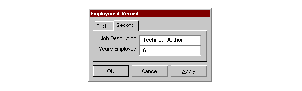
A property frame#
The
pages:init-keyword defines the pages available for the property frame.The apply callback and button define an additional Apply button available in property frames. The Apply button applies any changes made in the current page of the dialog, but does not dismiss the dialog from the screen. By default, there is no Apply button defined.
The page-changed callback lets you specified a callback that should be invoked if the current page in the property frame is changed by clicking on a different page tab.
- Operations:
- See also:
- <property-page> Open Instantiable Class#
The class of property pages.
- Superclasses:
- Discussion:
The class of property pages. These are pages that can be displayed in an instance of
<property-frame>.
A property page#
Internally, this class maps into the Windows property page control.
- See also:
- raise-frame Generic function#
Raises the specified frame to the top of the stack of visible windows.
- Signature:
raise-frame frame => ()
- Parameters:
frame – An instance of type
<frame>.
- Discussion:
Raises frame to the top of the stack of visible windows. After calling this function, frame will appear above any occluding windows that may be on the screen.
- Example:
The following example creates and displays a simple frame, then lowers and raises it. You should run this code in the interactor, pressing the RETURN key at the points indicated.
define variable *frame* =
  make(<simple-frame>, title: "A frame",
       layout: make(<button>)); // RETURN
start-frame(*frame*); // RETURN
lower-frame(*frame*); // RETURN
raise-frame(*frame*); // RETURN
- See also:
- redo-command Generic function#
Performs the last performed command again.
- Signature:
redo-command command frame => #rest values
- Parameters:
- Discussion:
Performs command again. The command is the command that was last executed using
execute-command.Note that the command described by command must be undoable.
You can both specialize this function and call it directly in your code.
- See also:
- remove-command Generic function#
Removes a command from the specified command table.
- Signature:
remove-command command-table command => ()
- Parameters:
command-table – An instance of type
<command-table>.command – An instance of type
<command>.
- Discussion:
Removes command from command-table.
- See also:
- remove-command-table Function#
Removes the specified command table.
- Signature:
remove-command-table command-table => ()
- Parameters:
command-table – An instance of type
<command-table>.
- Discussion:
Removes command-table.
Removes a menu item from the specified command table.
- Signature:
remove-command-table-menu-item command-table string => ()
- Parameters:
command-table – An instance of type
<command-table>.string – An instance of type
<string>.
- Discussion:
Removes the menu item identified by string from command-table.
- See also:
- set-frame-position Generic function#
Sets the position of the specified frame.
- Signature:
set-frame-position frame x y => ()
- Parameters:
- Discussion:
Sets the position of frame. The coordinates x and y are measured from the top left of the screen, measured in pixels.
- See also:
- set-frame-size Generic function#
Sets the size of the specified frame.
- Signature:
set-frame-size frame width height => ()
- Parameters:
- Discussion:
Sets the size of frame.
- Example:
The following example creates and displays a simple frame, then resizes it. You should run this code in the interactor, pressing the RETURN key at the points indicated.
- See also:
- <simple-command> Open Abstract Instantiable Class#
The class of simple commands.
- Superclasses:
- Init-Keywords:
function – An instance of type
<function>. Required.arguments – An instance of type
<sequence>. Default value#[].
- Discussion:
The class of simple commands. A simple command has an associated function and some arguments. Simple commands are not undoable.
The first argument to the function is always the frame.
- See also:
- <simple-frame> Open Abstract Instantiable Class#
The class of simple frames.
- Superclasses:
- Init-Keywords:
command-queue – An instance of type
false-or(<event-queue). Default value:make(<event-queue>).layout – An instance of type
false-or(<sheet>). Default value: ``#f.command-table – An instance of type
false-or(<command-table>). Default value:#f.menu-bar – An instance of type
false-or(<menu-bar>). Default value:#f.tool-bar – An instance of type
false-or(<tool-bar>). Default value:#f.status-bar – An instance of type
false-or(<status-bar>). Default value:#f.
- Discussion:
The class of simple frames.
The
command-queue:init-keyword specifies a command-queue for the frame.The
layout:init-keyword specifies a layout for the frame.The
command-table:init-keyword specifies a command table for the frame.The
menu-bar:init-keyword specifies a menu bar for the frame.The
tool-bar:init-keyword specifies a tool bar for the frame.The
status-bar:init-keyword specifies a status bar for the frame.- Operations:
- <simple-undoable-command> Open Abstract Instantiable Class#
The class of simple commands that can contain an undo action.
- Superclasses:
- Init-Keywords:
undo-command – An instance of type
<command>.
- Discussion:
The class of simple commands that can contain an undo action. A simple undoable command is like a simple command, except that it points to a command that can undo it, represented by the
undo-command:init-keyword.- See also:
- start-dialog Generic function#
Displays a DUIM frame as a dialog box.
- Signature:
start-dialog dialog => #rest values
- Parameters:
dialog – An instance of type
<dialog-frame>.
- Values:
#rest values – Instances of type
<object>.
- Discussion:
Displays a DUIM frame as a dialog box.
The function
start-dialogdynamically binds an<abort>restart around the event loop for the dialog that is started. The restart allows the event loop to be re-entered, and enables any callbacks run from the dialog to signal an<abort>(via theabortfunction, for instance), in order to terminate execution of the current callback and return to event processing. This facility is useful for implementing operations that cancel gestures and for debugging DUIM applications from Dylan debuggers.- See also:
- start-frame Generic function#
Starts the specified frame.
- Signature:
start-frame frame #key owner mode => status-code
- Parameters:
frame – An instance of type
<frame>.owner – An instance of type
false-or(<frame>). Default value:#f.mode – An instance of type
one-of("modal", #"modeless", #"system-modal"). Default value:#f.
- Values:
status-code – An instance of type
<integer>.
- Discussion:
Starts frame, optionally setting the owner of the frame and the mode in which it will run.
The function
start-framedynamically binds an<abort>restart around the event loop for the frame that is started. The restart allows the event loop to be re-entered, and enables any callbacks run from the frame to signal an<abort>(via theabortfunction, for instance), in order to terminate execution of the current callback and return to event processing. This facility is useful for implementing operations that cancel gestures and for debugging DUIM applications from Dylan debuggers.- Example:
The following example creates a simple frame, then displays it. You should run this code in the interactor, pressing the RETURN key at the points indicated.
define variable *frame* =
  make(<simple-frame>, title: "A frame",
       layout: make(<button>));  // RETURN

start-frame(*frame*);  // RETURN
- See also:
- undo-command Generic function#
Calls the undo command for the specified command.
- Signature:
undo-command command frame => #rest values
- Parameters:
- Values:
#rest values – Instances of type
<object>.
- Discussion:
Calls the undo command for command, undoing the effects of calling command. Note that command must be undoable.
You can call this command directly in your own code, as well as specialize it.
- See also:
- *user-command-table* Variable#
A user-defined command table that can be inherited by other command tables.
- Type:
- Discussion:
This is a command table that can be used by the programmer for any purpose. DUIM does not use it for anything, and its contents are completely undefined.
If desired, all new command tables can inherit the command table specified by this variable.
- See also:
- <wizard-frame> Class#
- Open:
- Instantiable:
The class of wizard frames.
- Superclasses:
- Init-Keywords:
page – An instance of type
<page>.pages – An instance of type
false-or(limited(<sequence>, of:<page>). Default value:#f.apply-callback – An instance of type
false-or(<function>). Default value:#f.apply-button – An instance of type
false-or(<button>). Default value:#f.
Note that the following two useful init-keywords are inherited from
<dialog-frame>:- Init-Keywords:
pages – An instance of type
false-or(<sequence>). Default value:#f.page-changed-callback – An instance of type
false-or(<function>). Default value:#f.
- Discussion:
The class of wizard frames. These are frames that are used to create wizards (series of connected dialogs) that are used to guide the user through a structured task, such as installing an application.

A wizard frame#
A wizard frame is a multi-page dialog, in which the user specifies requested information before proceeding to the next page in the sequence. At the end of the sequence, the user exits the dialog to send the relevant information back to the controlling application.
When a wizard frame is created, each page in the frame automatically has a Next and Back button to let the user navigate forward and backward through the sequence of pages.
In addition, if
apply-button:is specified, an Apply button is displayed in the frame. By default, clicking on this button lets the user apply the changes made so far without dismissing the frame from the screen. If specified, theapply-callback:function is invoked when the Apply button is clicked.The layout of a wizard frame is controlled using a
<stack-layout>.- Operations:
- Example:
define frame <my-wizard> (<wizard-frame>)
  pane name-pane (frame)
    make(<text-field>);
  pane organization-pane (frame)
    make(<text-field>);
  pane job-description-pane (frame)
    make(<text-field>);
  pane years-employed-pane (frame)
    make(<text-field>, value-type: <integer>);
  pane first-page-layout (frame)
    make(<table-layout>,
         columns: 2,
         x-alignment: #(#"right", #"left"),
         children: vector(make(<label>,
                               label: "Name:"),
                          frame.name-pane,
                          make(<label>,
                               label: "Organization:"),
                          frame.organization-pane));
  pane second-page-layout (frame)
    make(<table-layout>,
         columns: 2,
         x-alignment: #(#"right", #"left"),
         children: vector
                     (make(<label>,
                           label: "Job Description:"),
                      frame.job-description-pane,
                      make(<label>,
                           label: "Years Employed:"),
                      frame.years-employed-pane));
  pane first-page (frame)
    make(<wizard-page>,
         child: frame.first-page-layout);
  pane second-page (frame)
    make(<wizard-page>,
         child: frame.second-page-layout);
  pages (frame)
    vector(frame.first-page, frame.second-page);
  keyword title: = "My Wizard";
end frame <my-wizard>;
- See also:
- <wizard-page> Open Instantiable Class#
The class of wizard pages.
- Superclasses:
- Discussion:
The class of wizard pages. These are pages that can be displayed in an instance of
<wizard-frame>, and are used for a single dialog in the structured task that the wizard guides the user through.
A wizard page#
- See also: